
Classical LMS
Product Design, Motion Design, Design System
The brief: improve on the university’s learning management system for the student-side.
There are many LMS applications out there—what more can be improved and iterated on, and what makes one stand out from the rest?
After a cyclical process of interviewing, prototyping, testing, and animating, Classical LMS is my approach to the substantial problem of making education as frictionless as possible between web, mobile, and the classroom. With a design system and multi-breakpoint interface flexible enough to make learning just a little bit more accessible and sensitive to the wide variety of student priorities, Classical targets the pain points of the university's current LMS to prioritize seamless and efficient digital interaction.
The following video presents the Classical LMS design system, the customizability of the mobile and web interfaces, and an introduction to Plato, the GenAI assistant designed to be there when you need him.
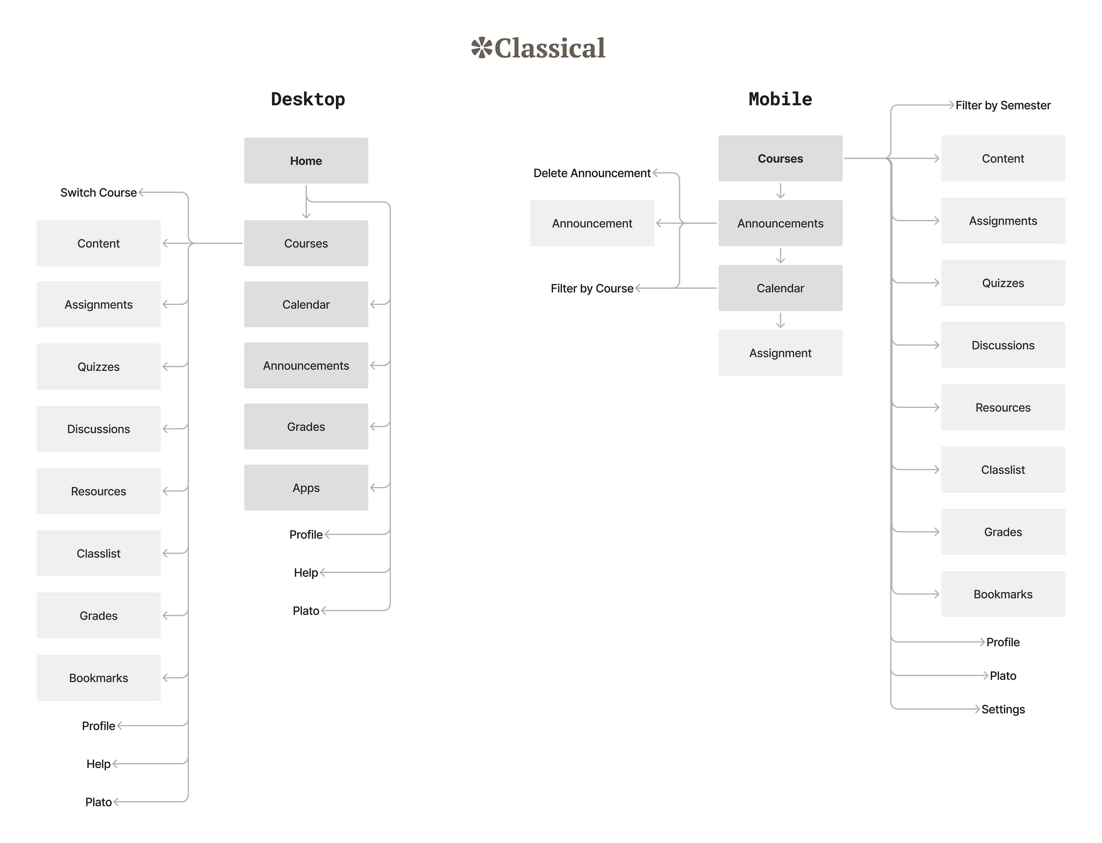
One important thing to consider was which features would carry over from the flagship desktop version into tablet and mobile. I learned from user interviews that students felt that the mobile app for the current LMS was disjointed and useless in some ways; I needed to make the Classical mobile app an integrated, functional part of the ecosystem without becoming bloated with too many features.
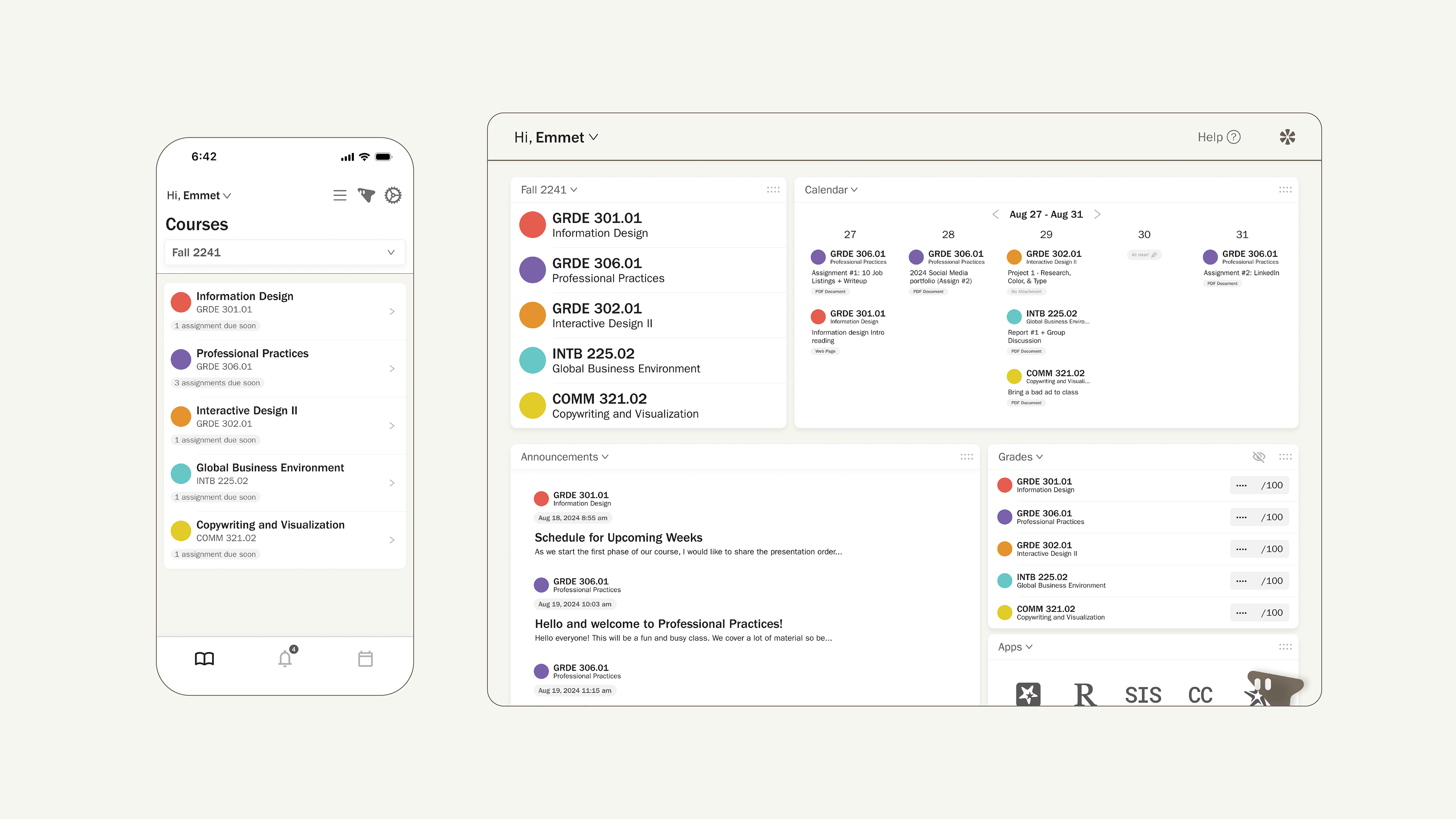
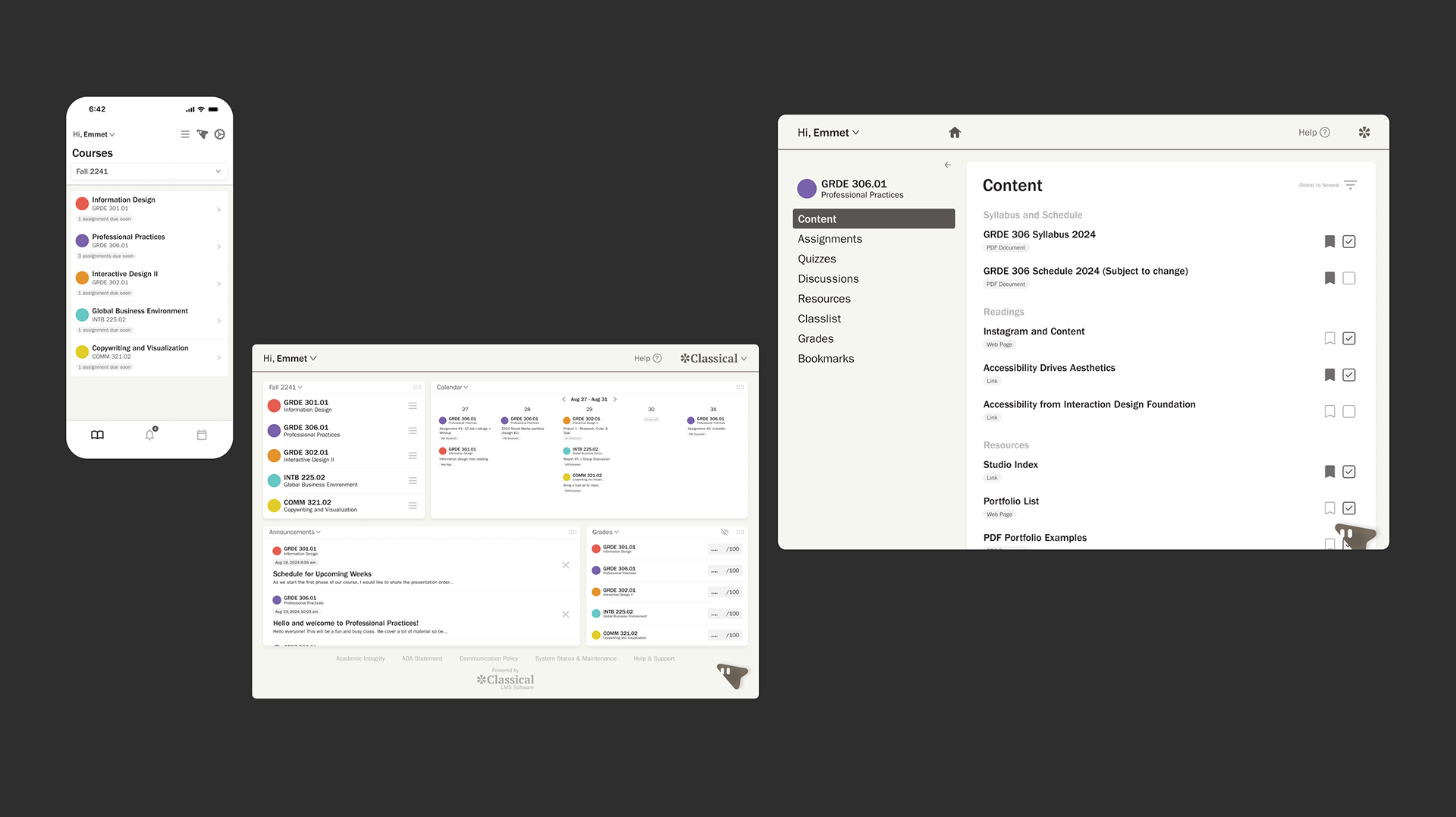
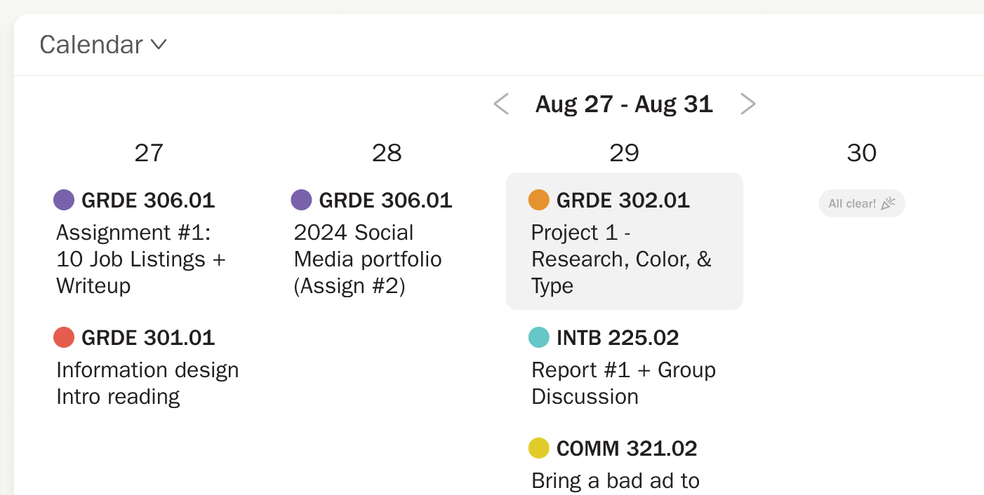
The mobile app condenses the desktop version's modular home dashboard with three separate pages: "Courses" (bringing all the same elements from the desktop's sidebar navigation), "Announcements," and "Calendar." Plato finds his home in the fixed header, blending in with the other icons.
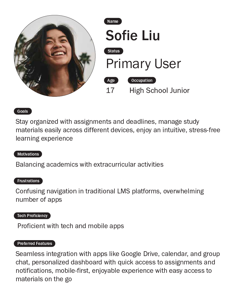
Combining an in-depth competitive analysis of similar software and interviewing students to pinpoint the main frustrations yielded a clearer path forward for what to iterate on, how to structure the experience, who I'm designing for, and why.
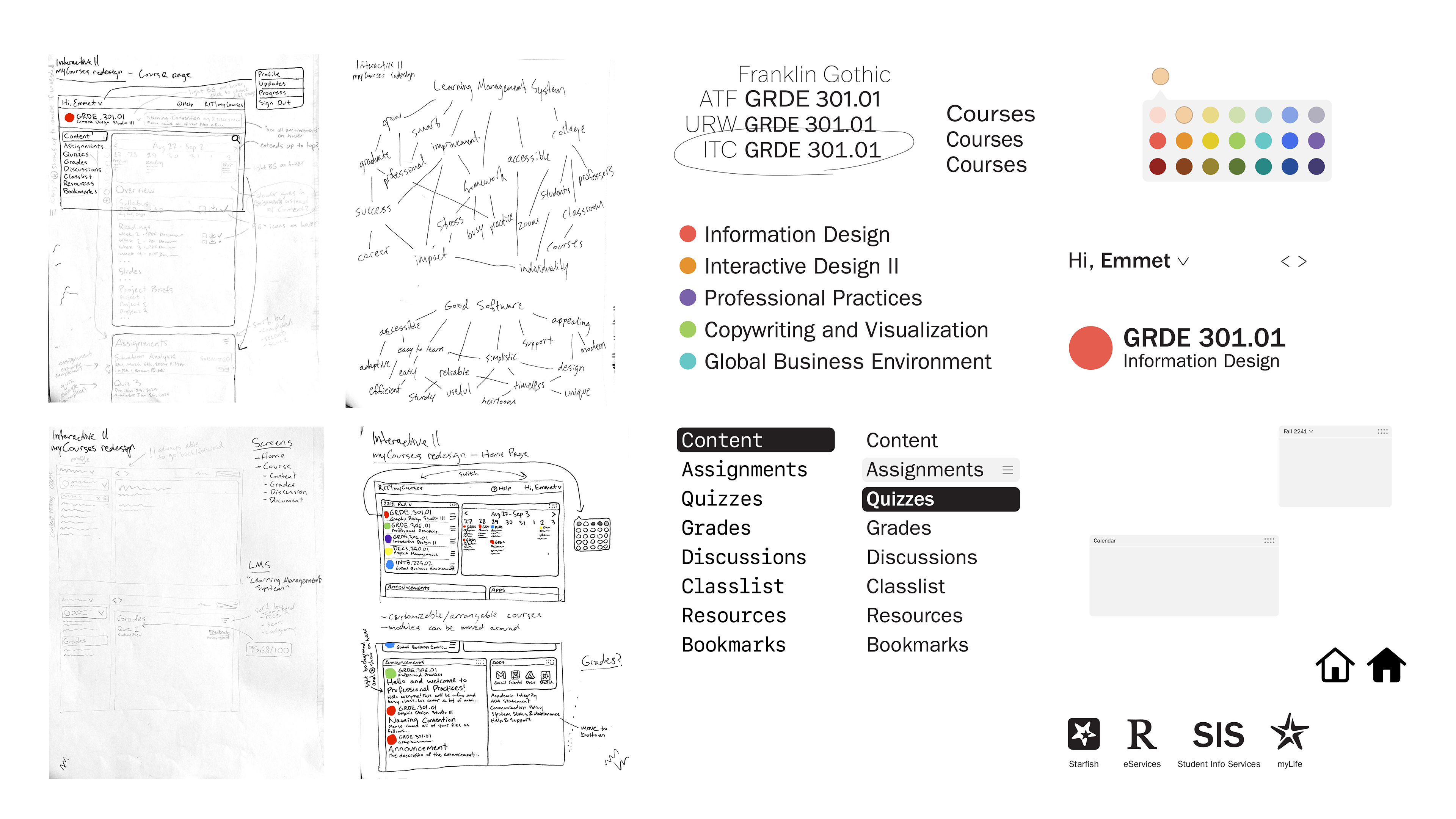
Mind mapping not only gives some direction to brand expression, but also to how to structure information with the user in mind; I exhaustively sketch wireframes in low-to-mid fidelity to get familiar with how the interface will work before moving into software. Then, experimenting with how high-fidelity UI components will look gives me a better idea of how sizing, colors, and typography will come across in the finished design, allowing me to adjust as needed for prototyping and testing.
I always document thoughts and notes before, during, and after research, even if it doesn't all make it into the final designs.
Prototype test of Plato usability

User interviews revealed that users experienced the current LMS system to have confusing and sometimes inaccessible flows, clunky interactions, and redundant patterns, making everyday tasks and crucial moments frustrating (even maddening, especially in the stressful lives of college students).
Based on the surveys and research, the three primary goals for the interface became:
To have open and easy navigation to be able to get almost anywhere the student needs to go at any time;
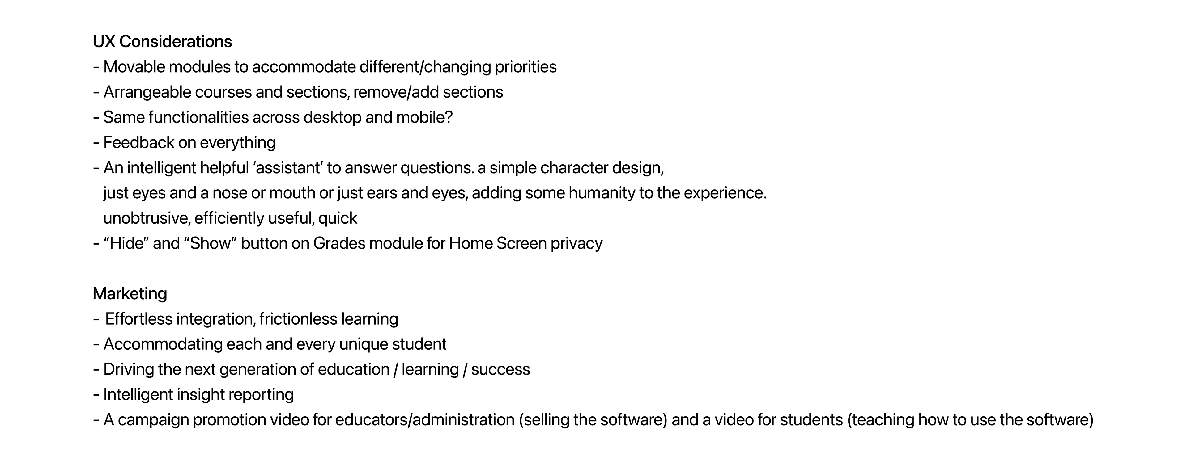
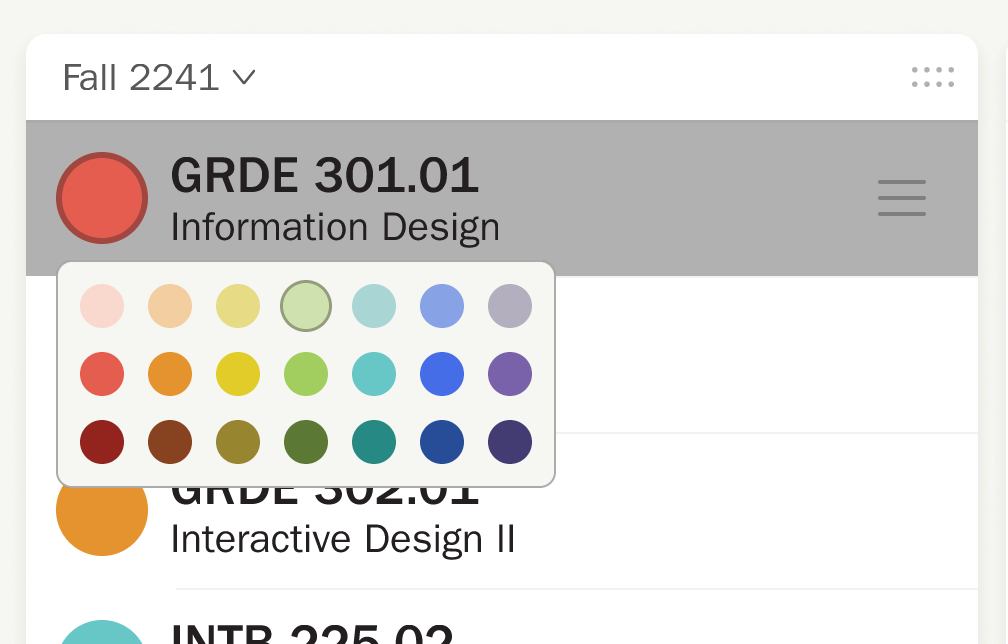
To have a customizable experience, to be able to hide or show, rearrange, or label things as the student wishes;
And not to overwhelm the student with a needless and unnecessary quantity of information that communicates a false sense of urgency.
With the addition of marketing material like animations to the project, I also considered the goals, motivations, and frustrations of two secondary users: educators, who also need to interact with the software to provide students with material, and administrators—or, the "customer" of the product—who may may have very different needs and motivations than students or educators. Consulting several educators and administrators lent some useful context for the needs of non-student LMS users.


The following is the full Classical desktop interface prototype, displaying the some common interactions and flows built on an adaptive foundation.