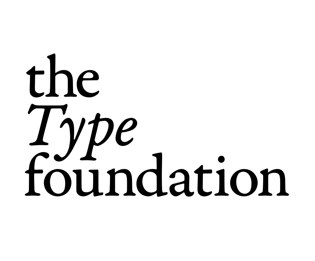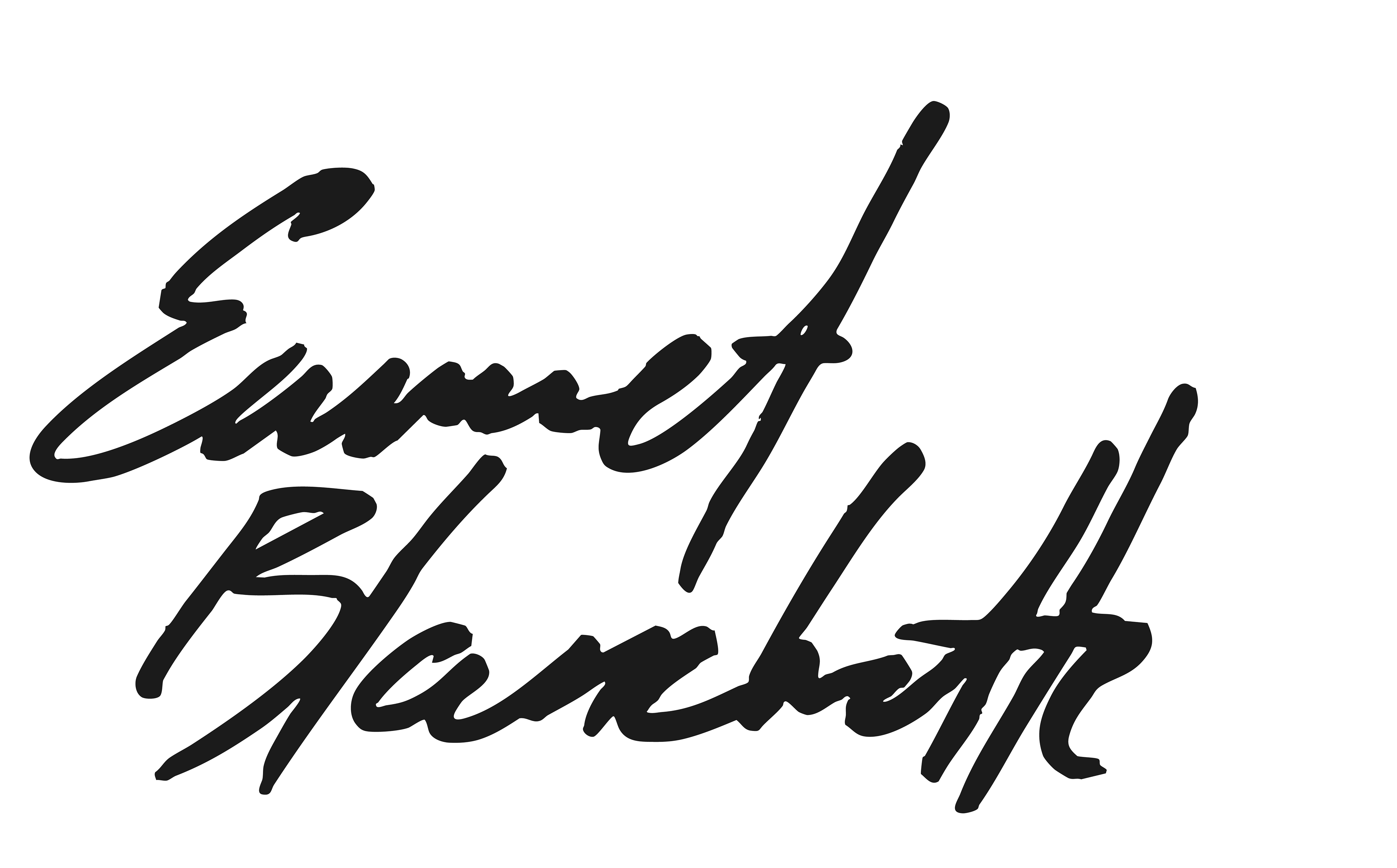
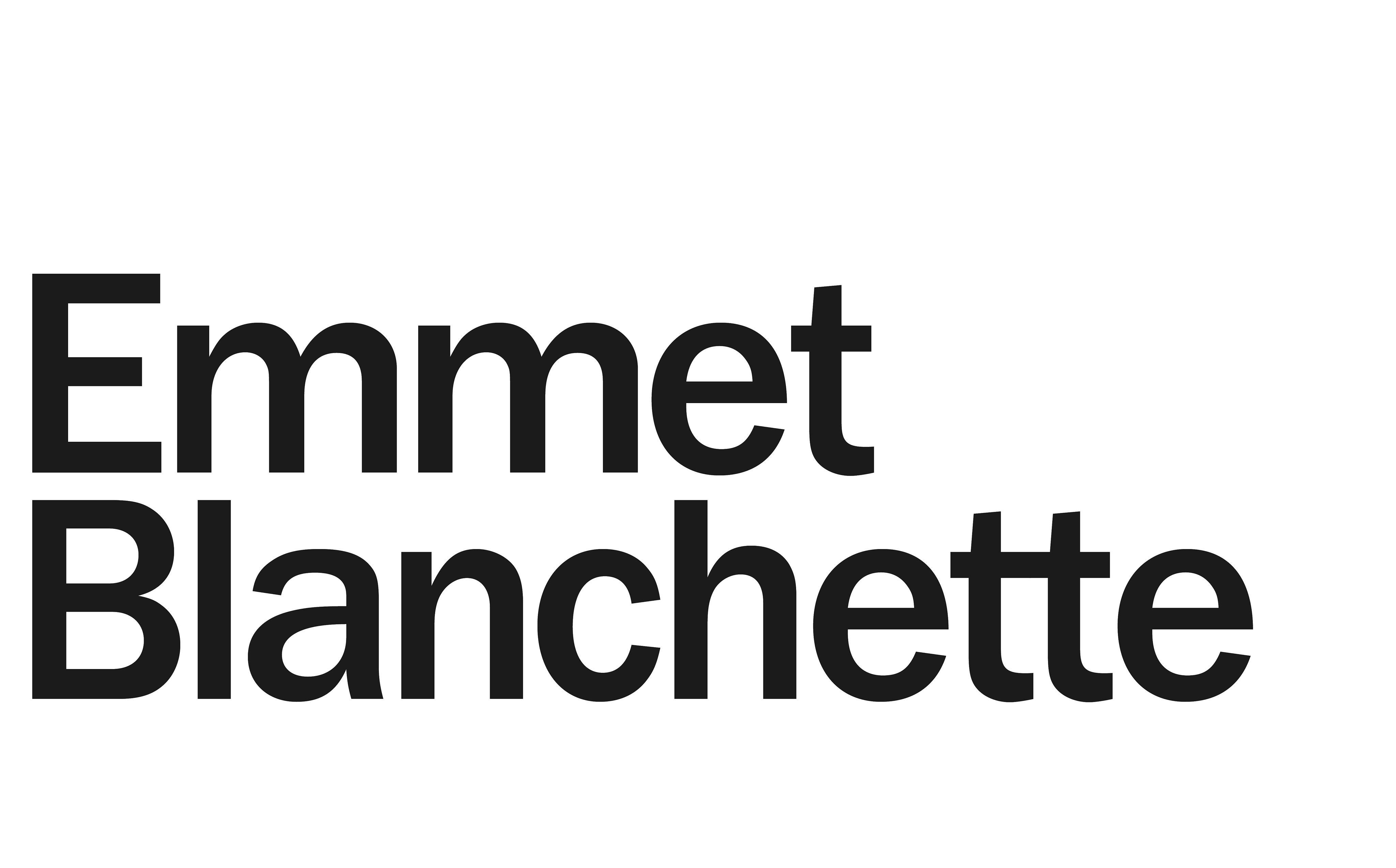
The Type Foundation
Visual Identity, Naming
The brief: create a name and logo for an event-planning organization.
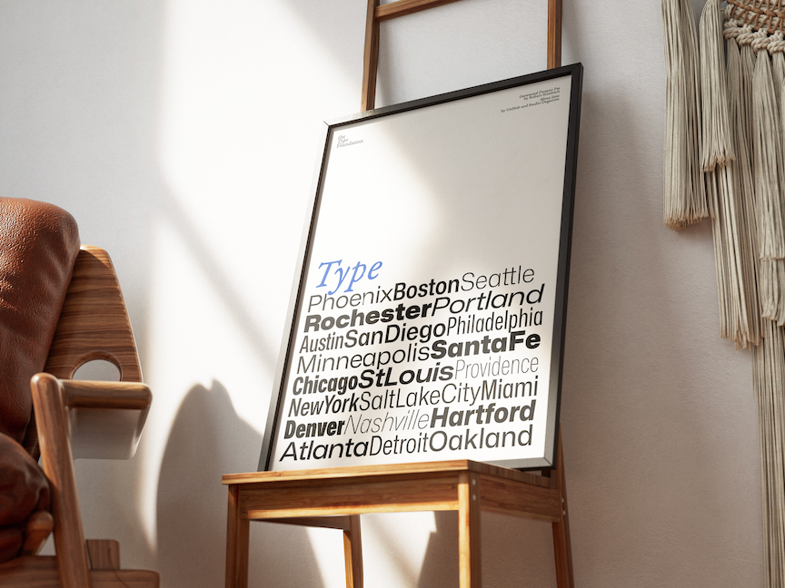
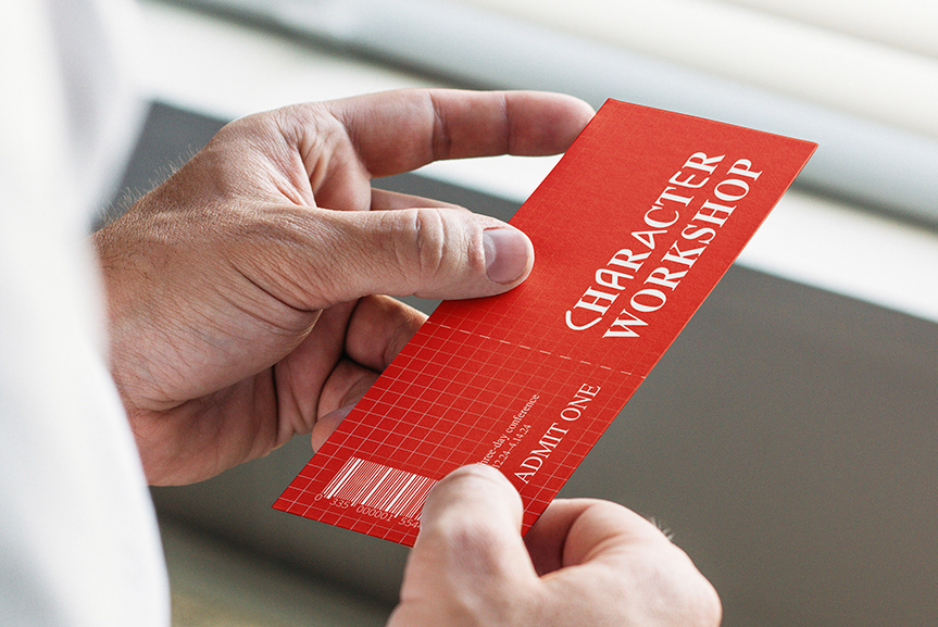
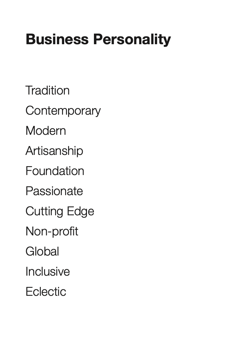
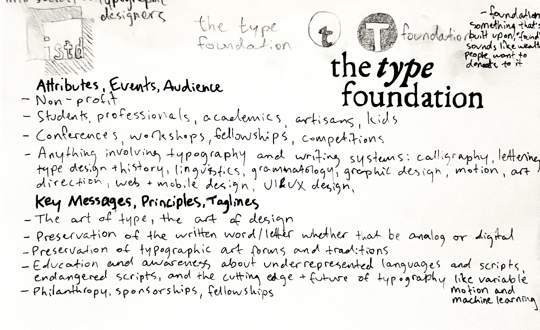
The Type Foundation emerged as a non-profit dedicated to creating community around typography. It organizes annual conferences (Character Workshop!), each year in a different city, dealing with the written word, whether that be analog or digital, the preservation of typographic art forms and traditions, education and awareness about underrepresented languages and endangered scripts, the cutting edge and future of typography, and everything in between.
The target audience is anyone interested in or involved academically or professionally with typography, type design and relevant software development, writing systems, linguistics, calligraphy, lettering, graphic design, motion design, UX and product design, and art.
Students have the opportunity to make connections, start learning new skills, and secure fellowships or internships; professionals and academics too seek to make connections, learn about recent research and development, and discuss trends. Typographic artisans have workshops through which they can display their skills and teach others.


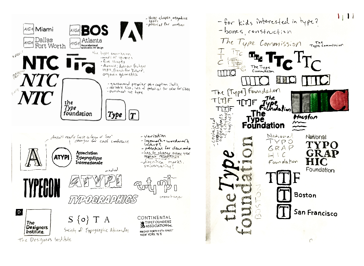
The sketching process included a competitive analysis of other typography-related organizations and brainstorming how to communicate the distinctiveness of The Type Foundation.
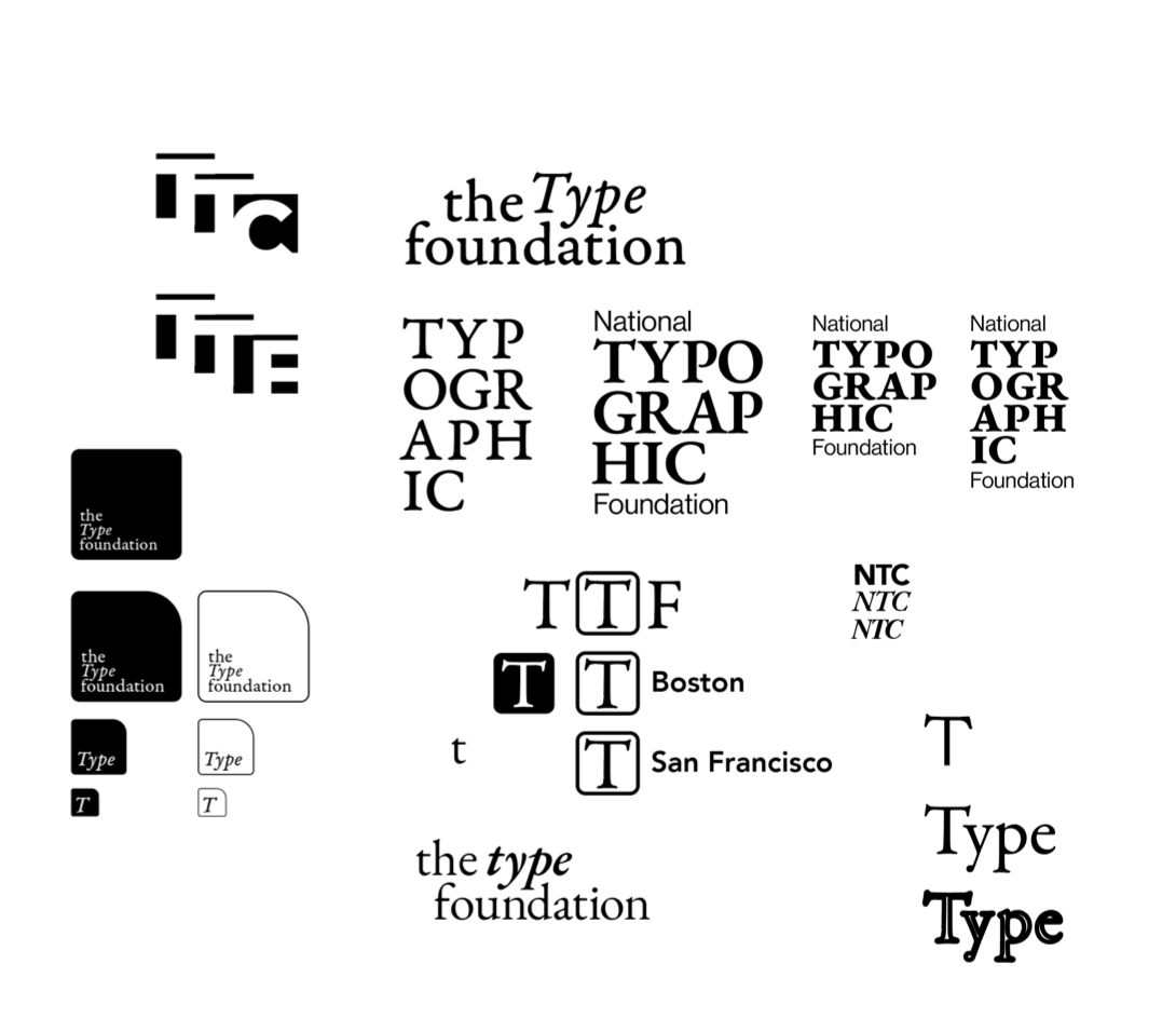
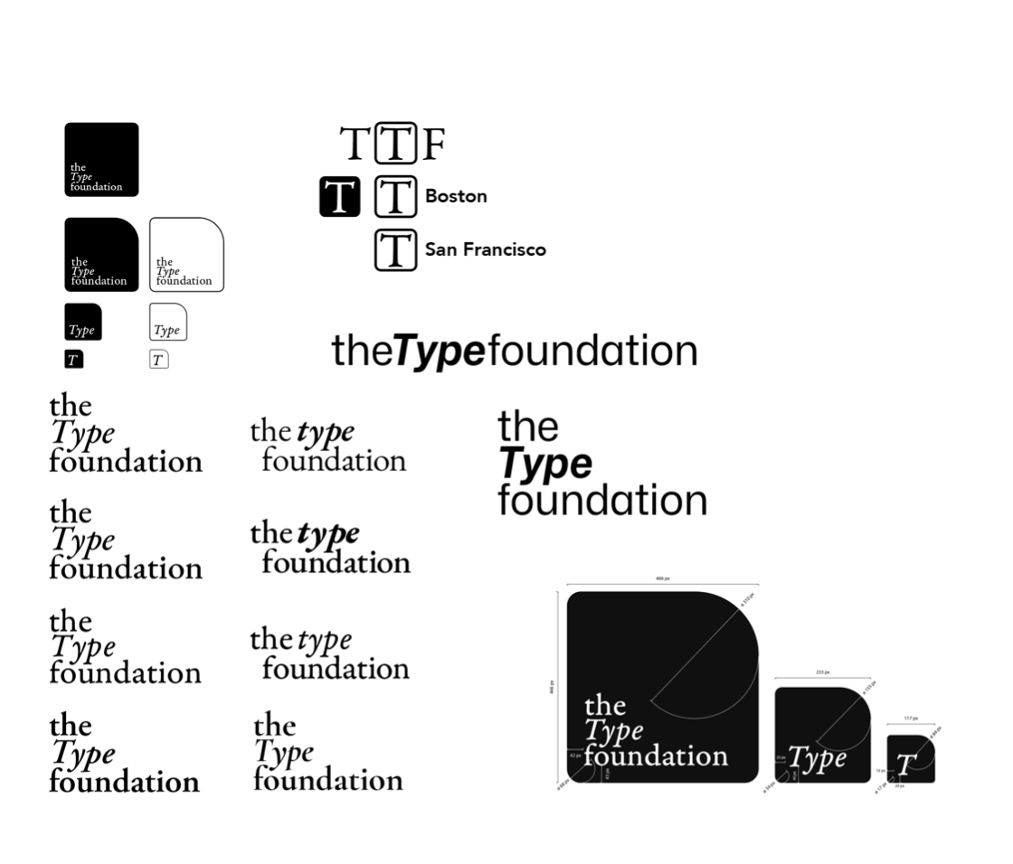
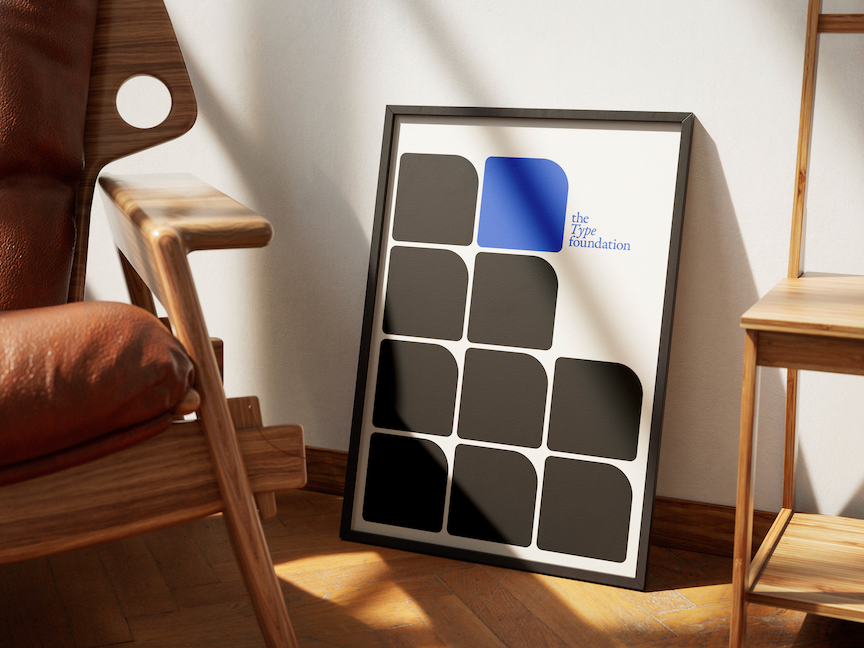
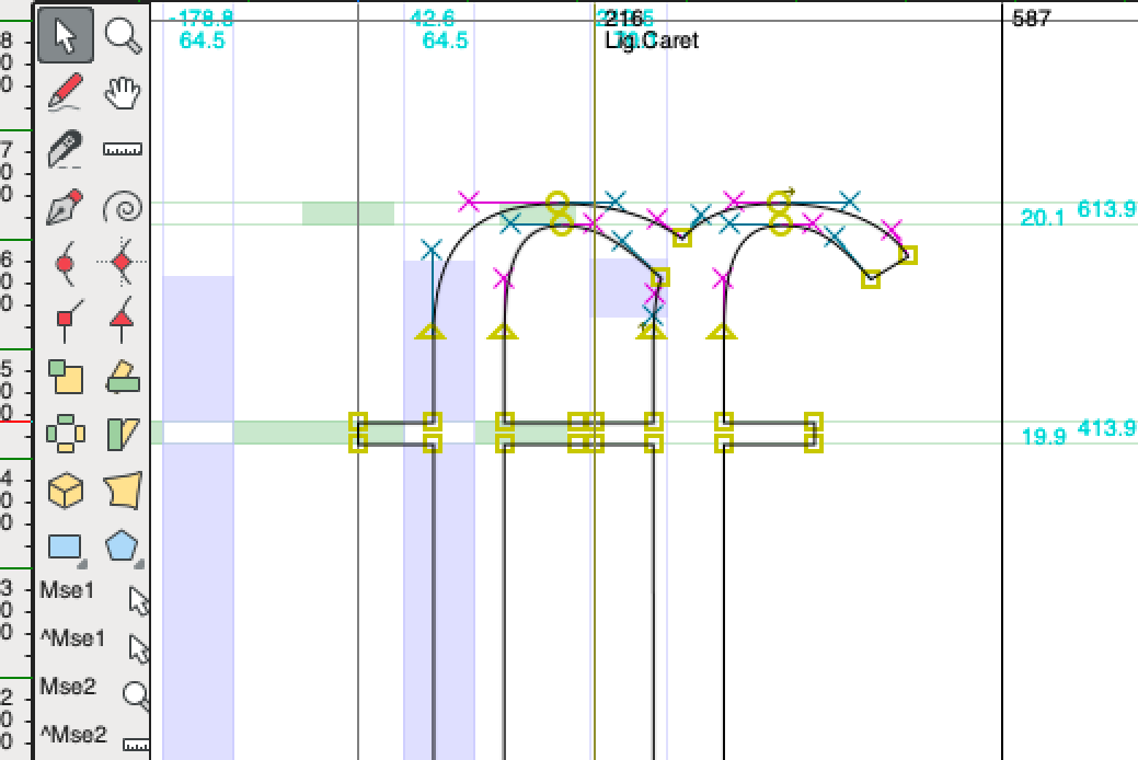
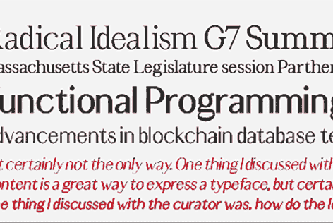
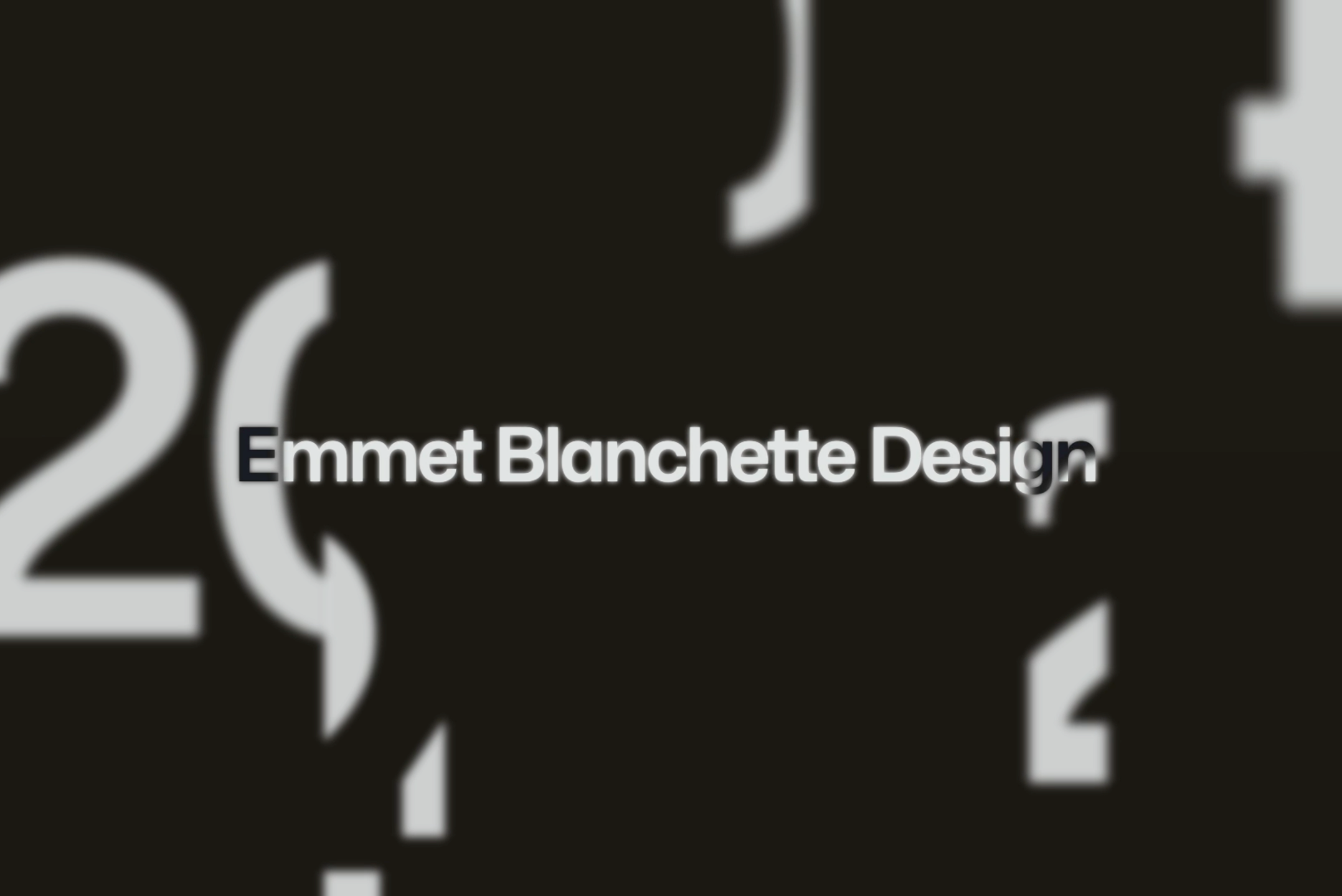
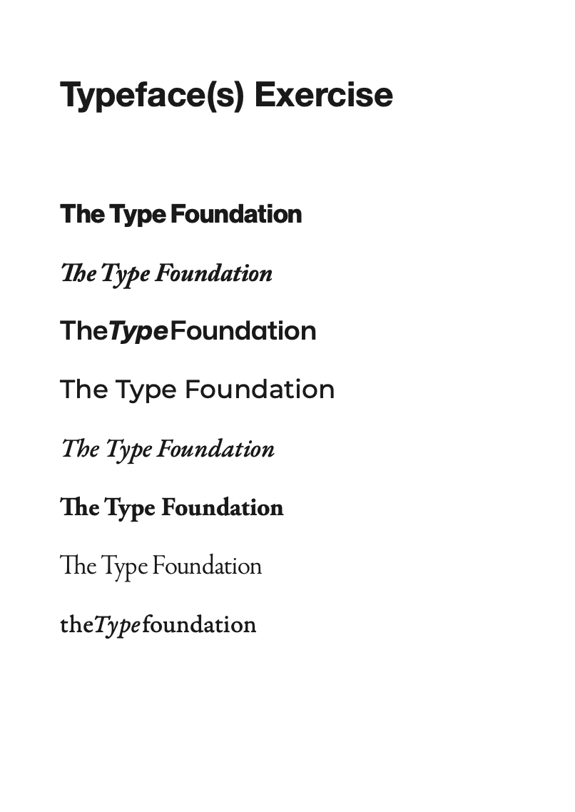
Once the overall concept for the logo was in place, the layers started to peel away, revealing more and more of the visual identity of an iconic organization. As a typographic organization, it was of utmost importance to maintain high visual integrity and typographic excellence while at the same time showing a fun and experimental side.

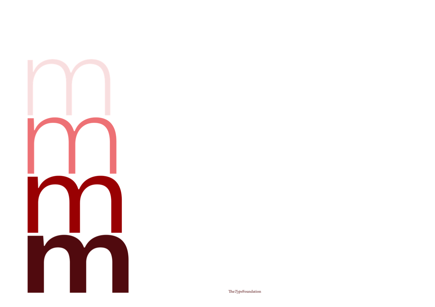

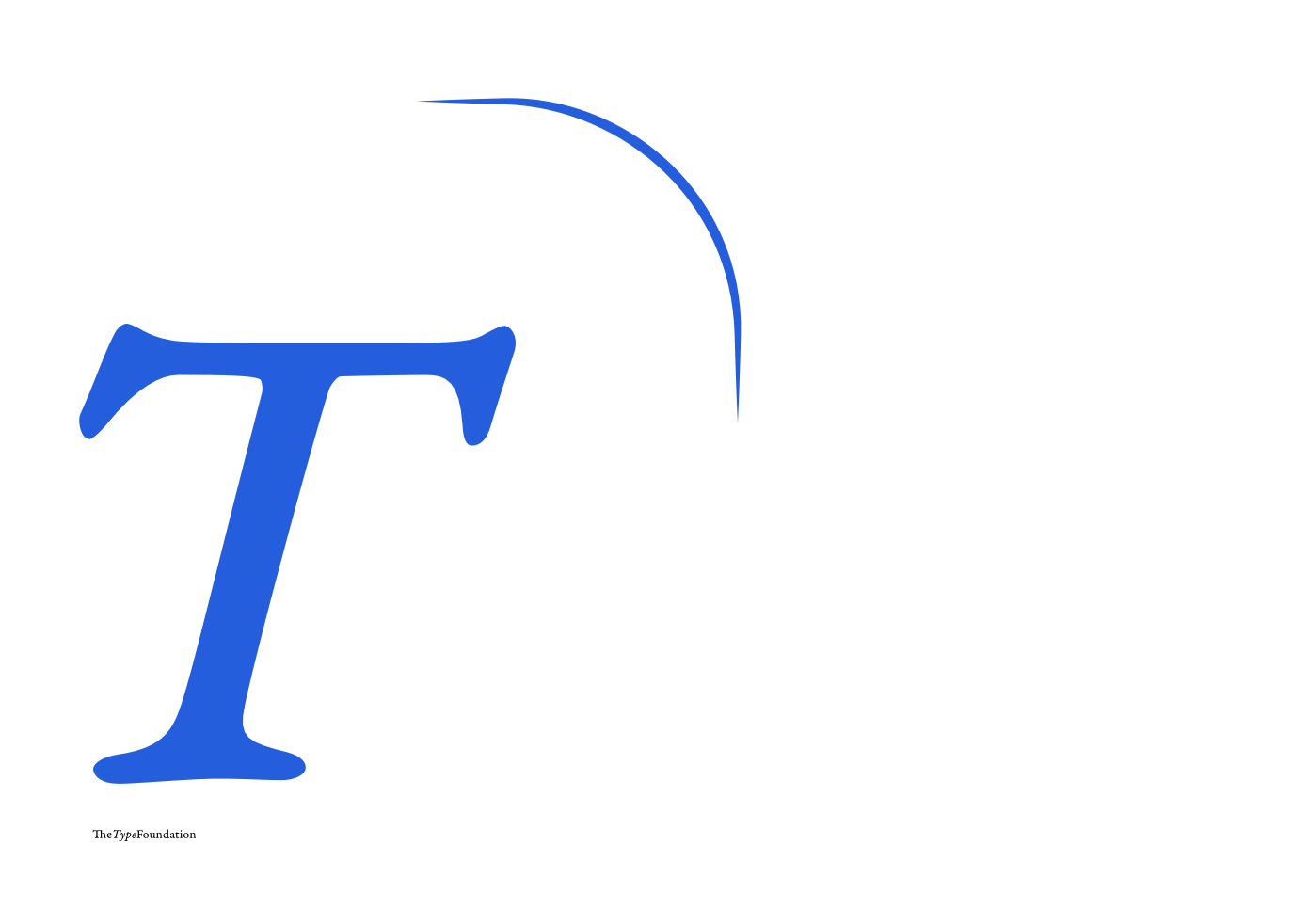
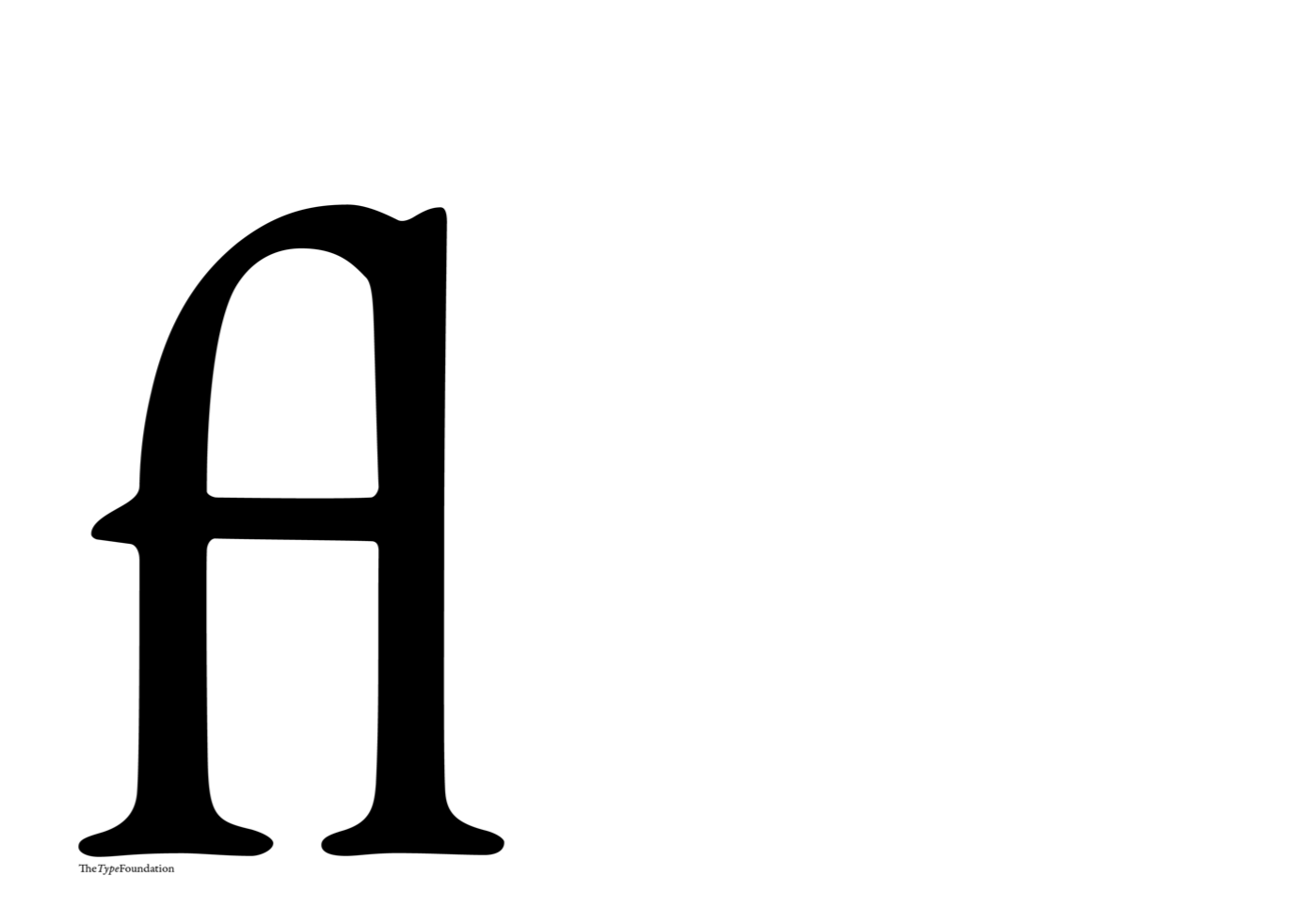

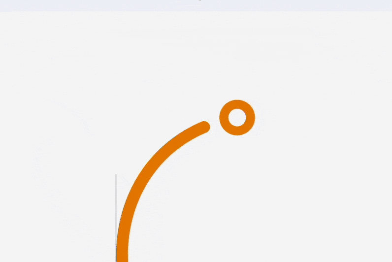
A variable logo, similar to variable fonts, allows for flexibility and relevance in a landscape where new mediums are constantly being developed.