Fitforge
User Research, Product Design
The brief: design a community app to encourage fitness.
Fitforge is built to be an approachable, flexible, and meaningful fitness companion. Through empathetic user research, three broad goals emerged for the app: connect people with fitness communities; facilitate education about fitness and healthy lifestyles, and; spur action by providing a starting point and paths to progress.
The modes of research included competitive analyses of similar experiences (of which there are not many, like Peloton, Nike Run Club, and Strava) and user surveying.
What are some of the sentiments and frustrations people have with working out and fitness? Which commonly desired features are missing from competitors?
I put posters with a QR code to a survey all over my campus to find out. I got over 50 respondents providing valuable information on a variety of qualitative and quantitative questions.
Five examples from the survey of 17 questions that I engineered to obtain direction for the product
The survey responses revealed several recurring themes and insights into peoples's experiences, preferences, and challenges in their fitness journeys.
It became clear that creating a space where users can feel comfortable, supported, and encouraged would align well with the needs highlighted in the research. In finding a fitness community, it would greatly benefit Fitforge users to be able to finely adjust and filter their results based on interests, experience level, and other personal, unique criteria.
I distilled these findings into user personas with empathy maps to be more specific in my thinking about how to design Fitforge with the user in mind. In creating personas, I'm careful not to homogenize the characteristics and maintain a broad sense of who the app is for.
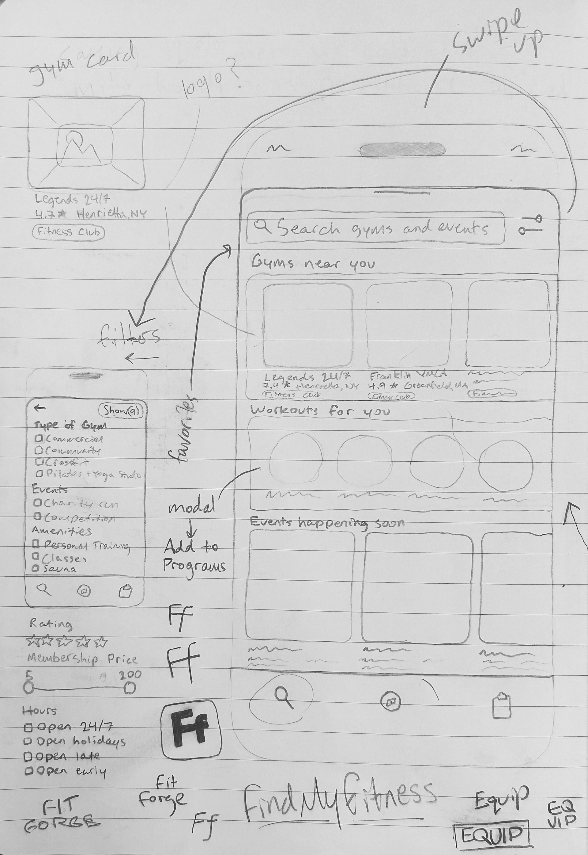
The sketching process, a combination of low- and mid-fidelity, provides a lot of structure to think about how different features will fit together, which features need to be cut, and how different screens fit into a consistent and intuitive overall flow. It also gives a sense of ordering; which screens should be more immediate to the user and which should take multiple interactions to reach. A lot will change in the process from sketches to high-fidelity prototypes based on further research and testing, but the sketches provide the foundation of the app.
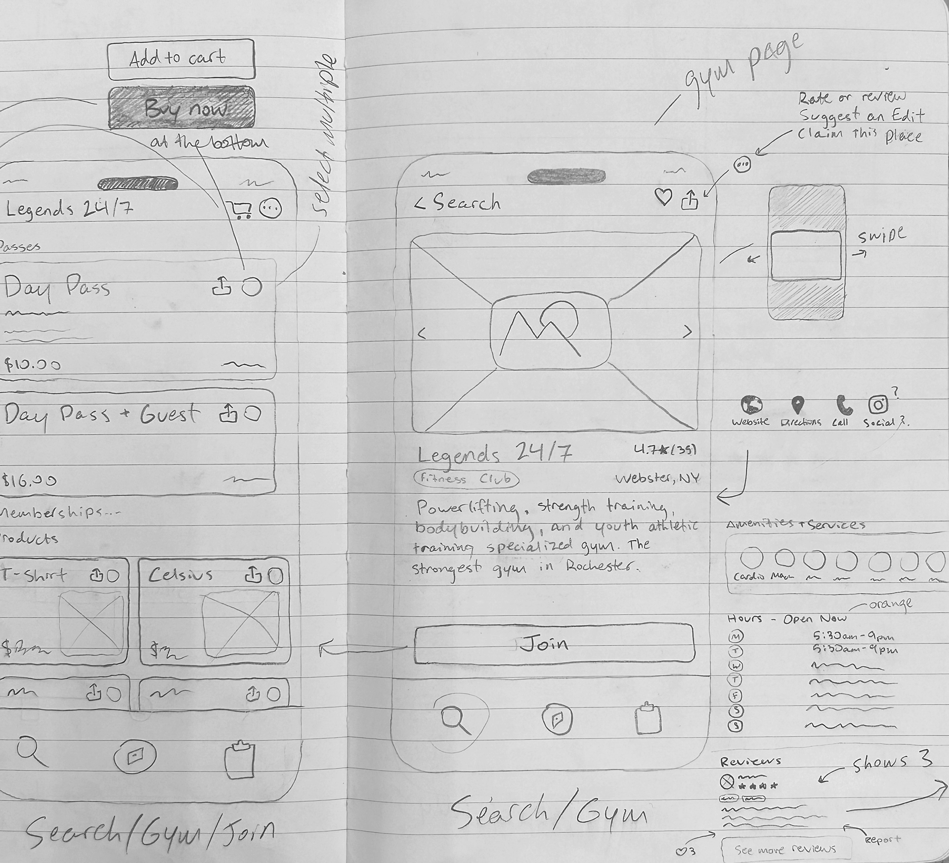
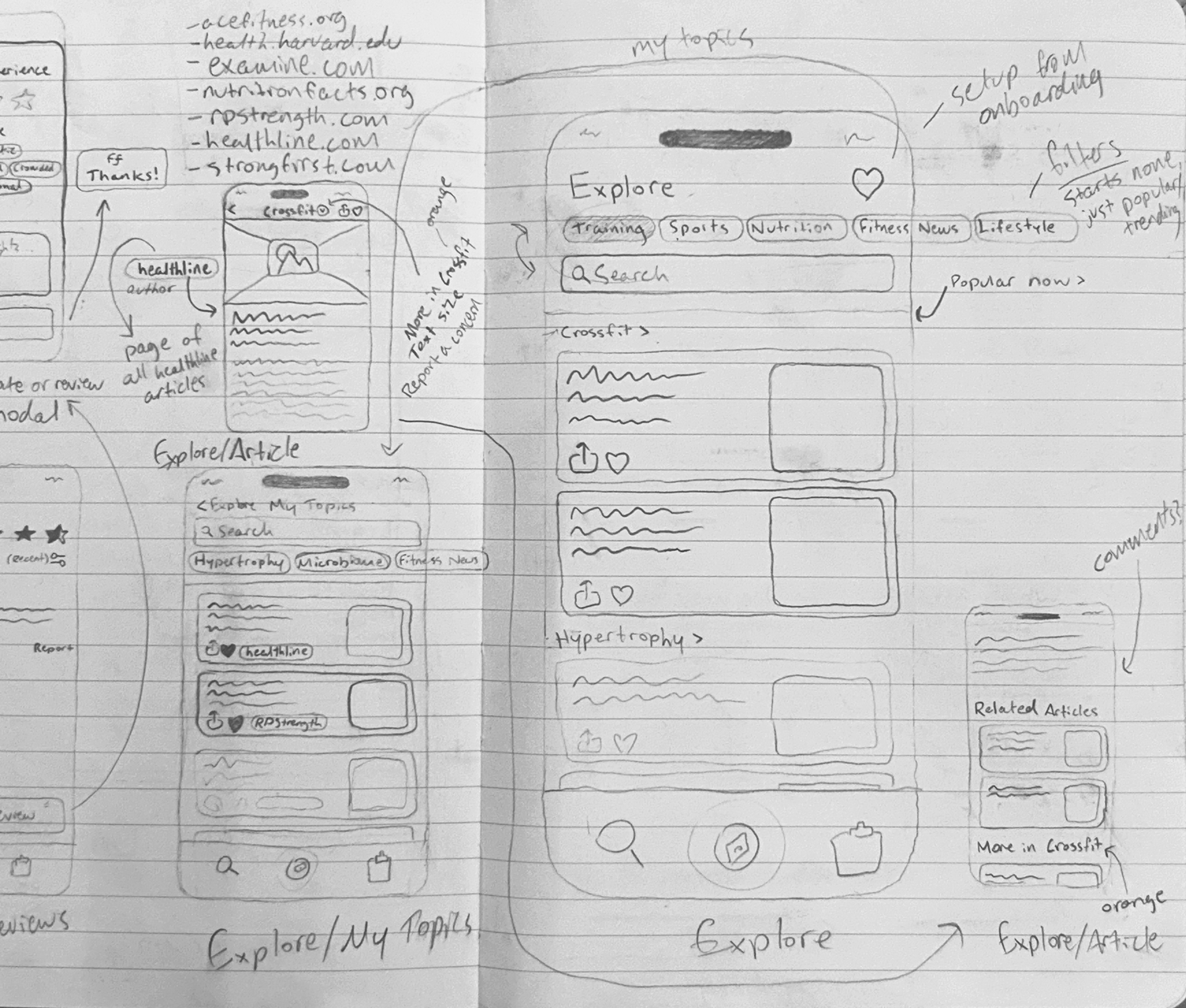
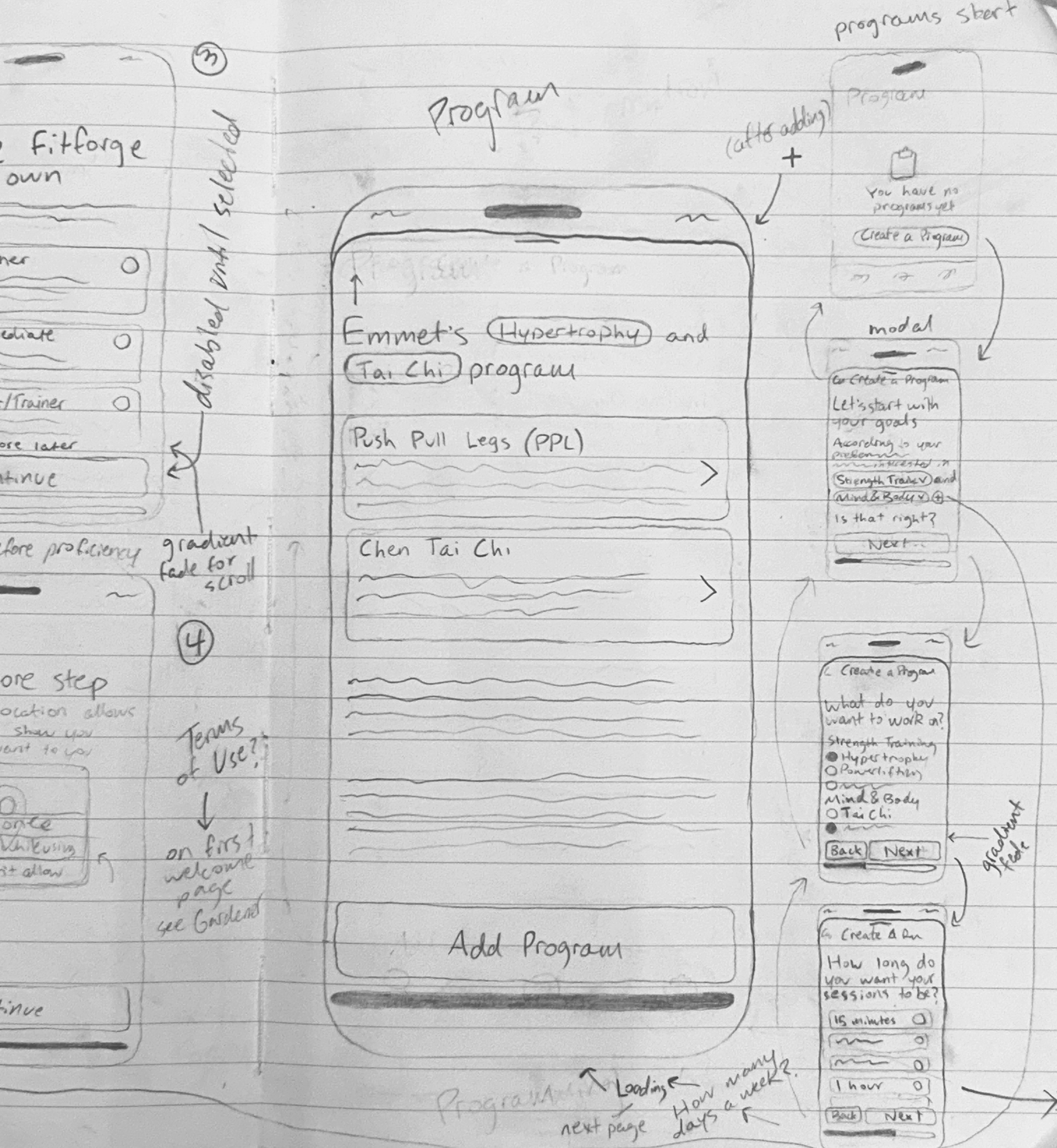
In order from left to right is sketching for the onboarding flow, search, fitness center page and the membership pass ordering flow, explore with the articles flow and the program creation flow.
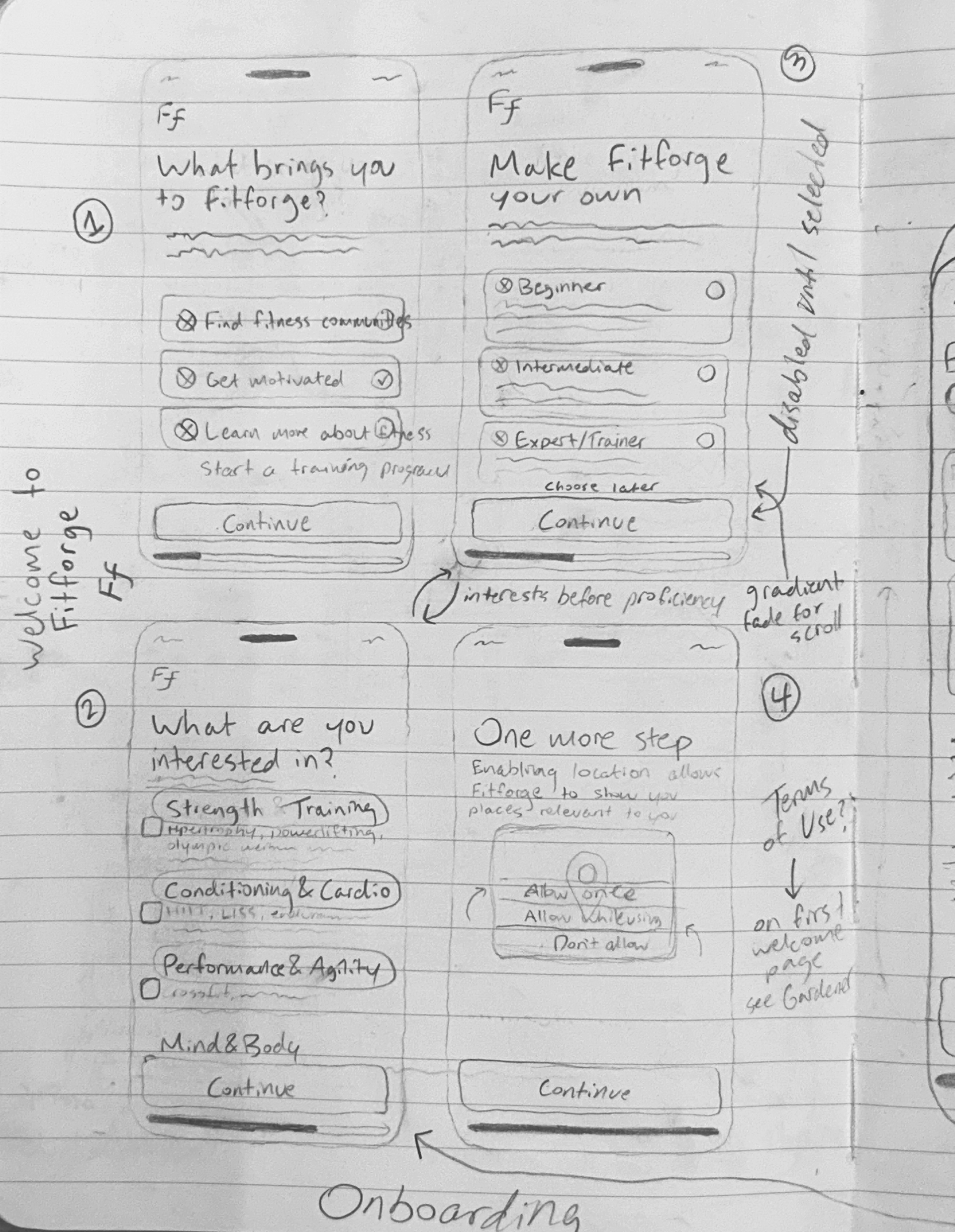
The onboarding flow is considerate of all user interests and experience levels. The preferences set during onboarding also provide the customized content for the Explore and Program pages.
The interface of Fitforge was designed with the iOS interaction guidelines in mind, utilizing the top-level navigation of iOS 18 components (such as navigation tab bars, search bars, and SF symbols), but otherwise using a bespoke design system and set of interface components. This makes the app feel familiar and approachable for users, while still expressing a unique memorability.
Prototyping the flow of filtering fitness communities on the home screen (Search)
Users can read about topics that interest them from the leading reputable, free journals and publications and discover new fitness topics with the Explore page. These article cards also appear within sections in the Program page that are relevant to the topic.

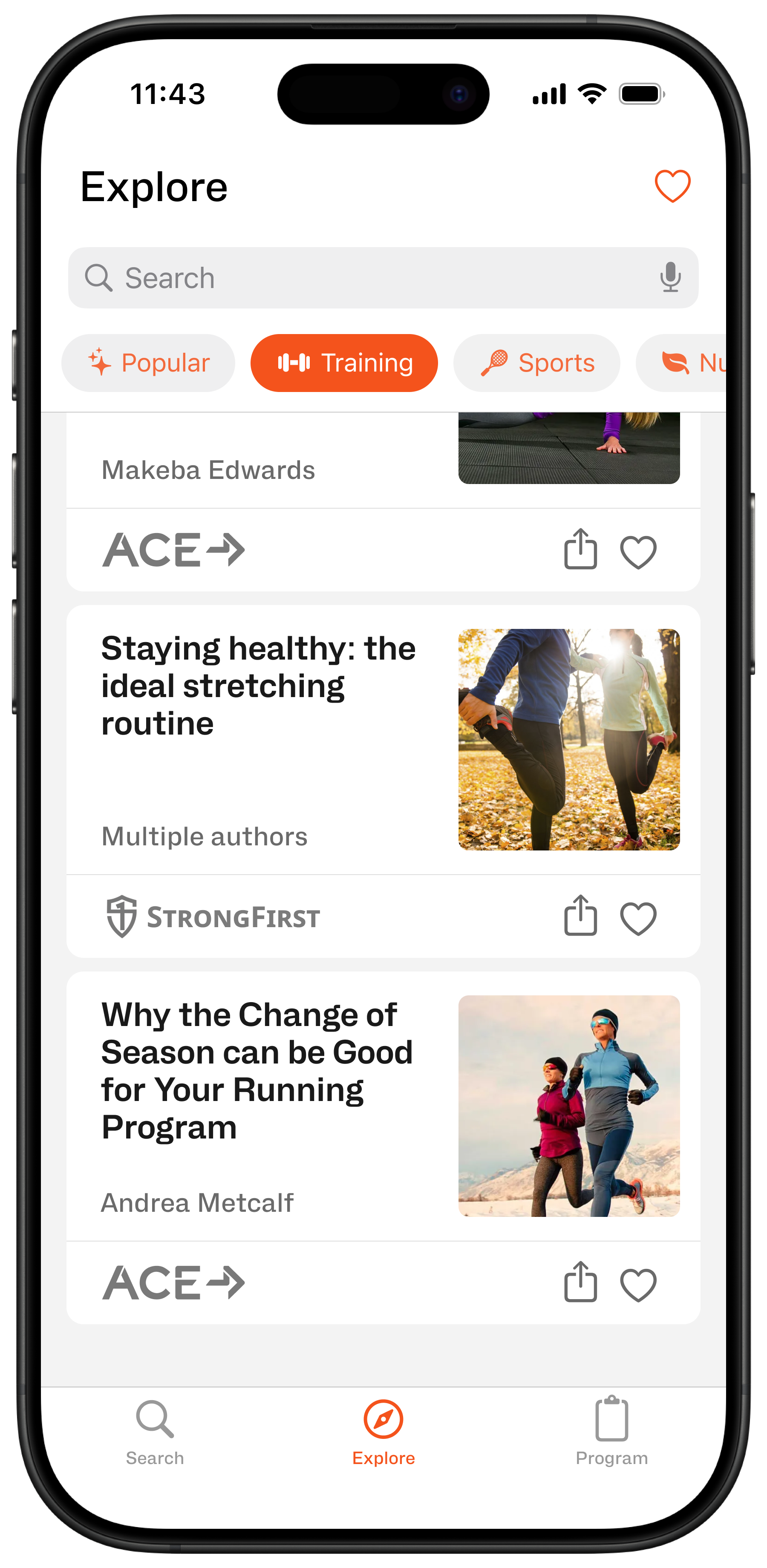
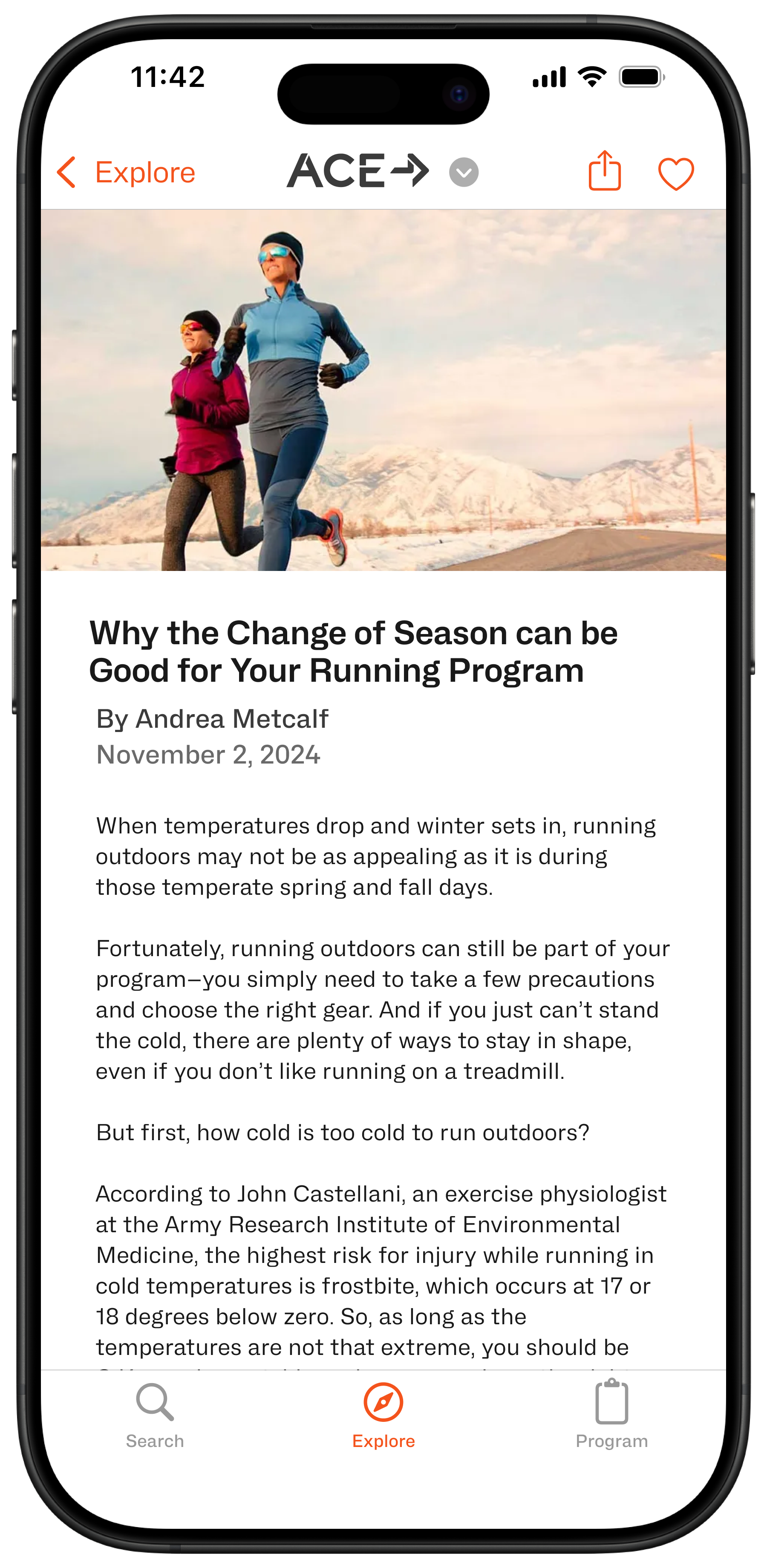
Prototyping the save an article flow within the Explore page
The last main purpose of Fitforge is to spur action.
I discovered from the survey responses that one of the primary challenges people face when joining a fitness community or starting their fitness journey is feeling or looking out of place because of a lack of a plan.
The Program page is designed to minimize the barriers to entry users may feel by providing a no-nonsense plan to get started based on a few questions about their interests and desired commitment level. With concise tips and video instructions on proper form, as well as the means to progress and modify the program as needed, users can feel comfortable trying something new.
The Program flow from creating and adding a custom program (with related articles) to viewing an exercise
The next steps for Fitforge are conducting user feedback sessions with the existing prototypes to gather insights into how users might instinctively use the app, interpret the features, and react to the experience.
