
Loyal
Type Design, Motion Design
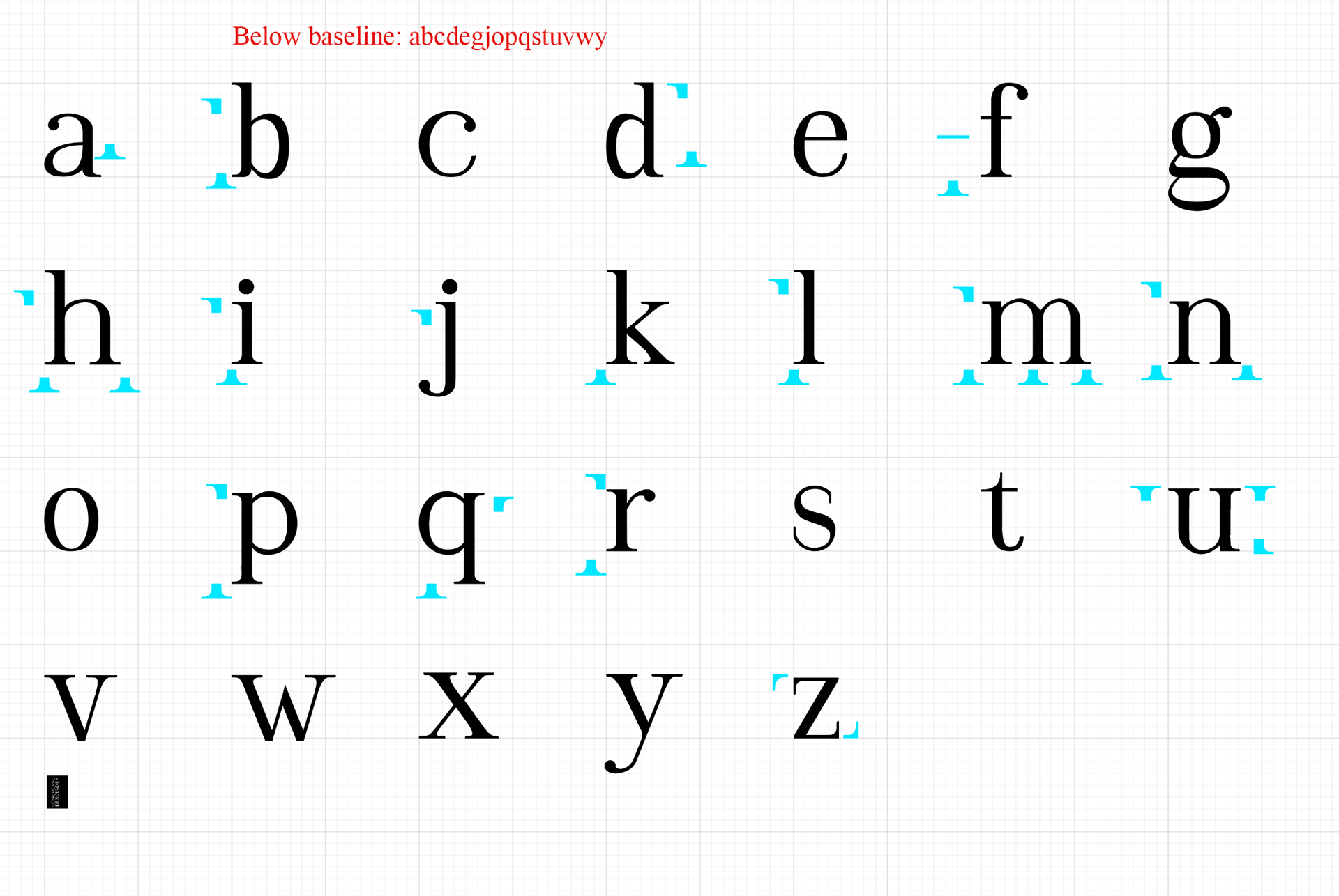
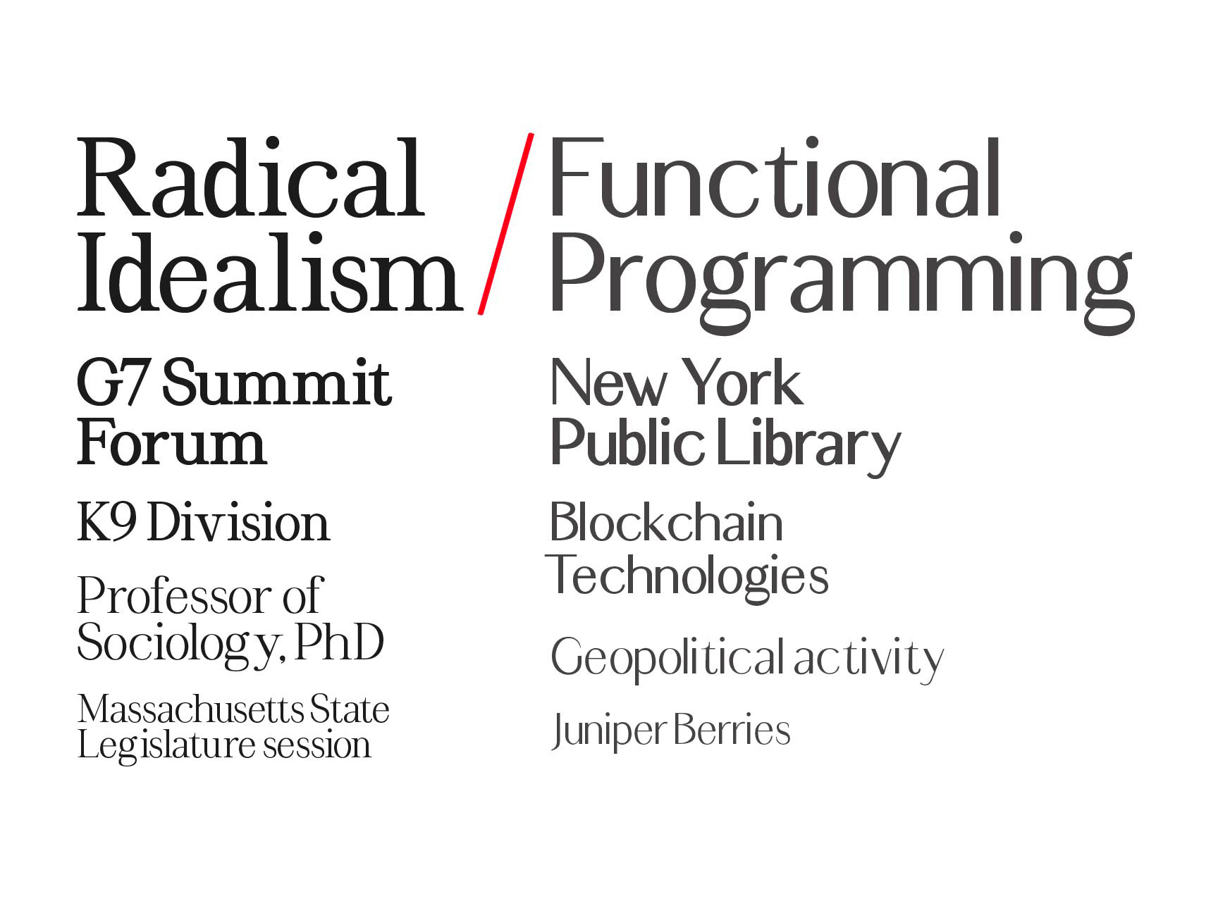
How do the letters change the content?
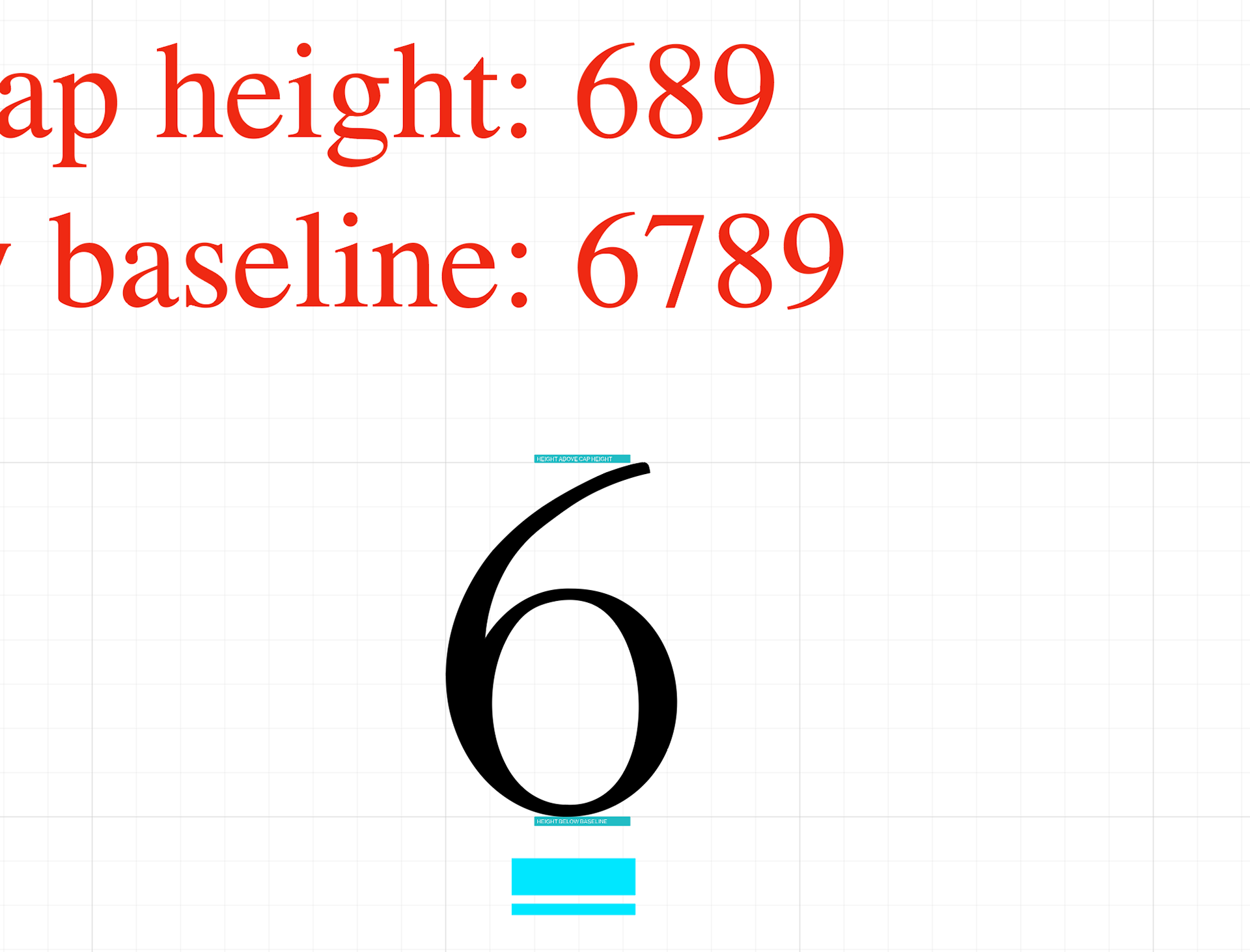
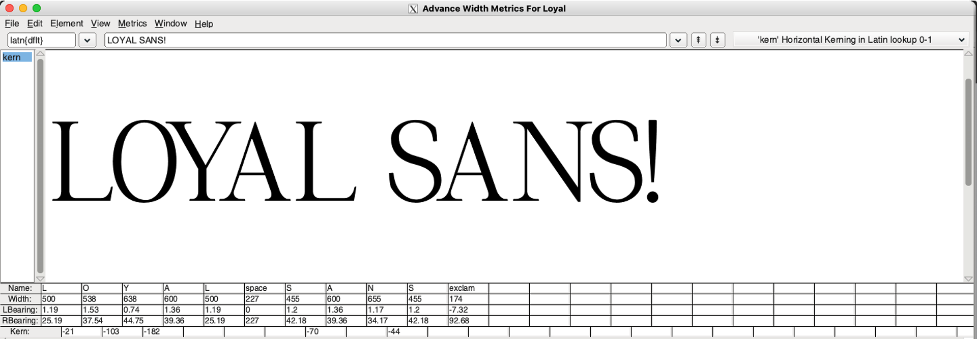
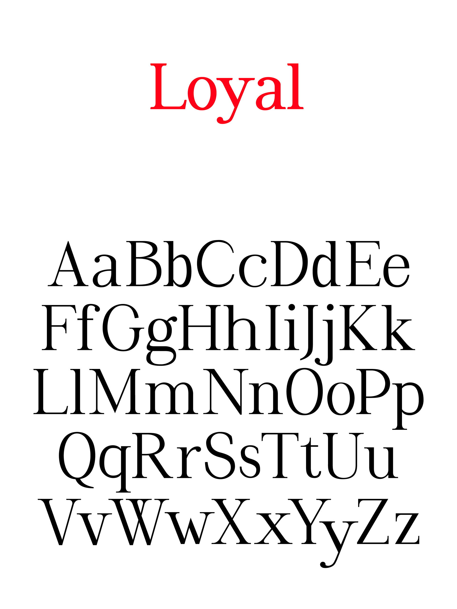
Through this four-year experiment I gained an intimate understanding of the anatomy and integrity of letterforms and a close familiarity with detailed vector editing, type design software and encoding, and very iterative processes.
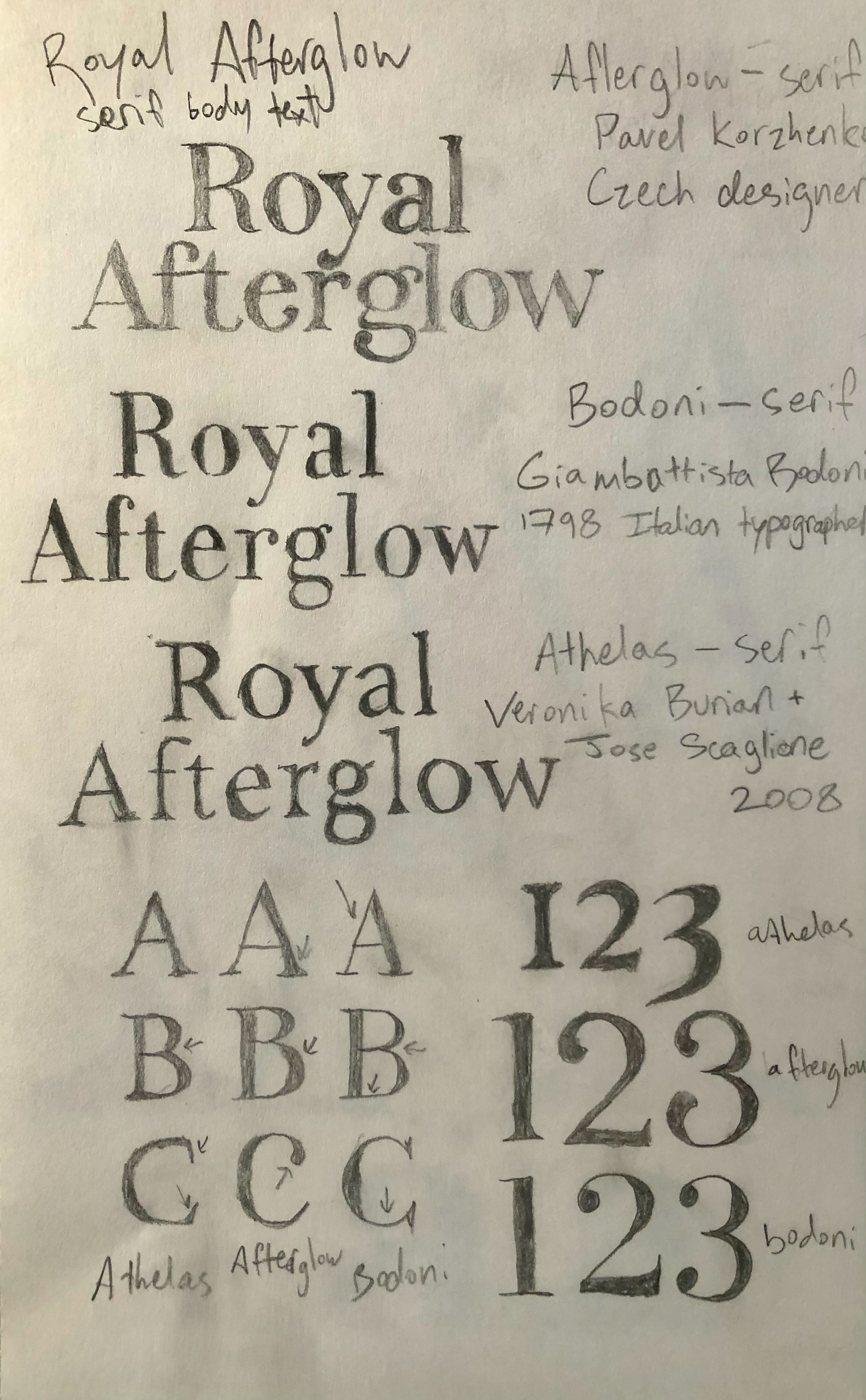
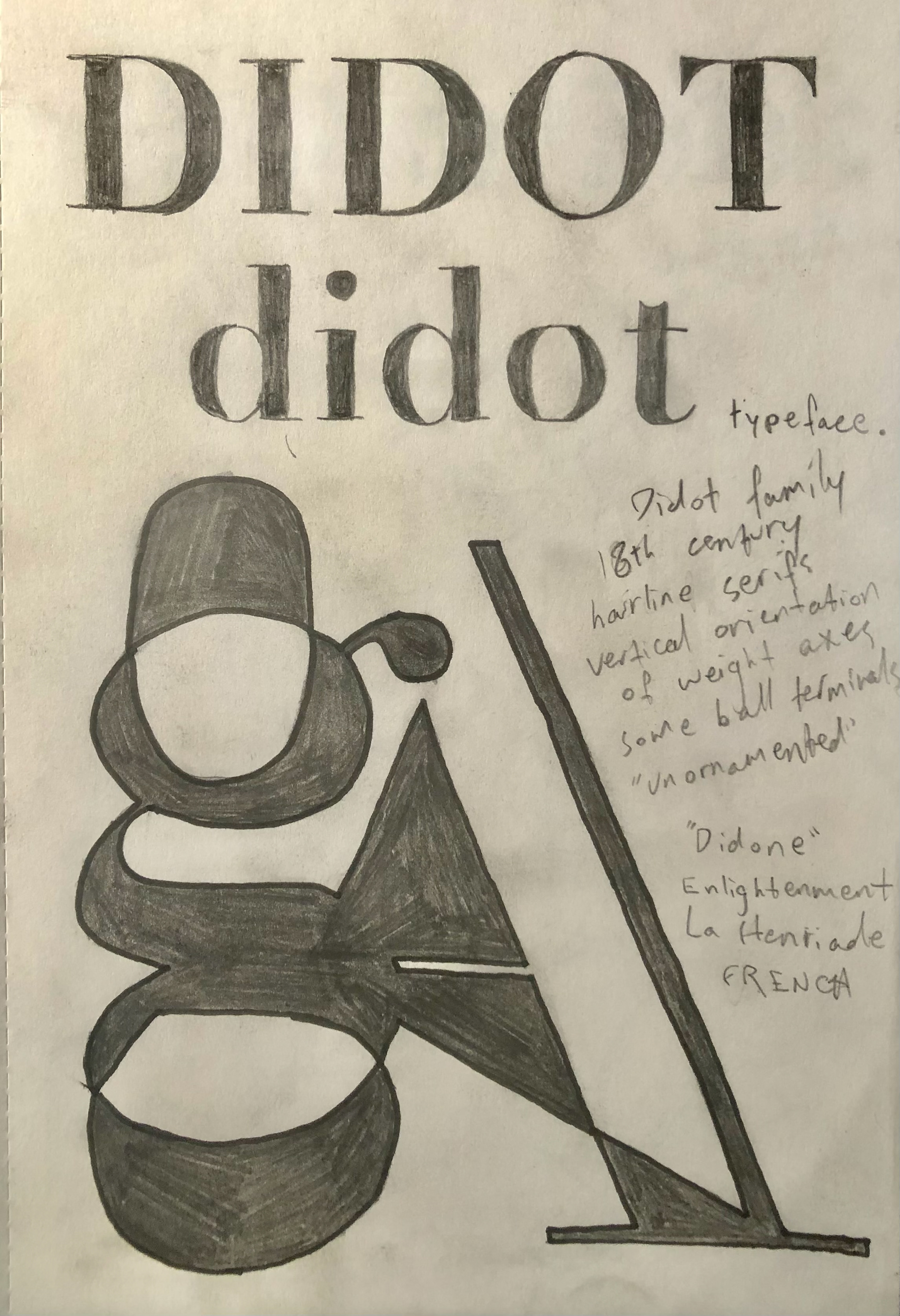
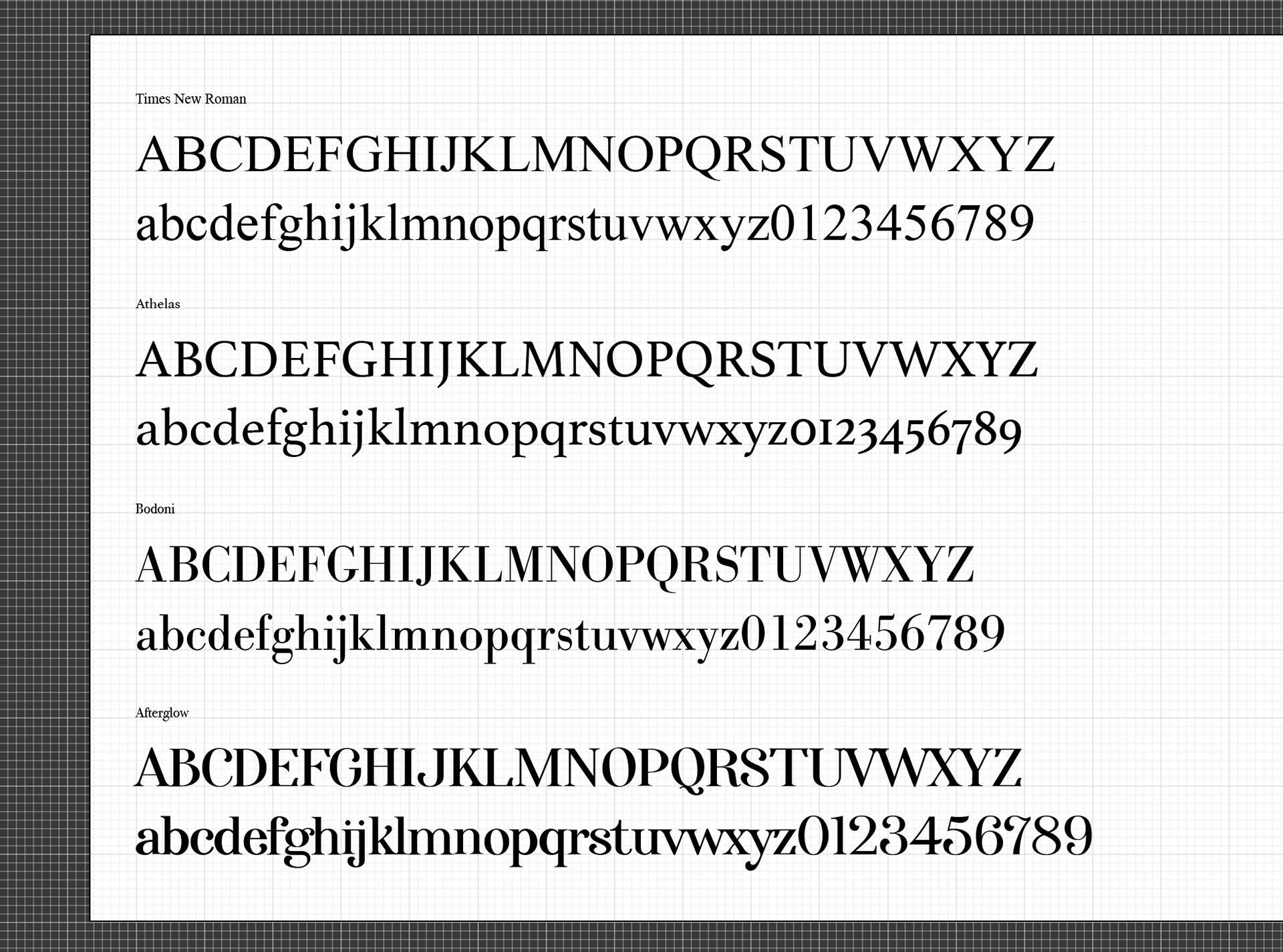
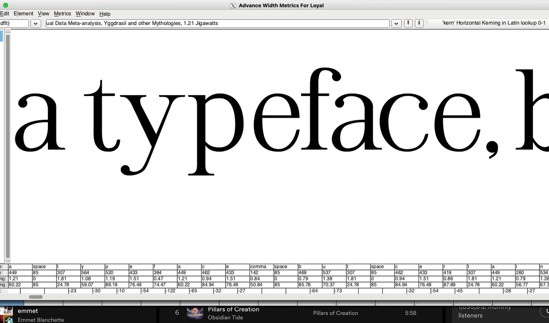
Across a multitude of testing and revising stages, with ample opportunities to play with form and recognize the artistic value of letterforms, this concept became a full-fledged font family, free-and-open-source for others to test and experiment on. To construct "Loyal" I routinely checked and researched my reference fonts to determine what was standard in Transitional, Humanist, and modern type design and what would otherwise best suit the needs of my typeface. The question I thought about most of all was, "what problem am I trying to solve?" Even though I am still not certain of the answer, this project was an excellent learning experience and a humbling foray into the world of type design.
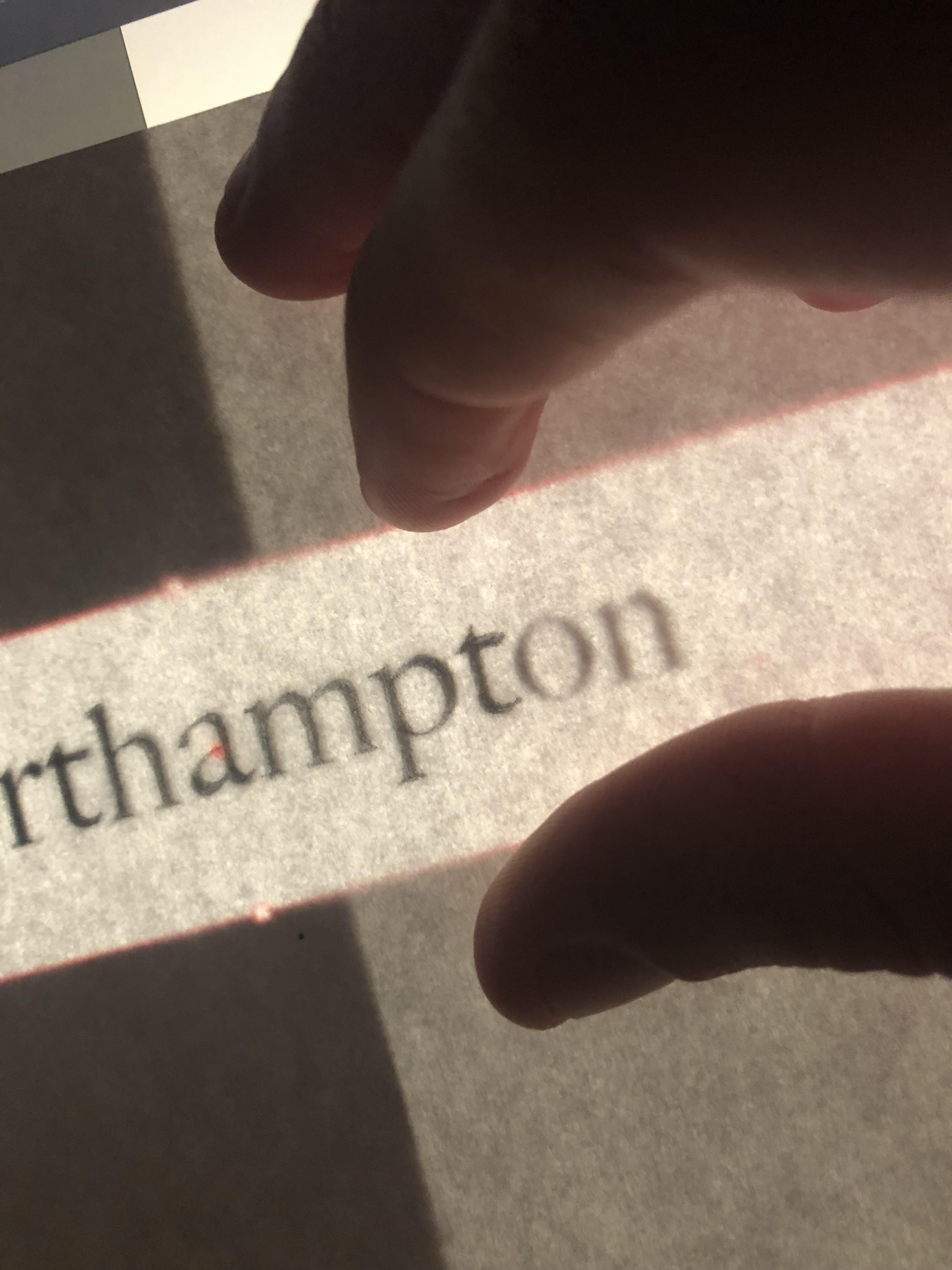
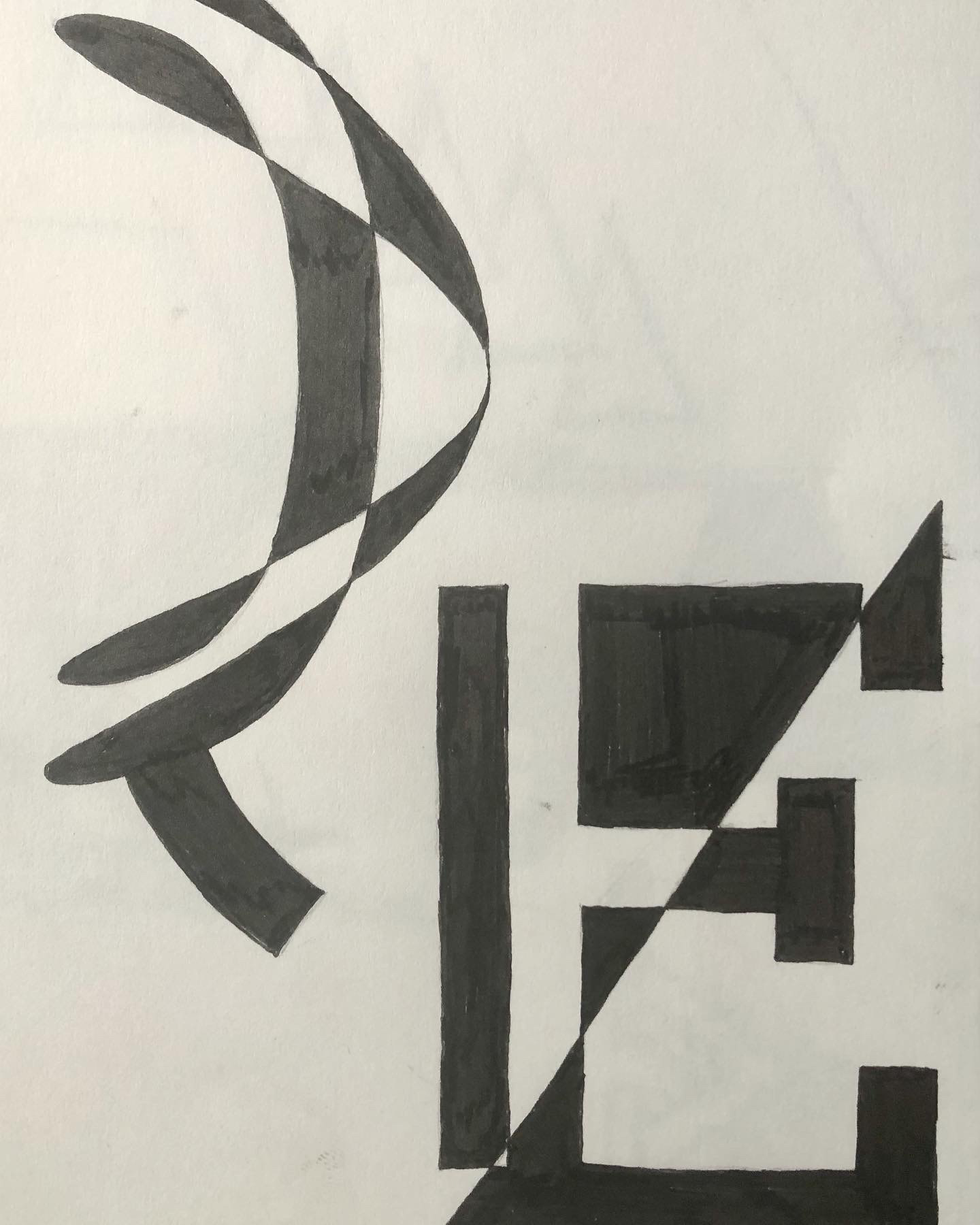
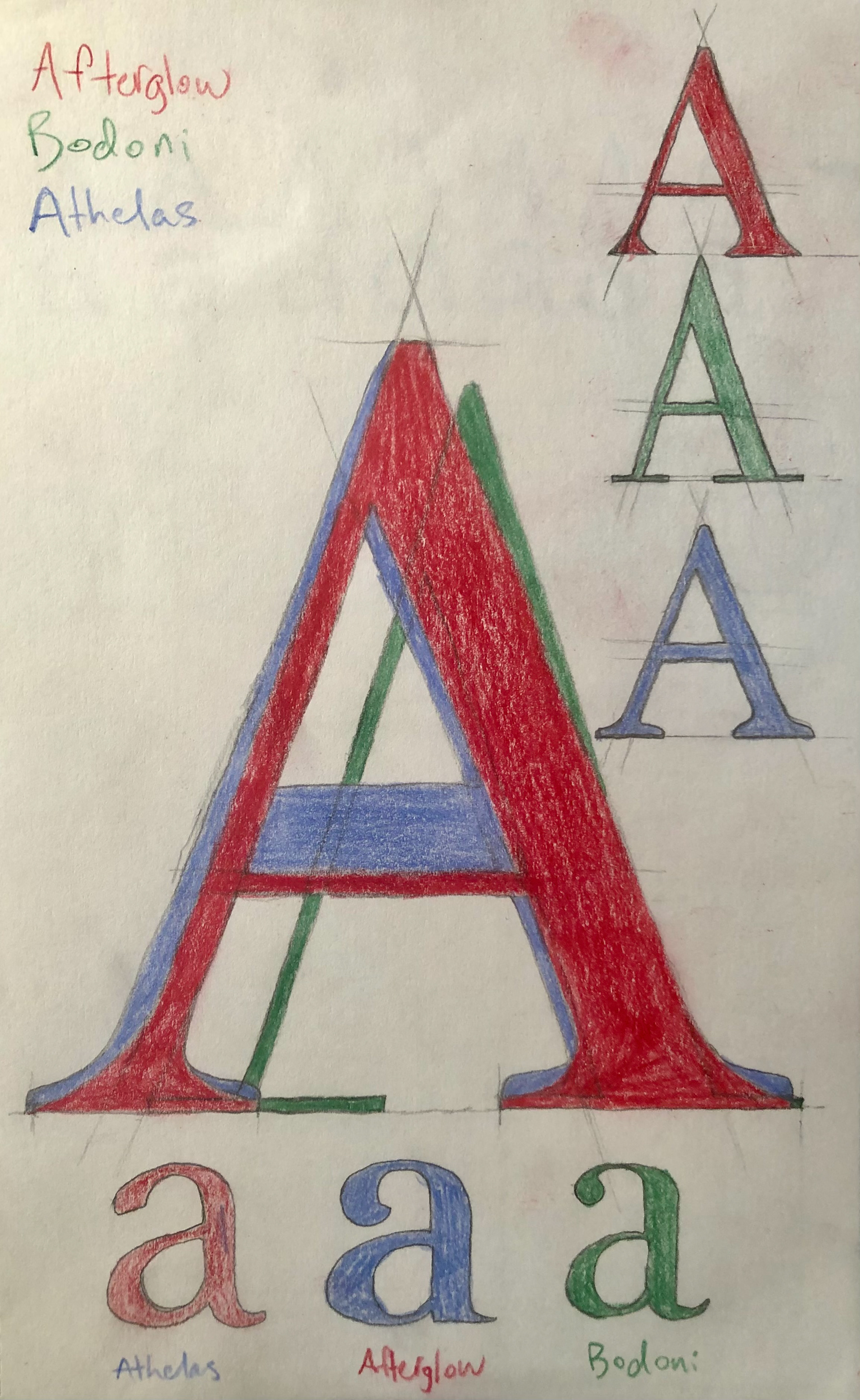
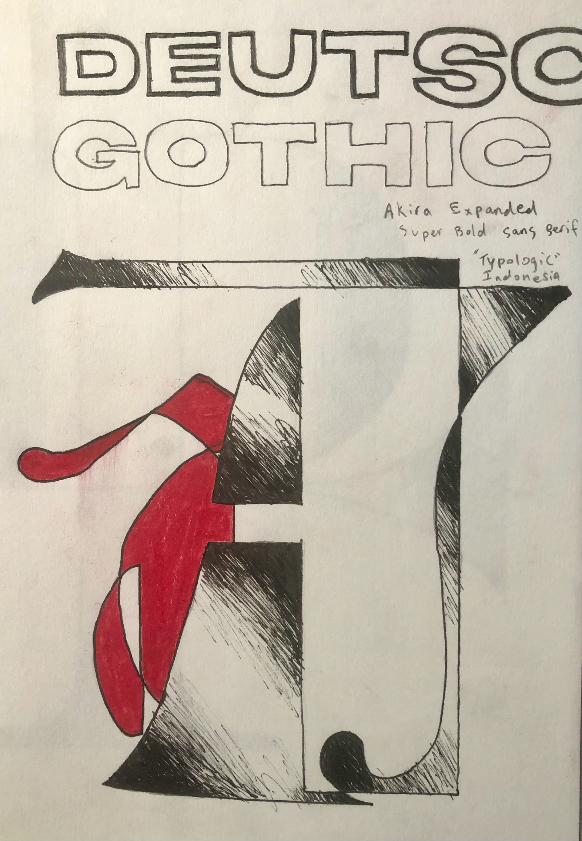
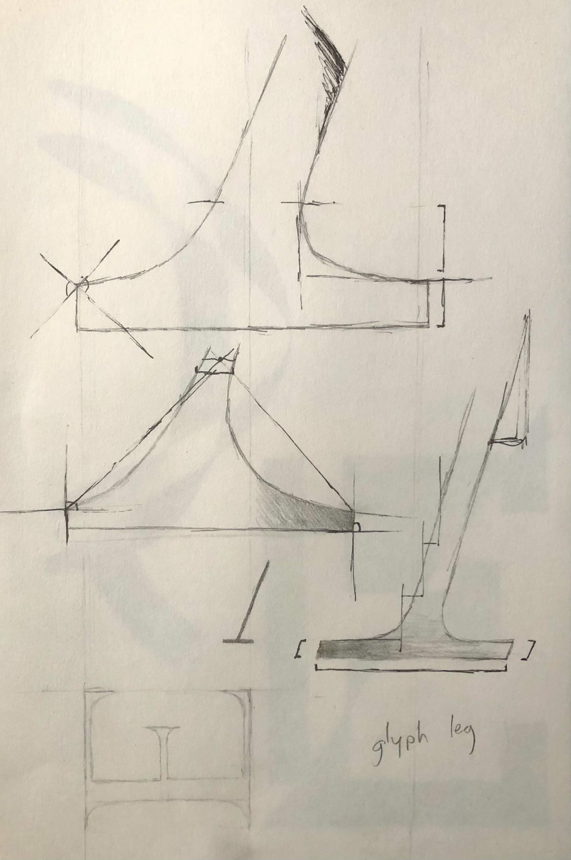
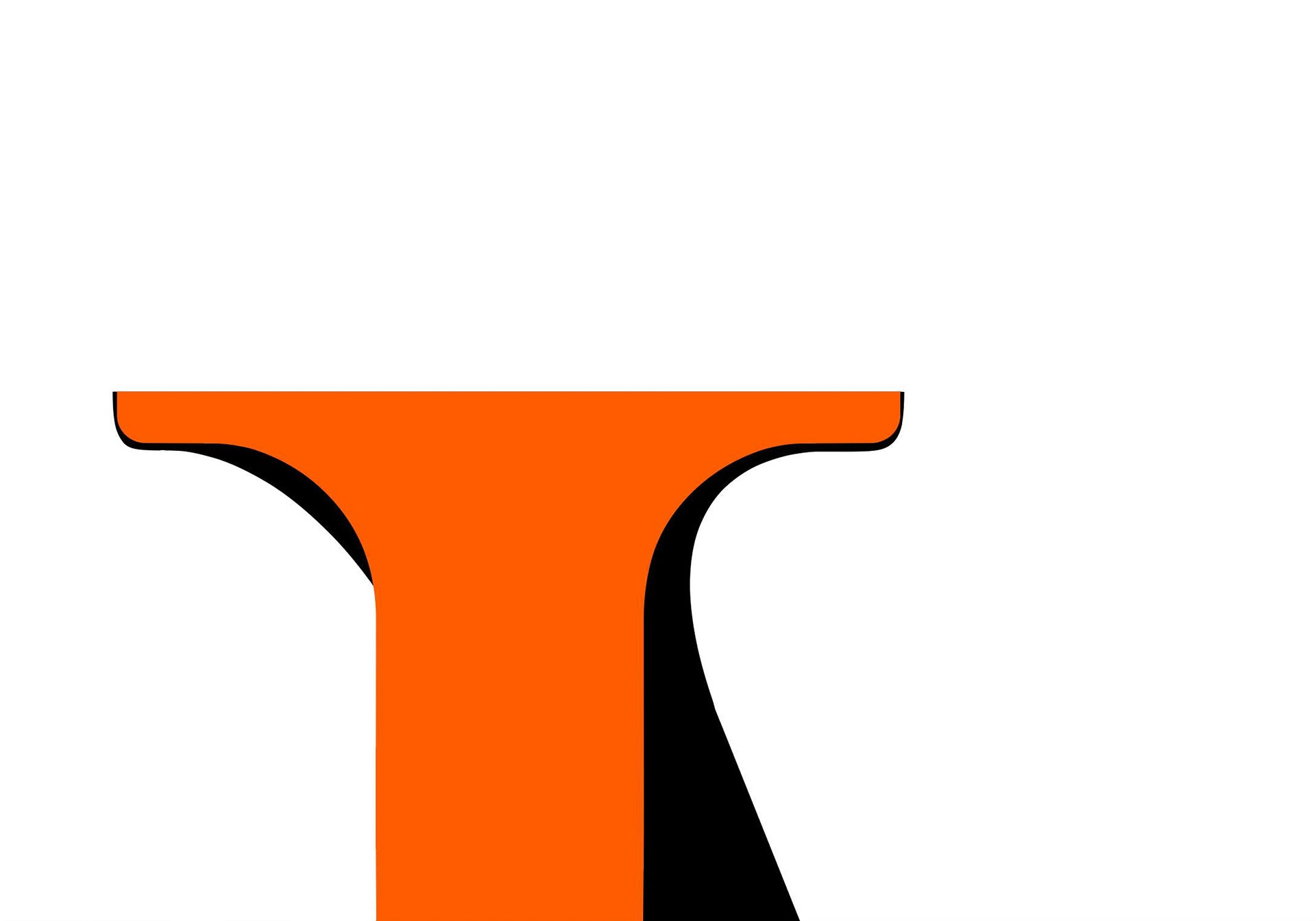
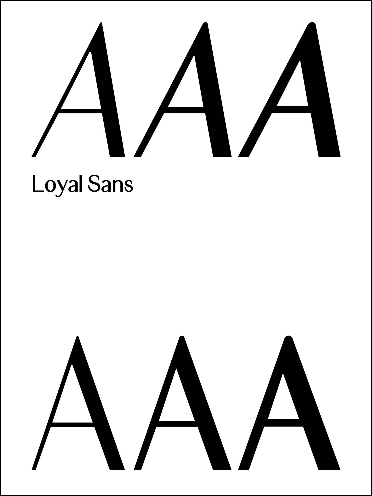
What is the 'tool' of Loyal? To figure it out I tested out many different approaches to medium and mark making.
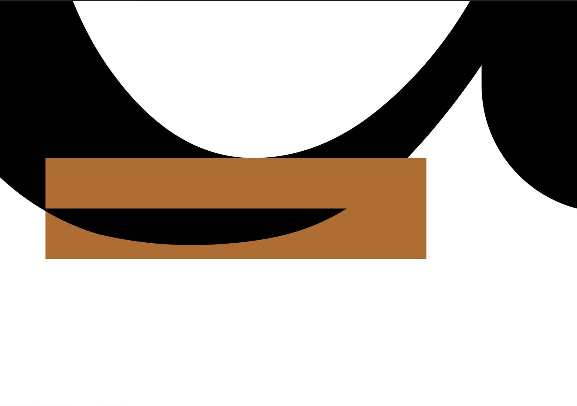
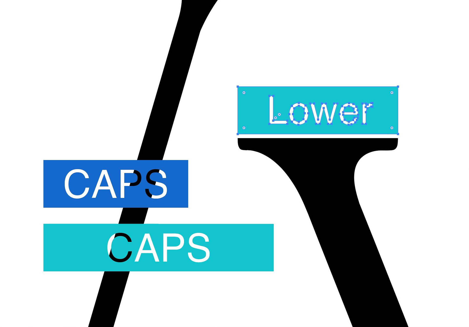

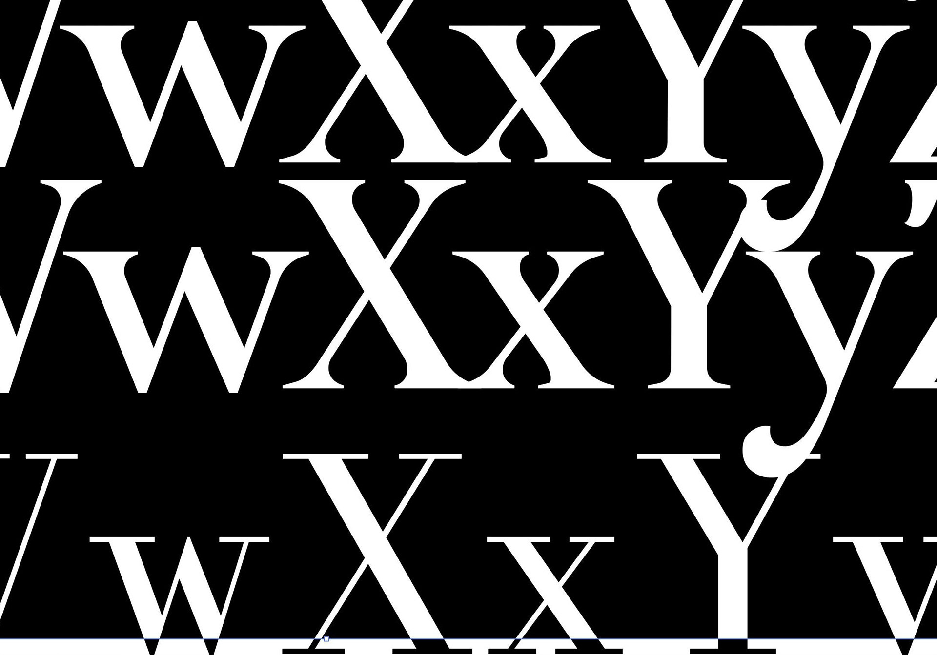
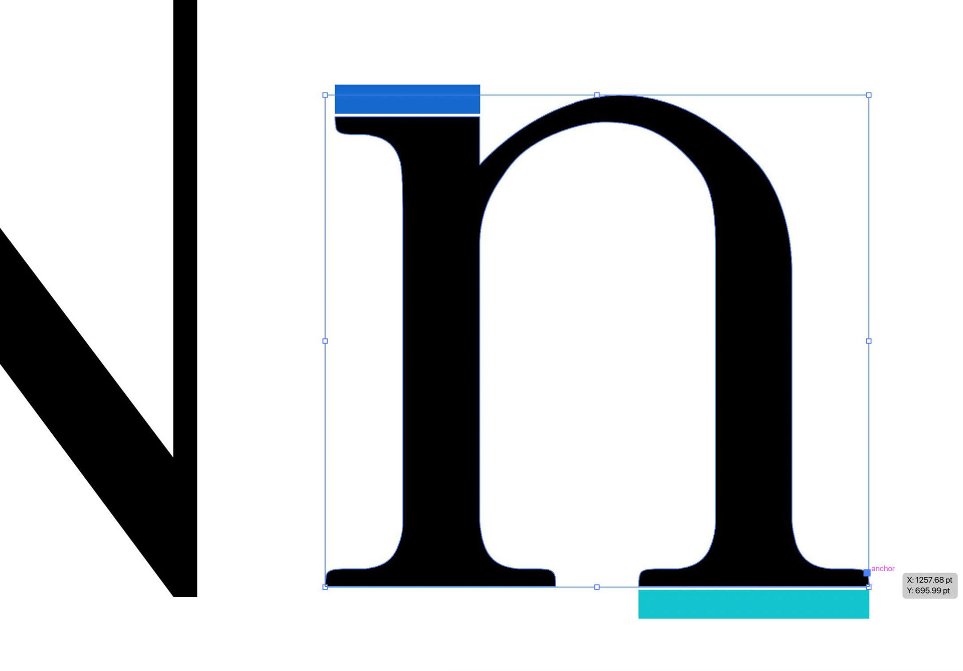
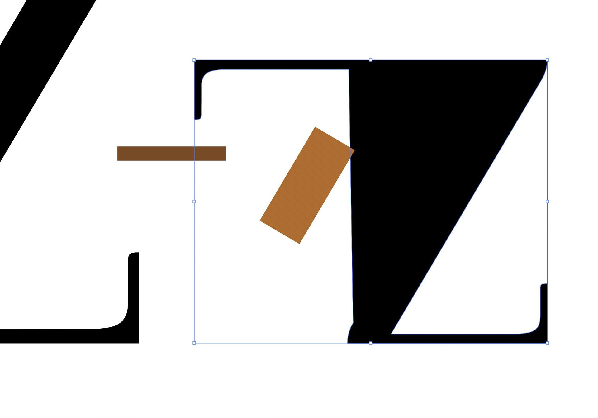
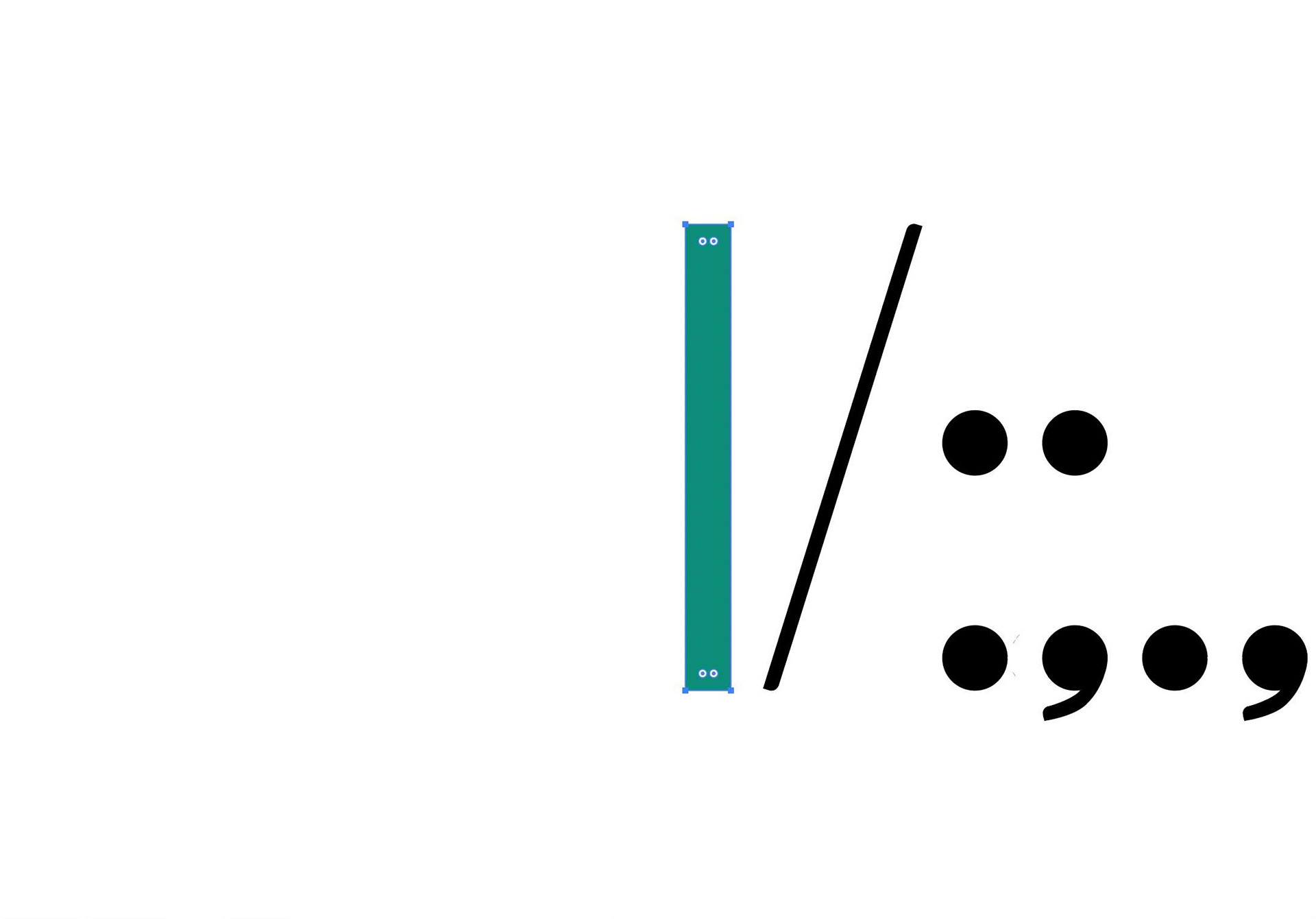
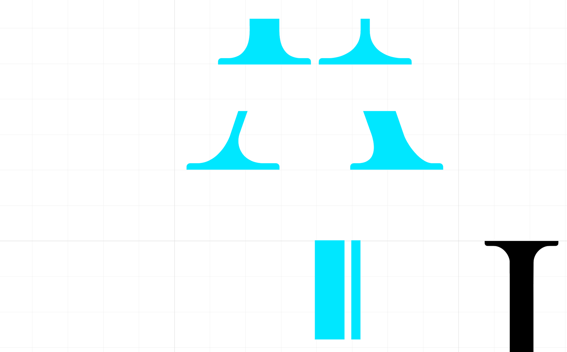
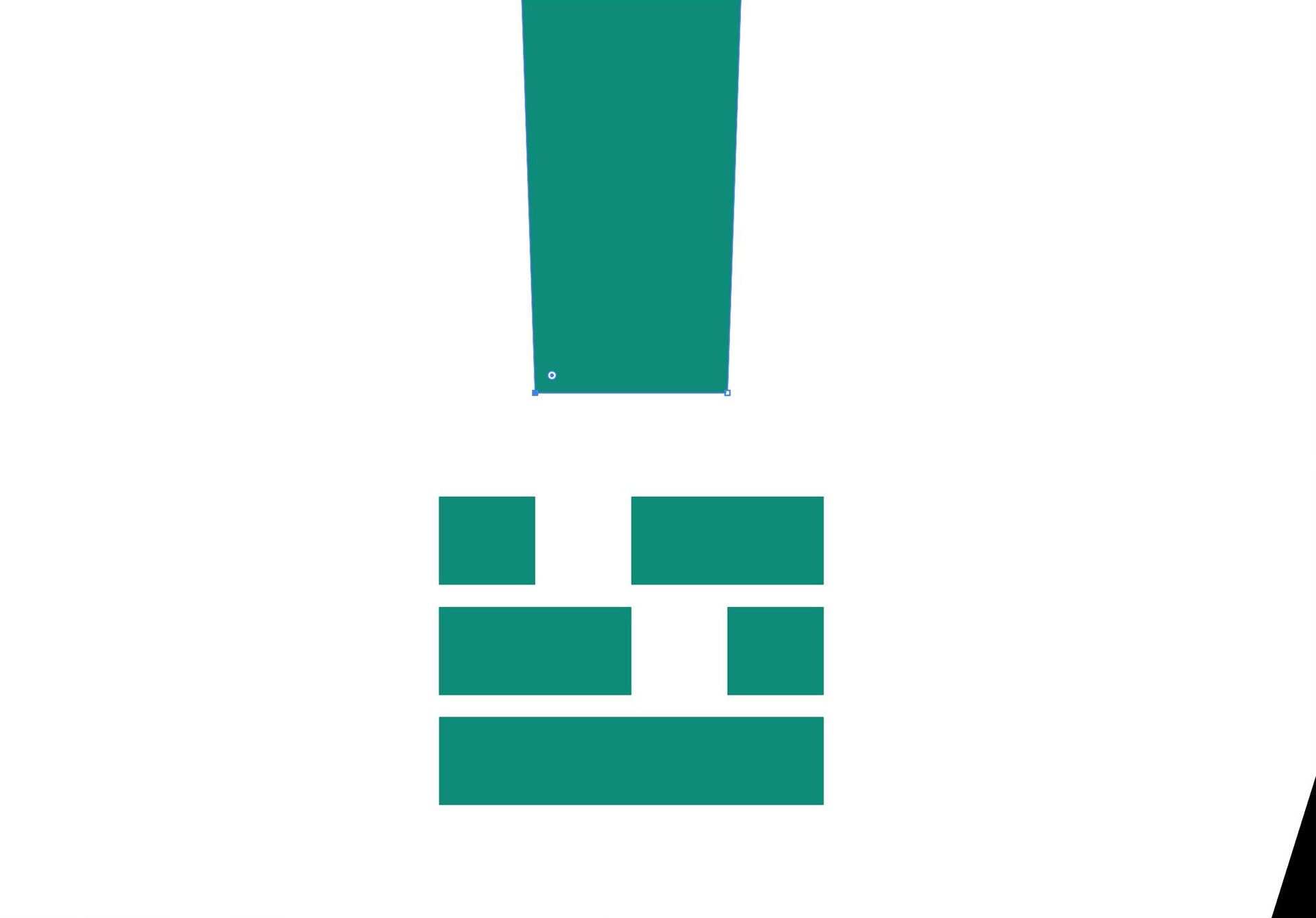
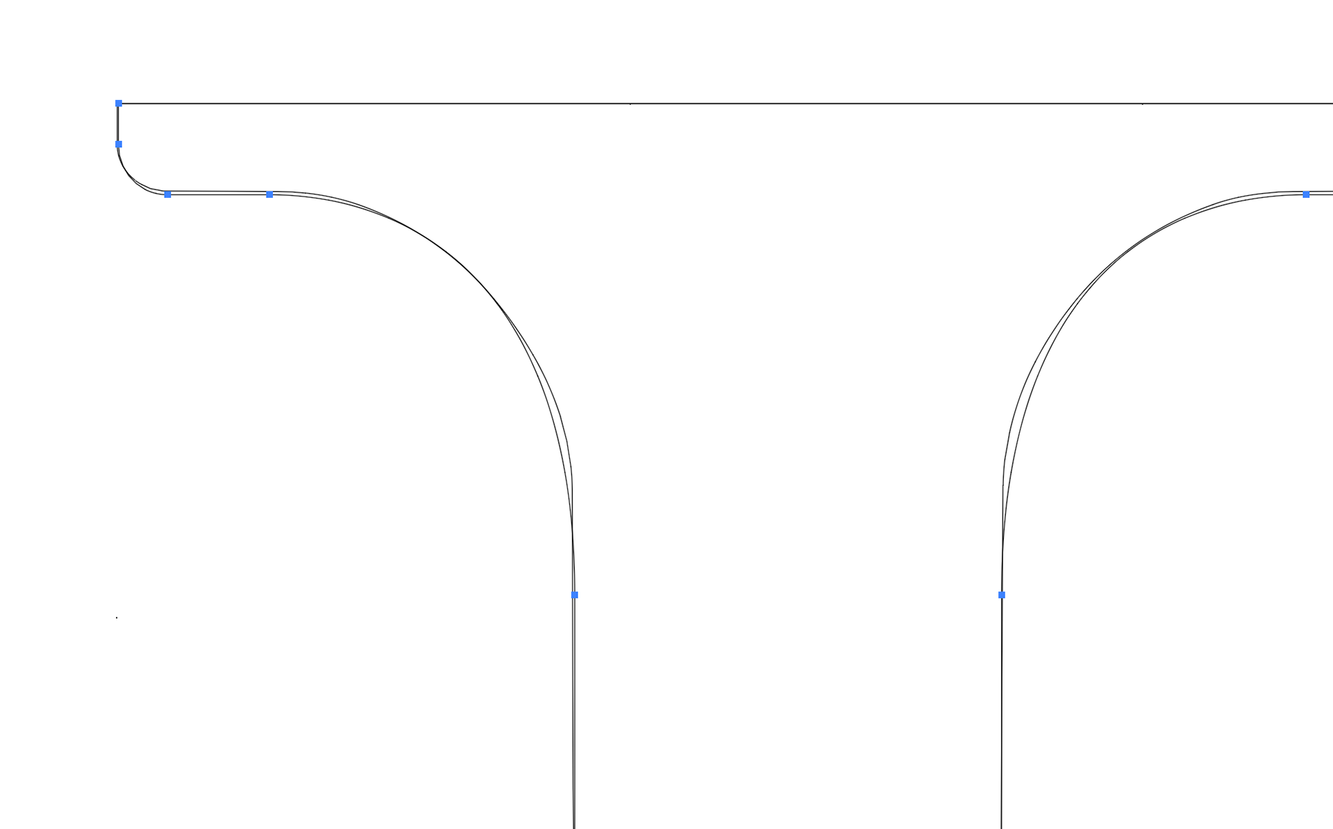
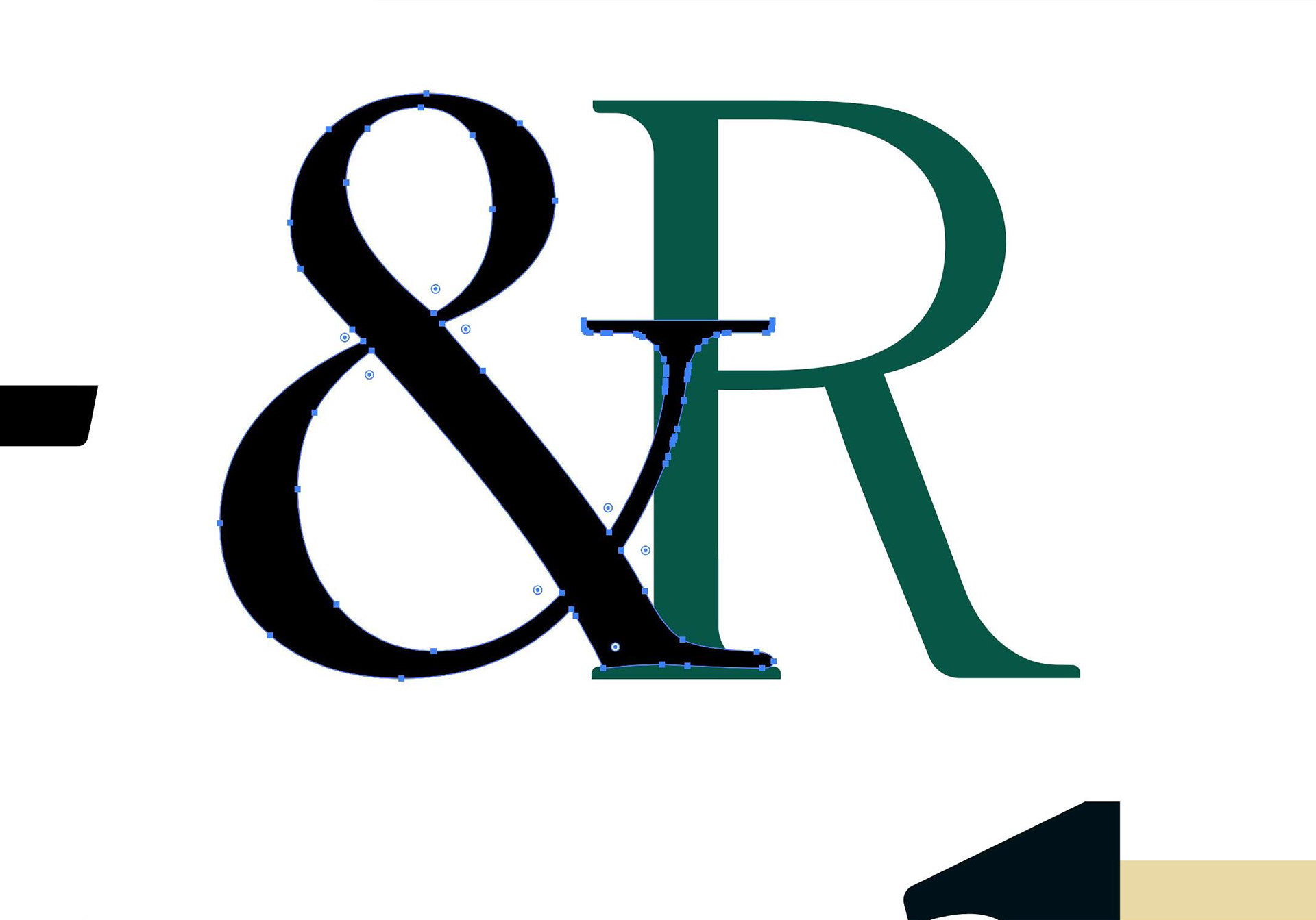

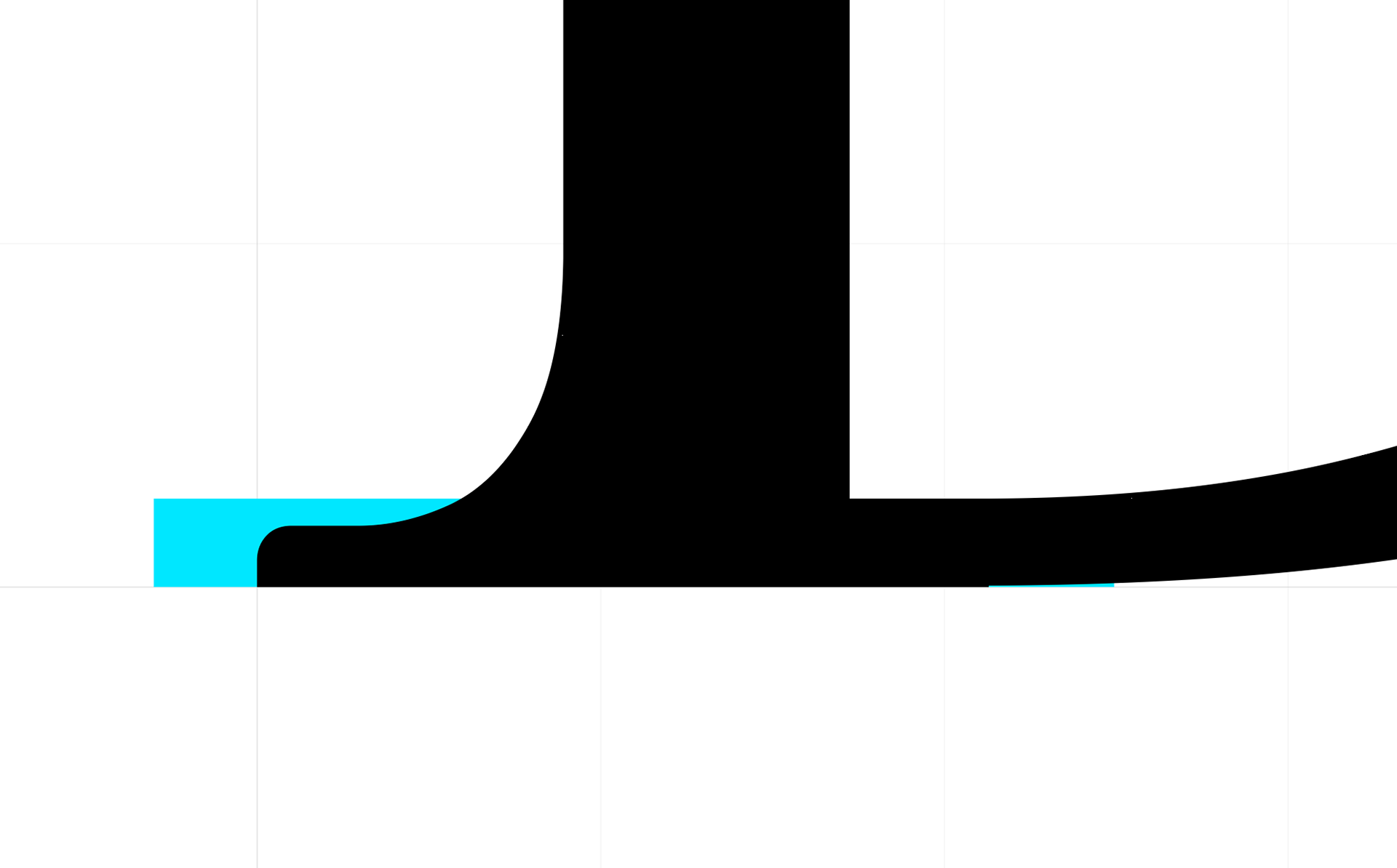

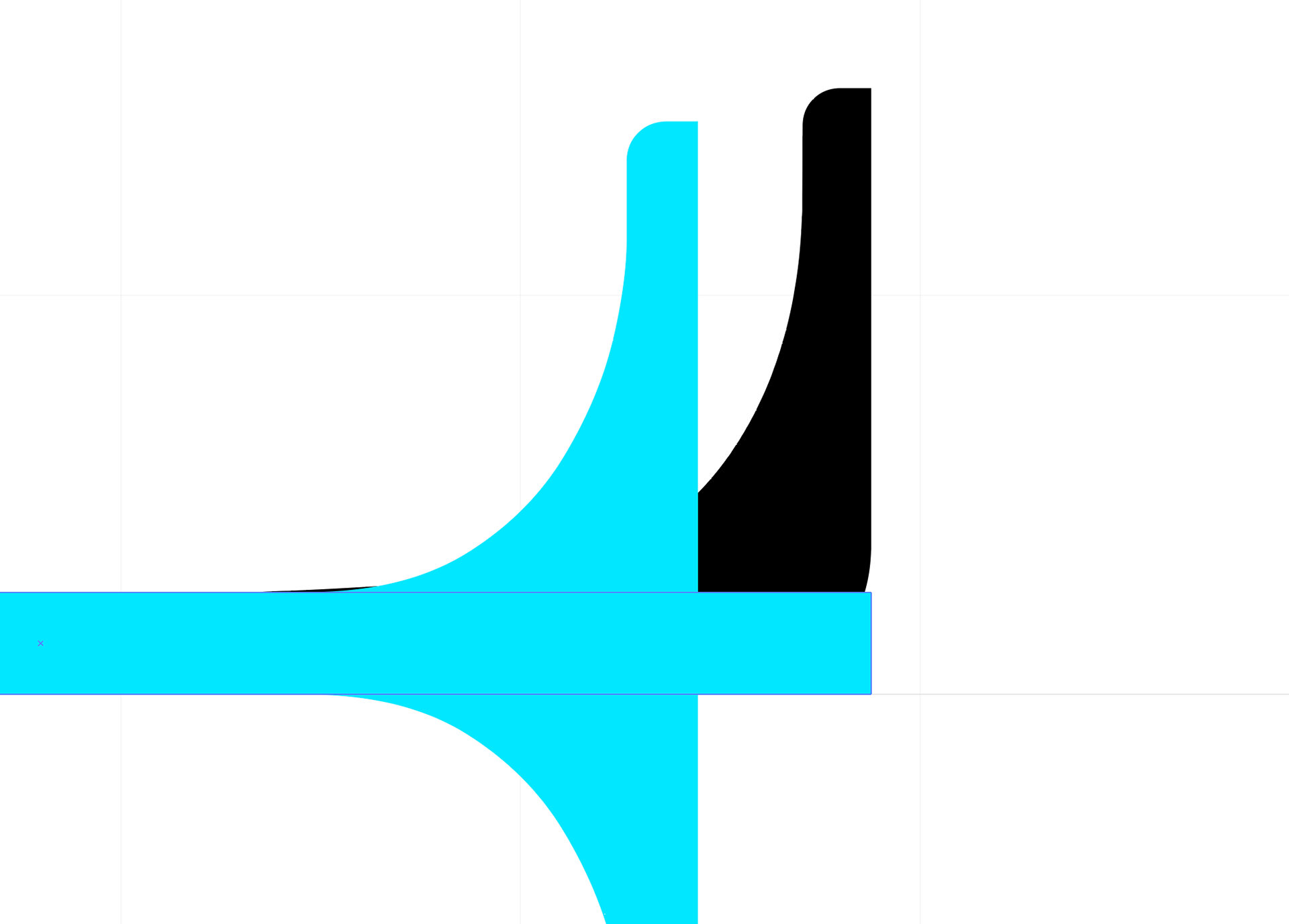
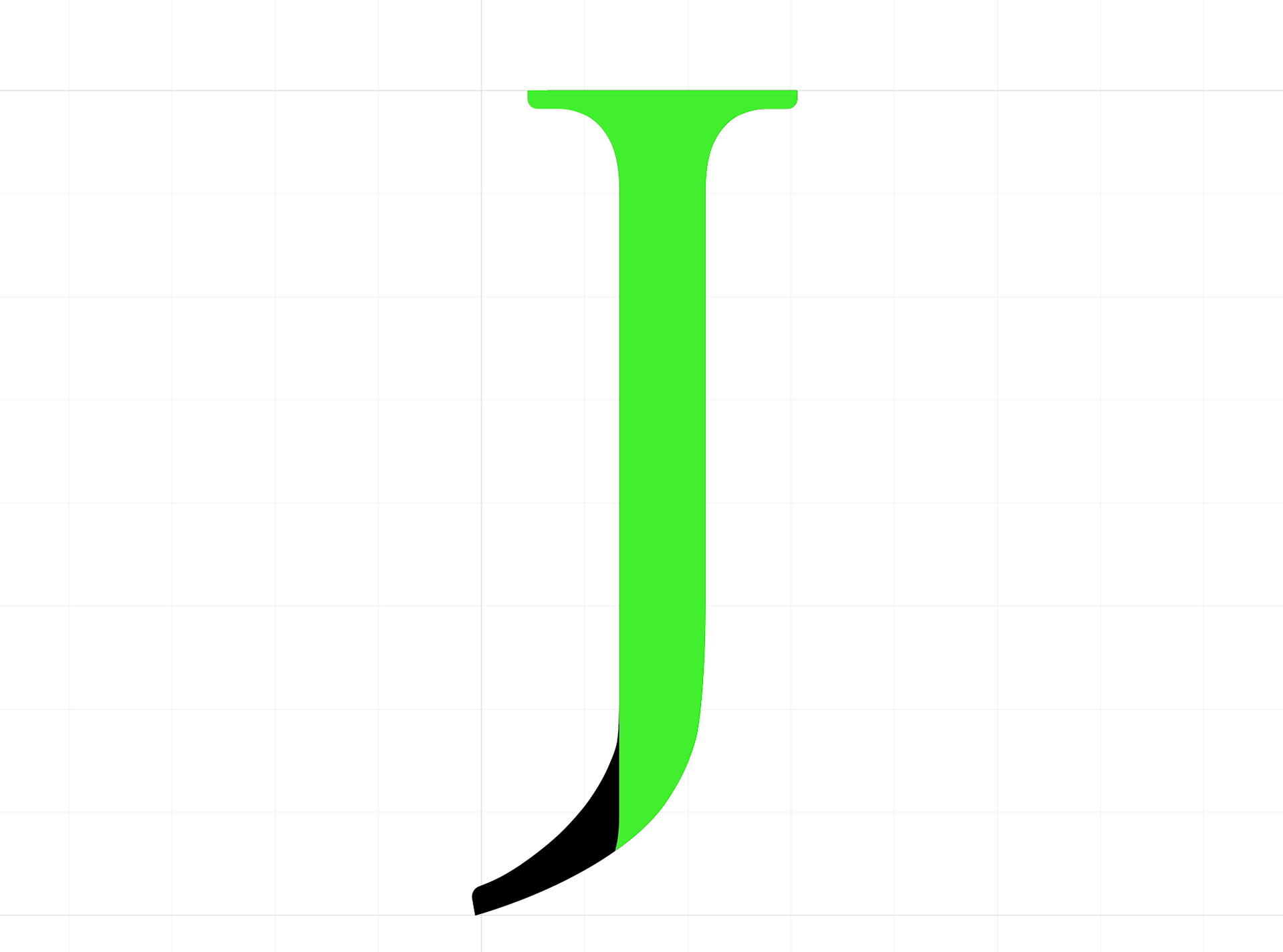
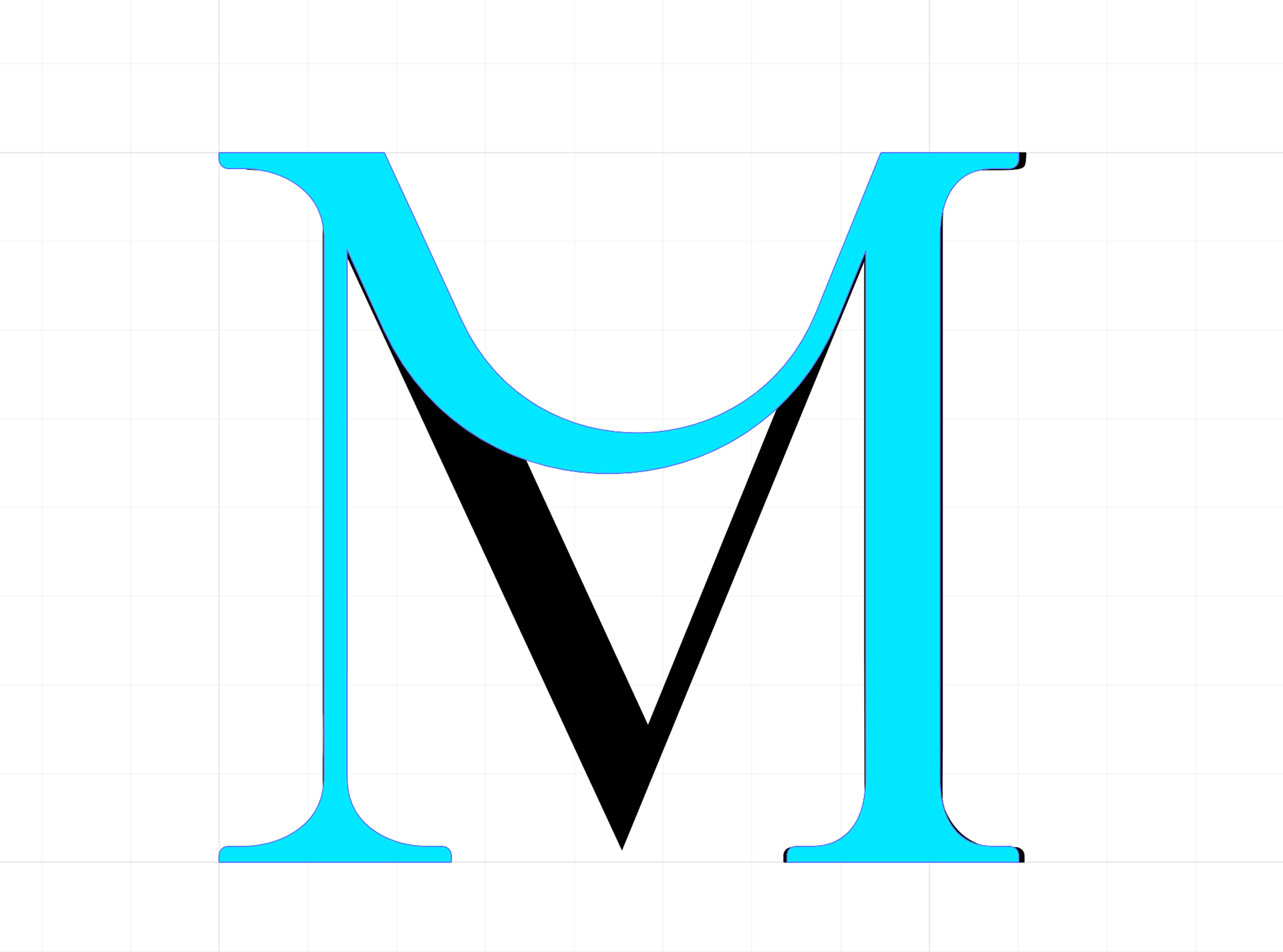

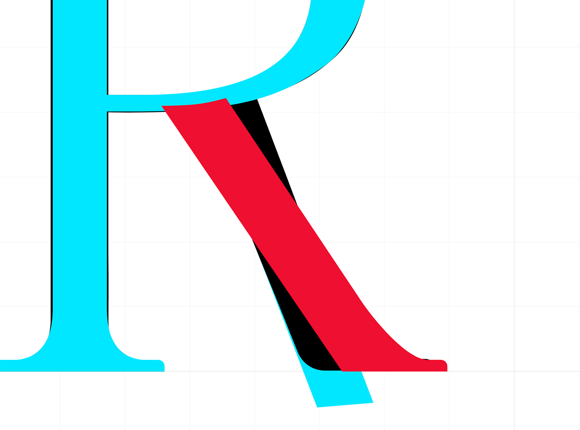
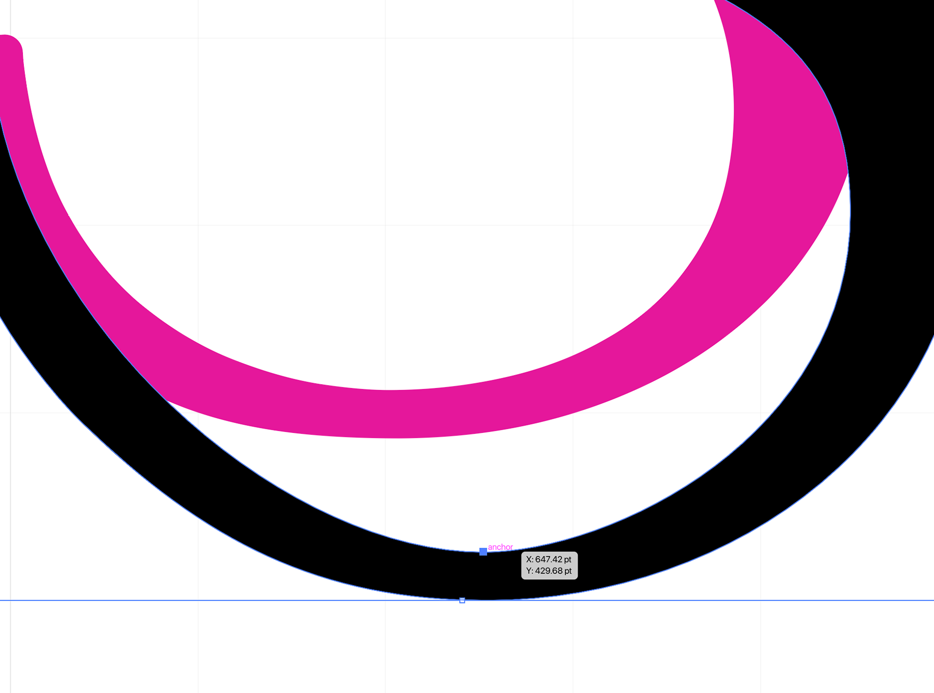
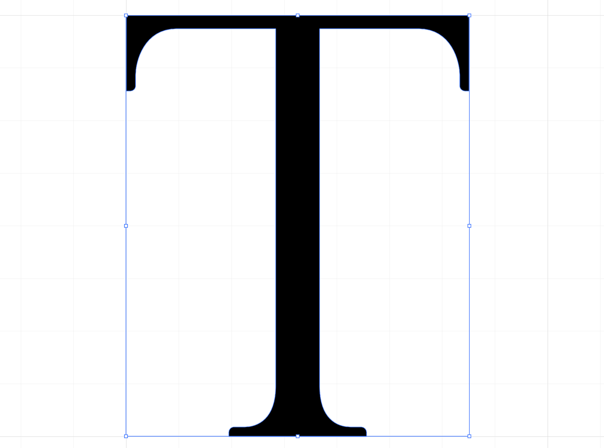


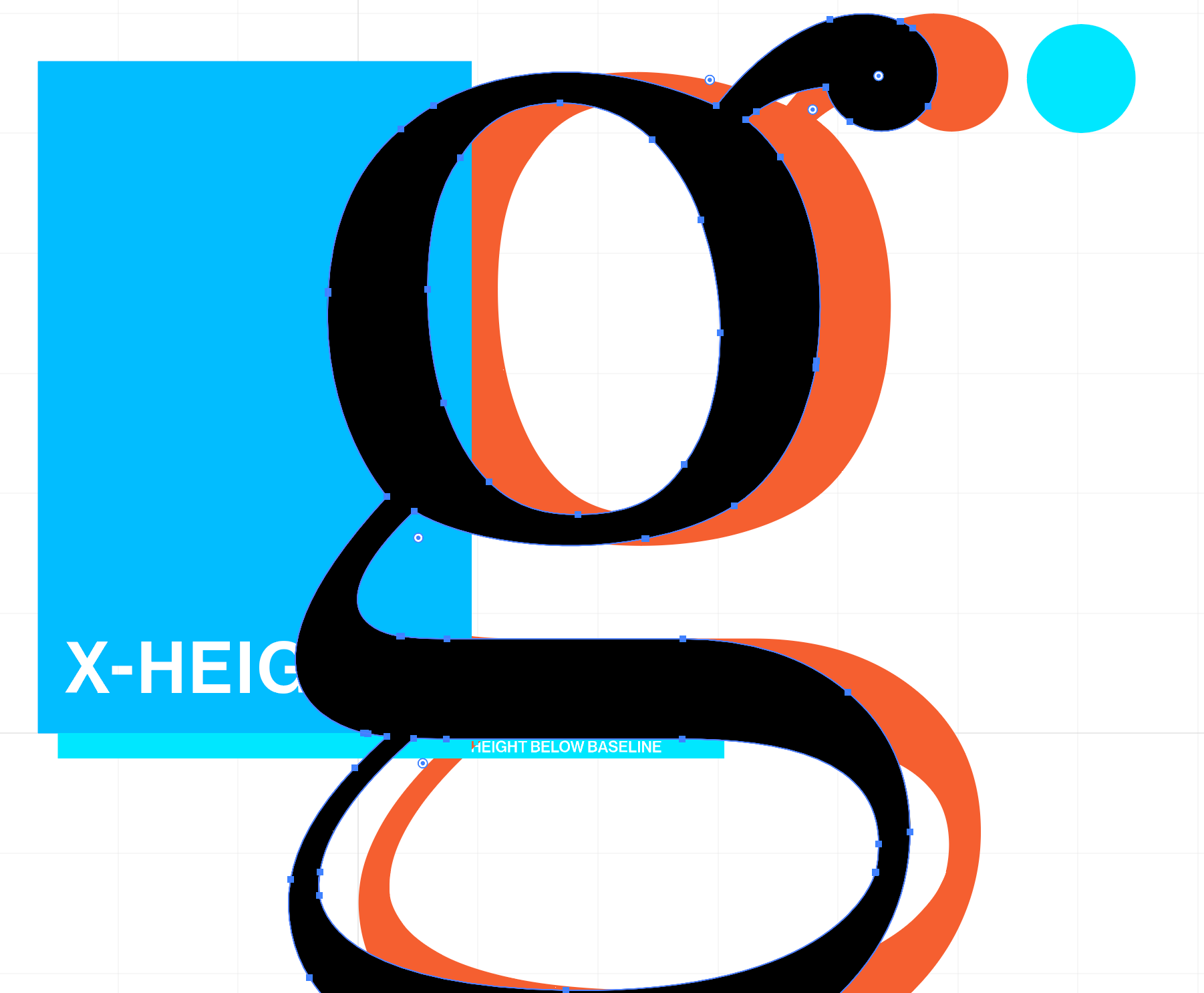
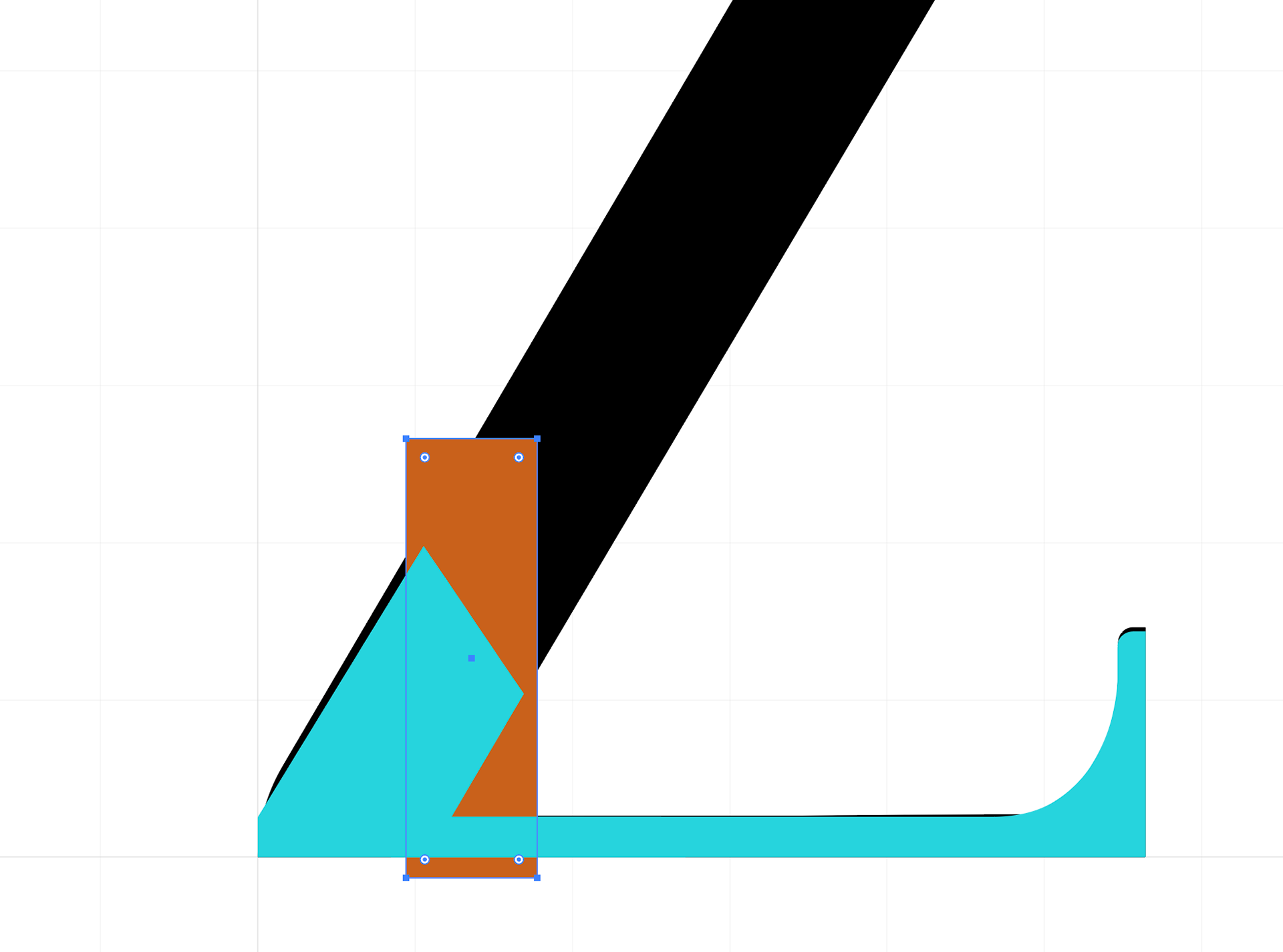


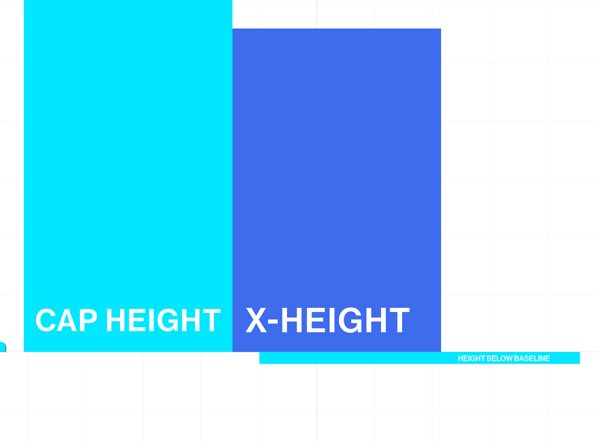

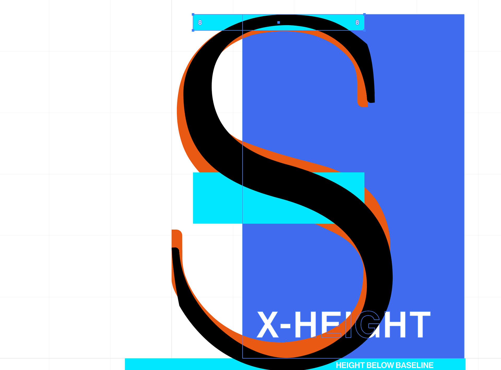
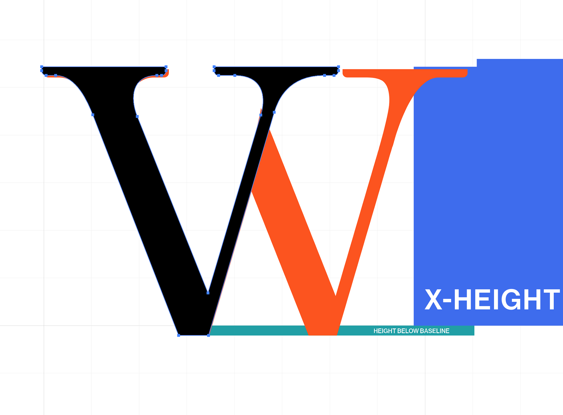
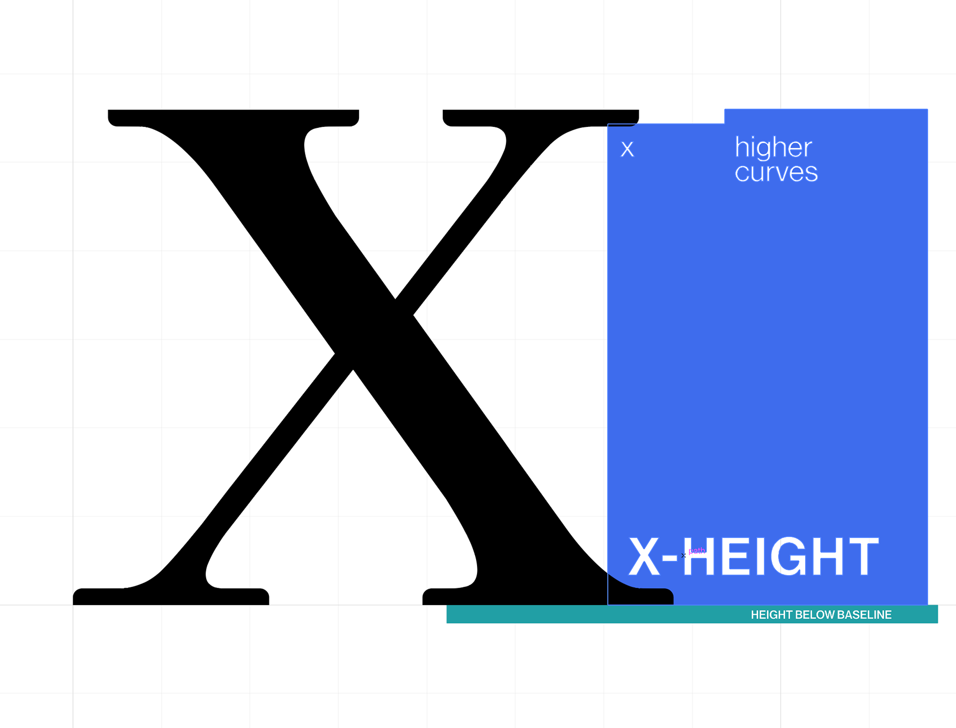


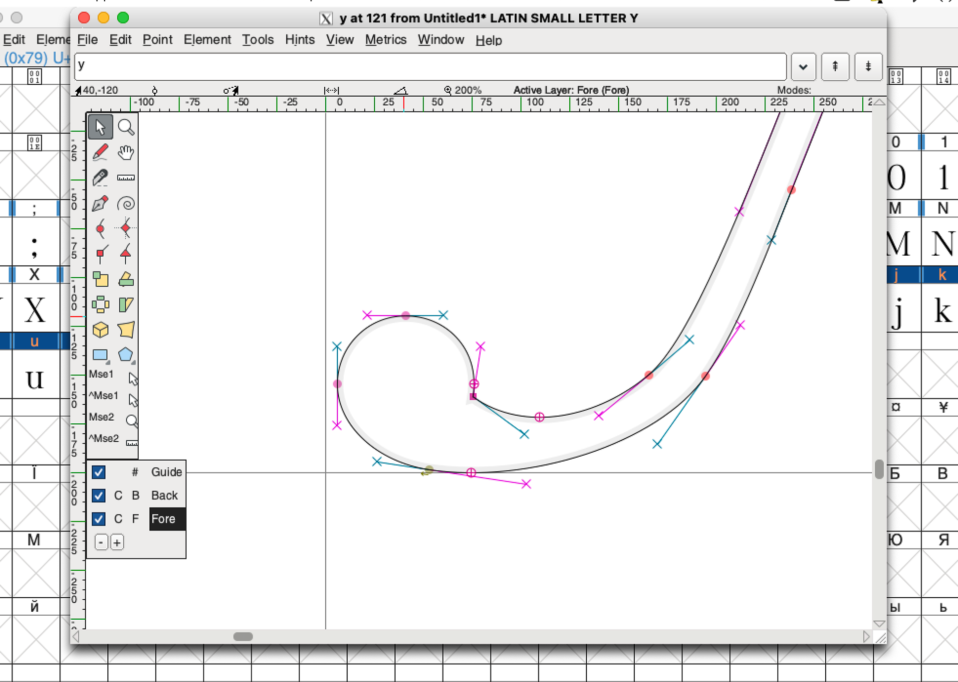
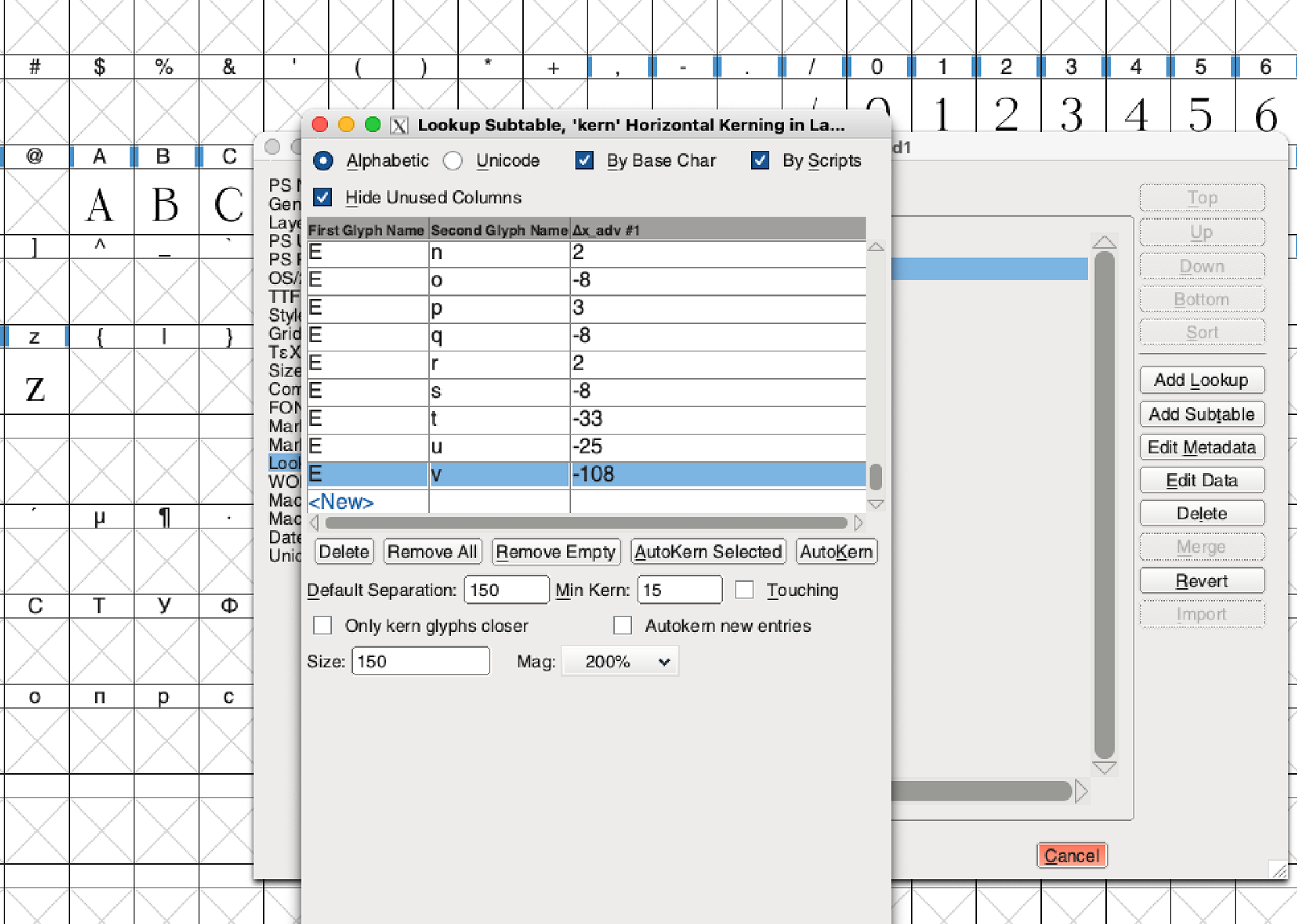
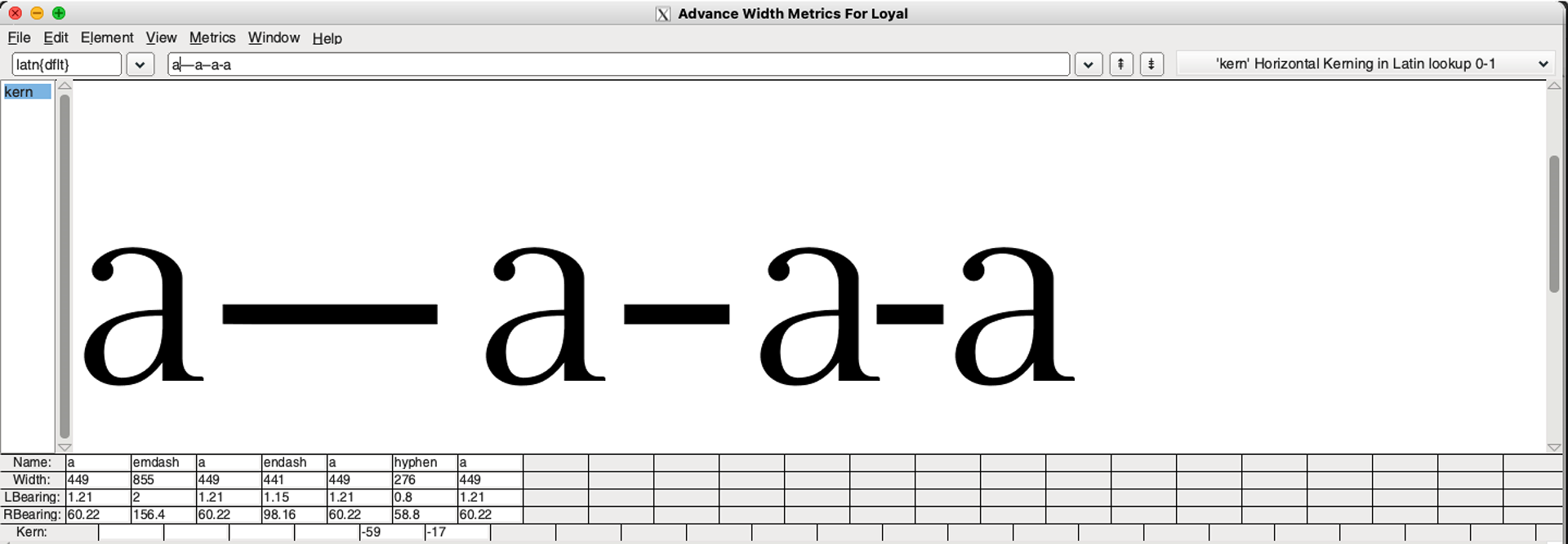
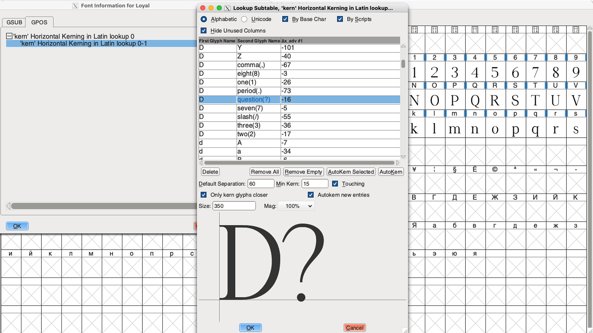
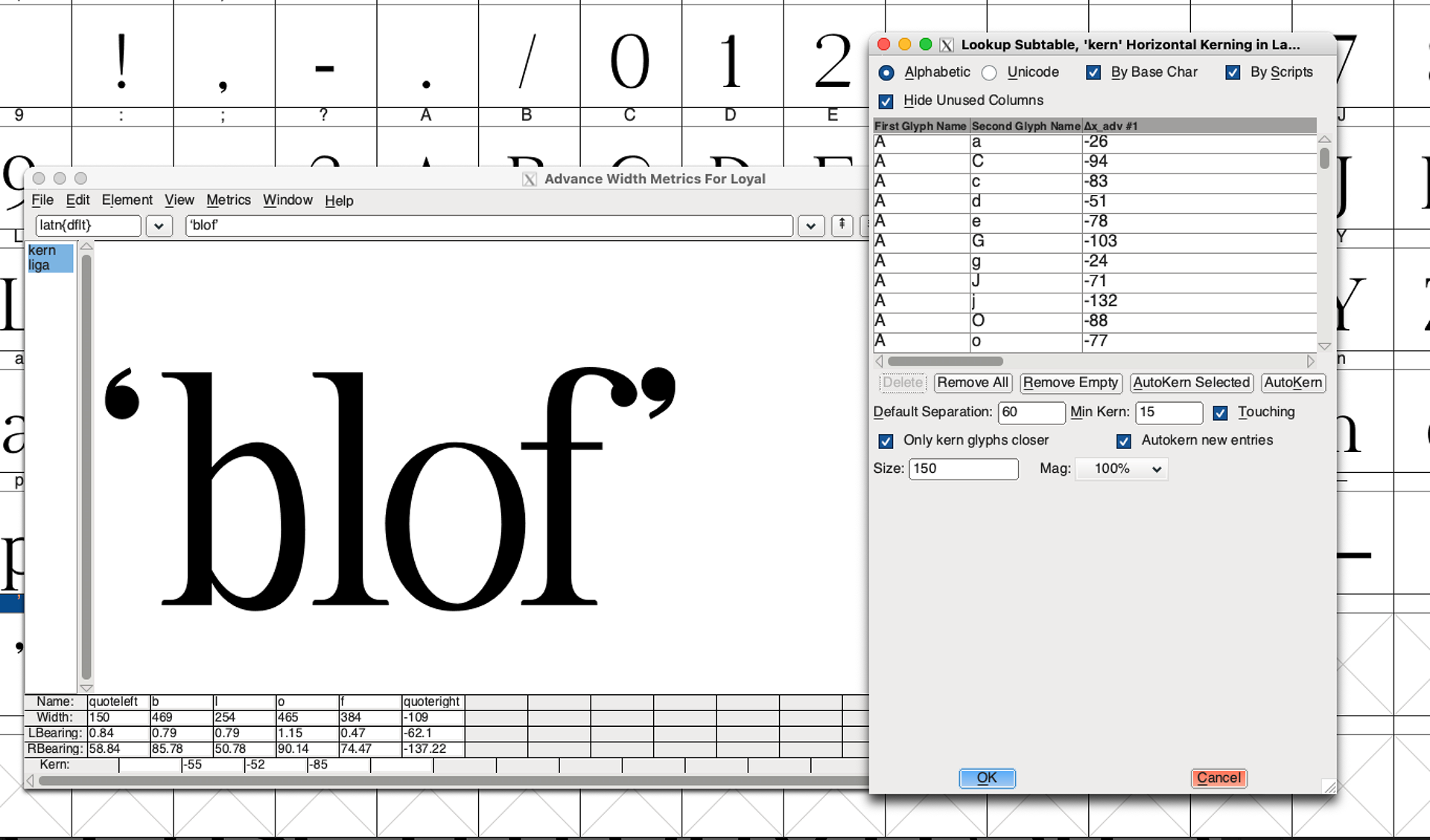
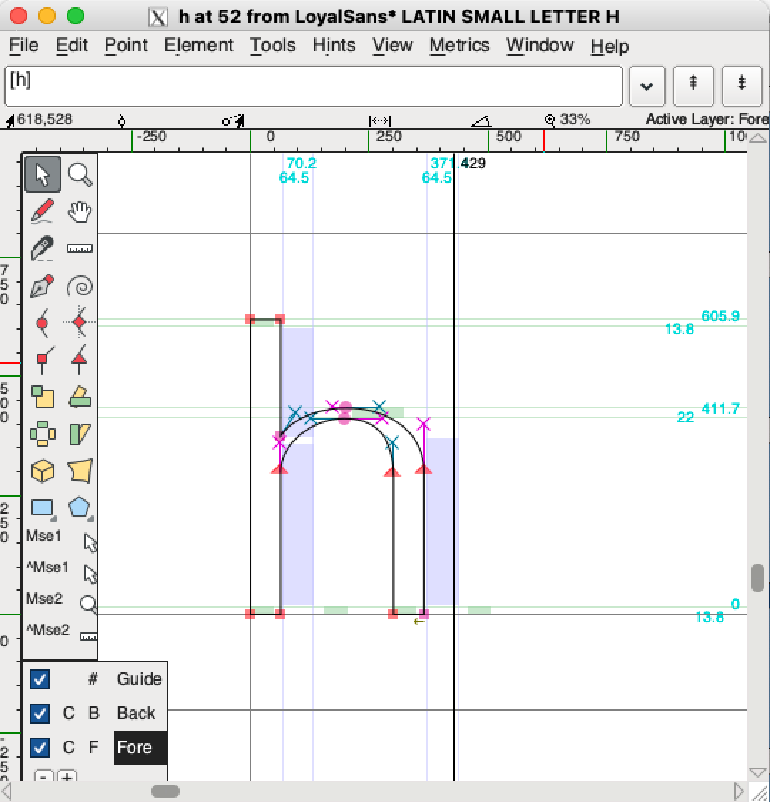
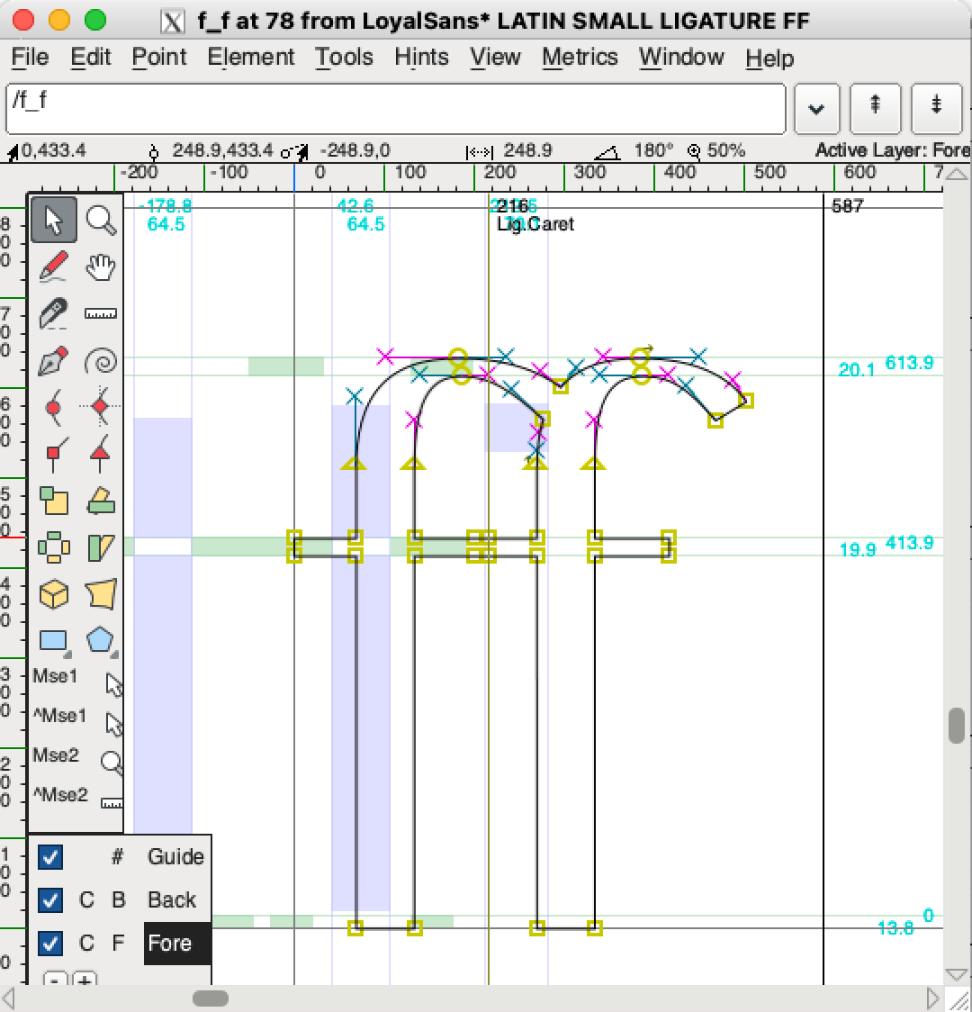
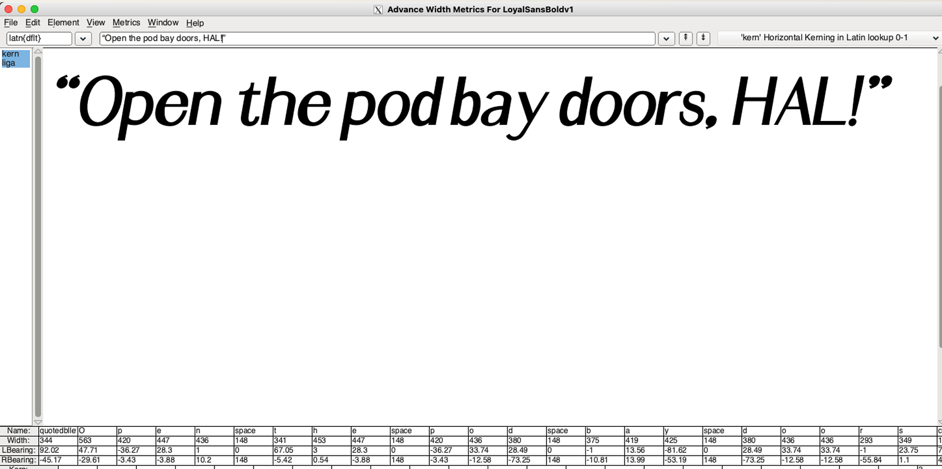
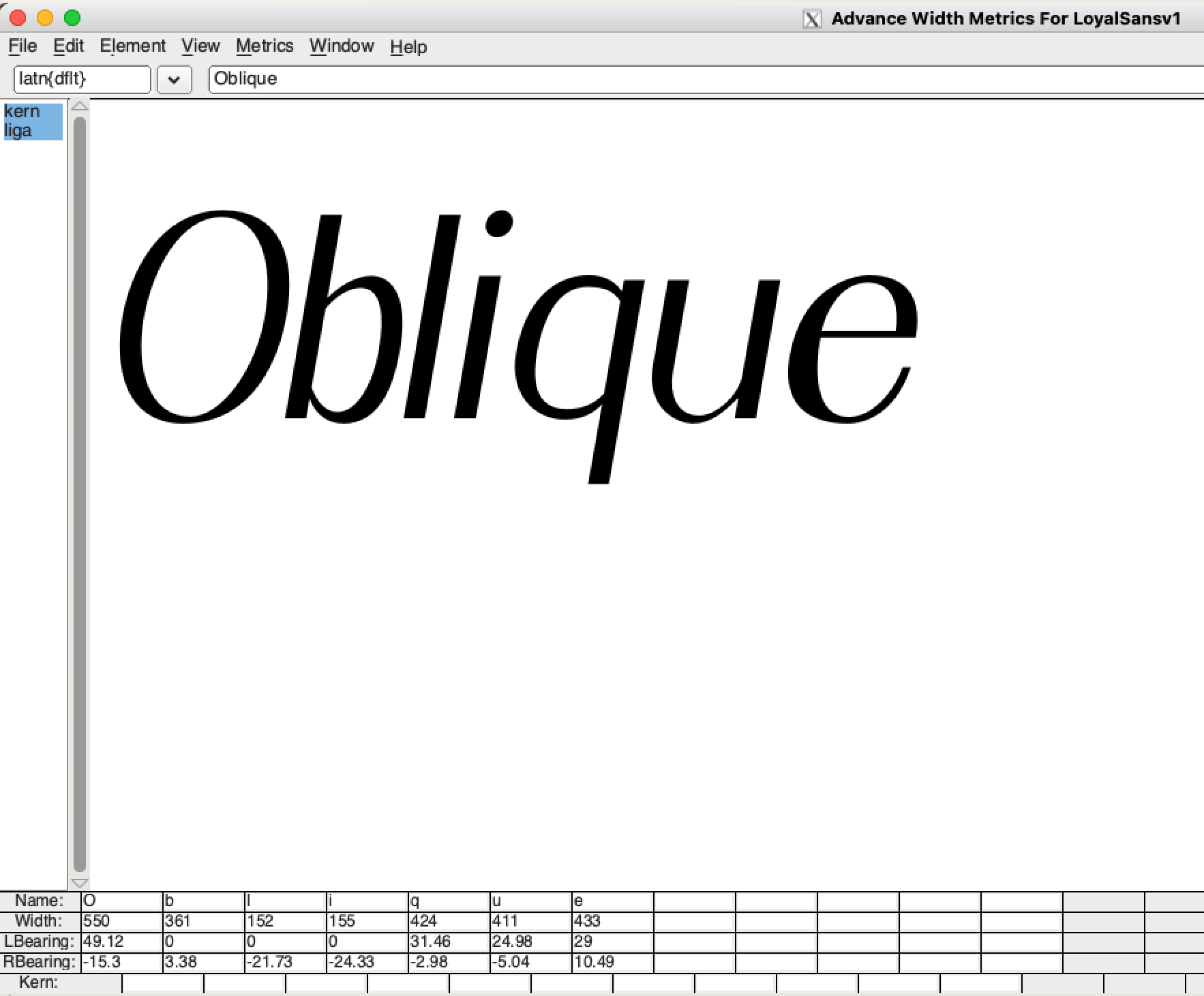
In the digital step of the process, it is extremely important to work as non-destructively as possible and with complete mathematical uniformity. There are also a lot of subtleties that must be taken into account every step of the way. Solving one problem can often lead to four more problems, so being able to easily backtrack and revise was crucial.


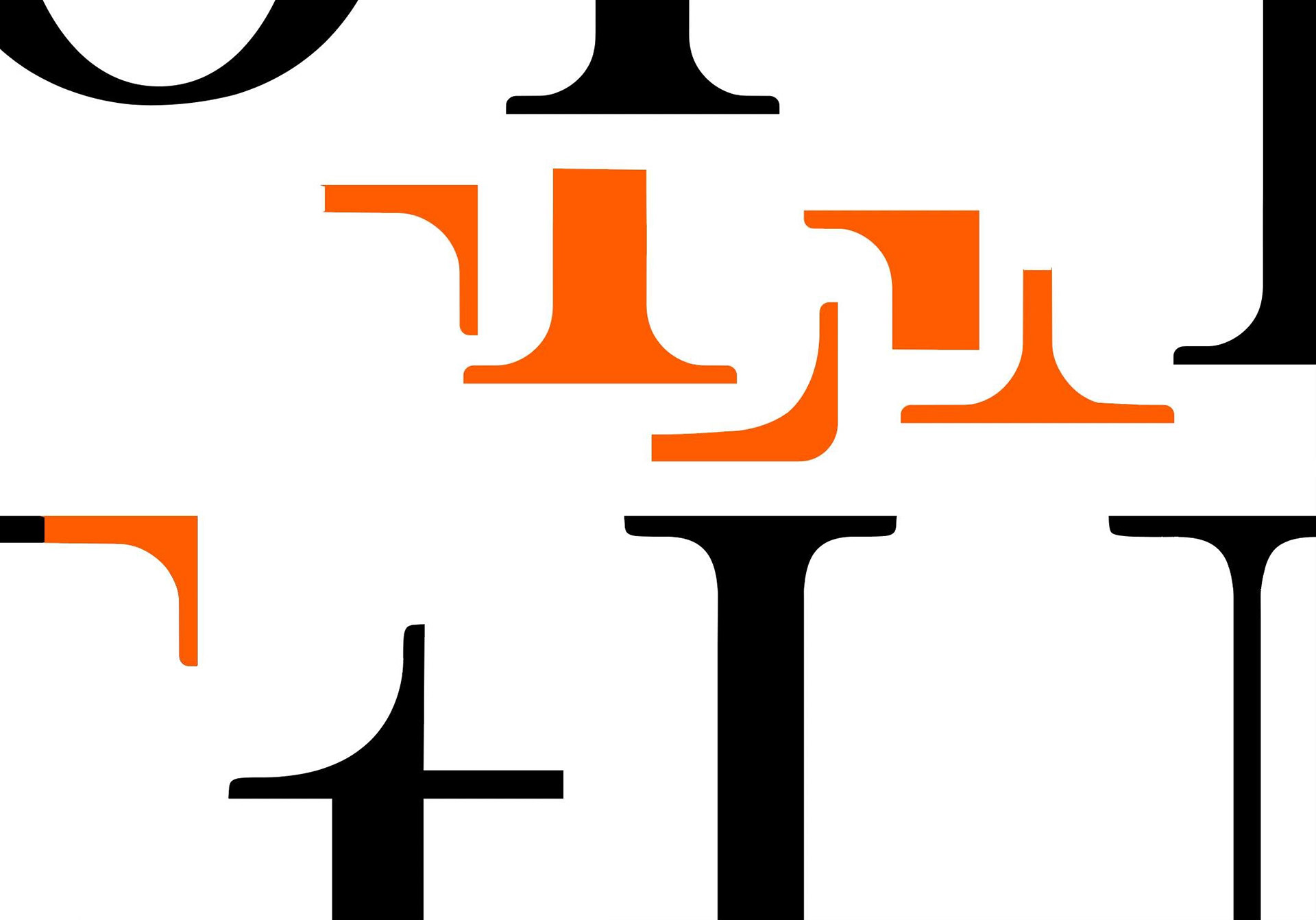
Animated type specimens are a great way to display variability.


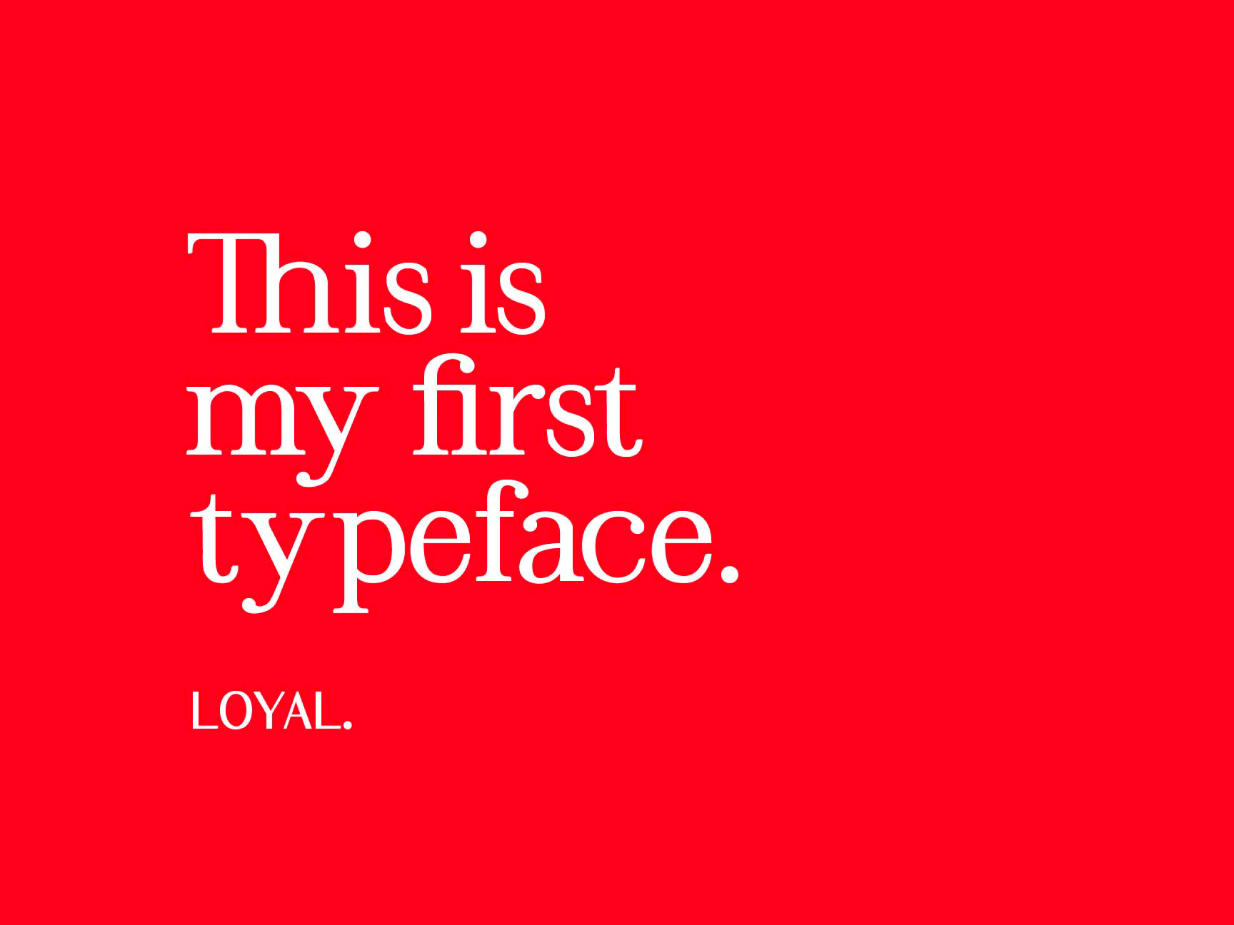
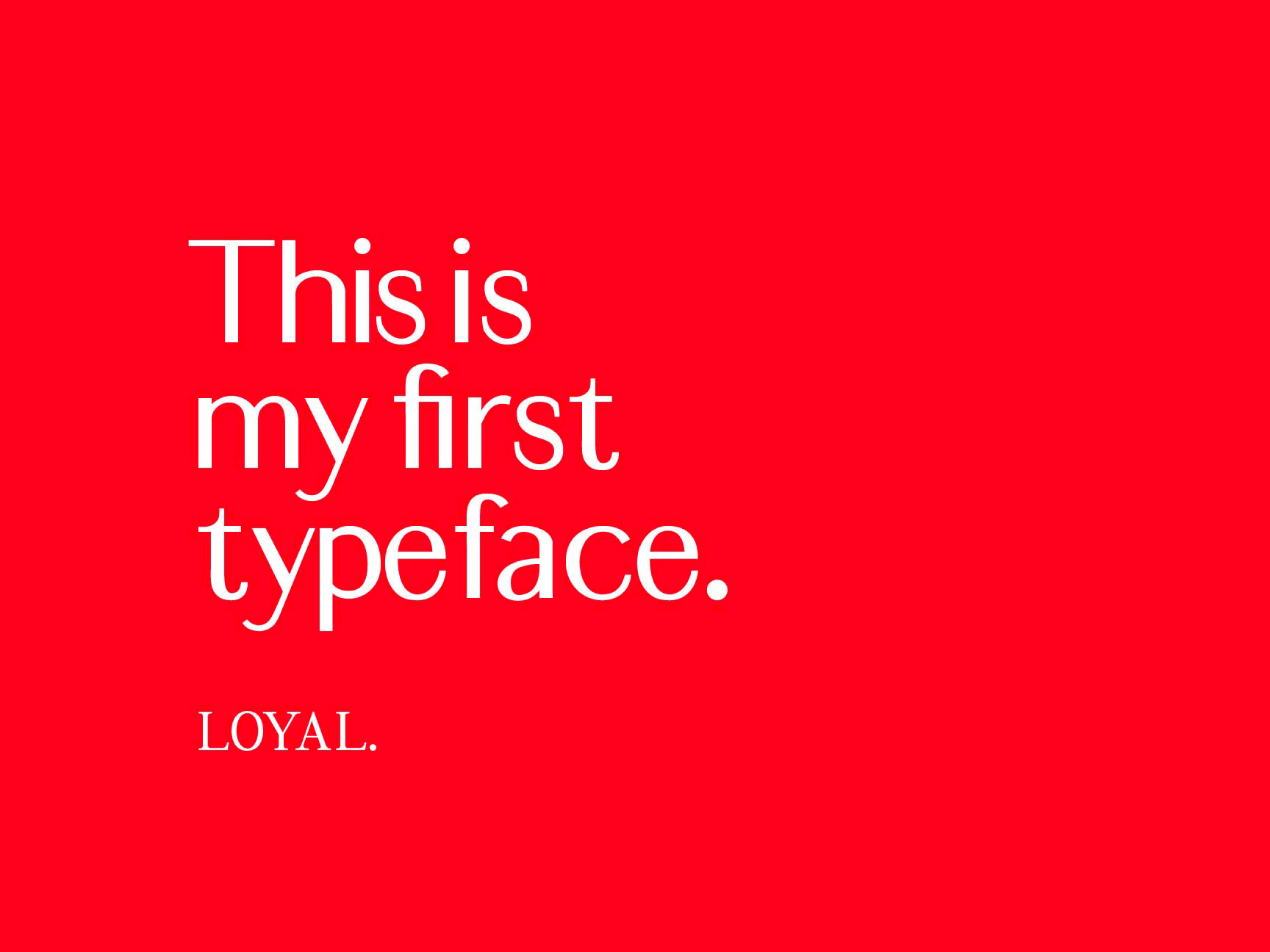
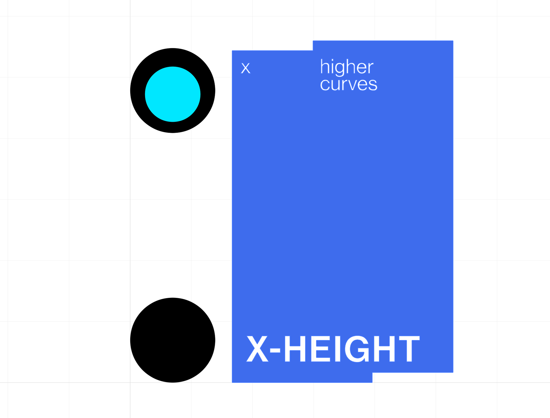
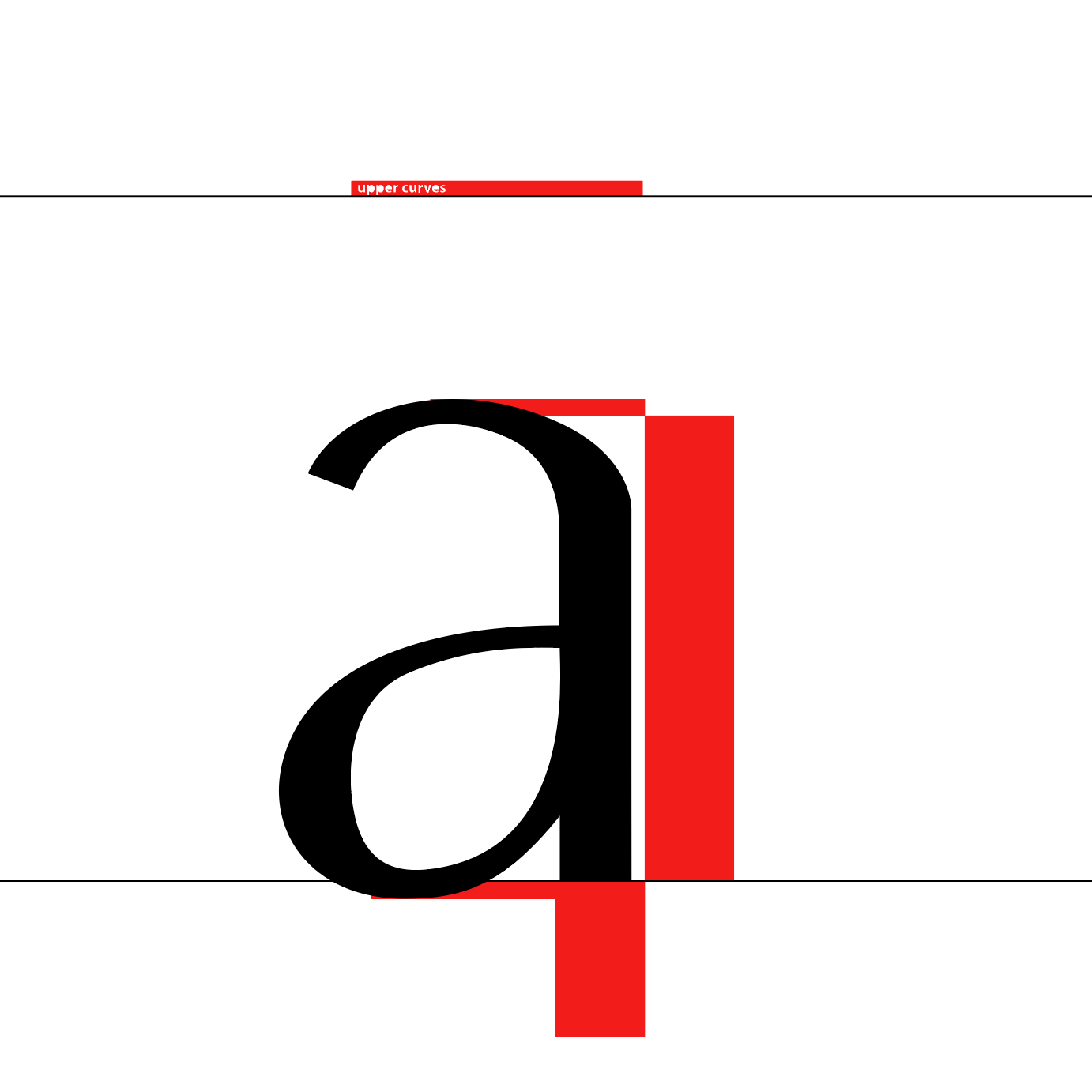
The most interesting thing about the last stages of this project was thinking about what sort of content the forms I was creating would convey. What do the forms and spaces say? The words ("content") came to me from the forms, which is opposite of the typical process in graphic design, where the content demands a certain form.


loyaltypedesign.com is a web project to reflect on and present the process of making Loyal, developed from scratch with CSS and JavaScript. Please refer to the below video while the website undergoes improvements.