
The New York Times
Product Design
For the summer of 2025 I interned at The New York Times as a product designer on the Ad Mission.
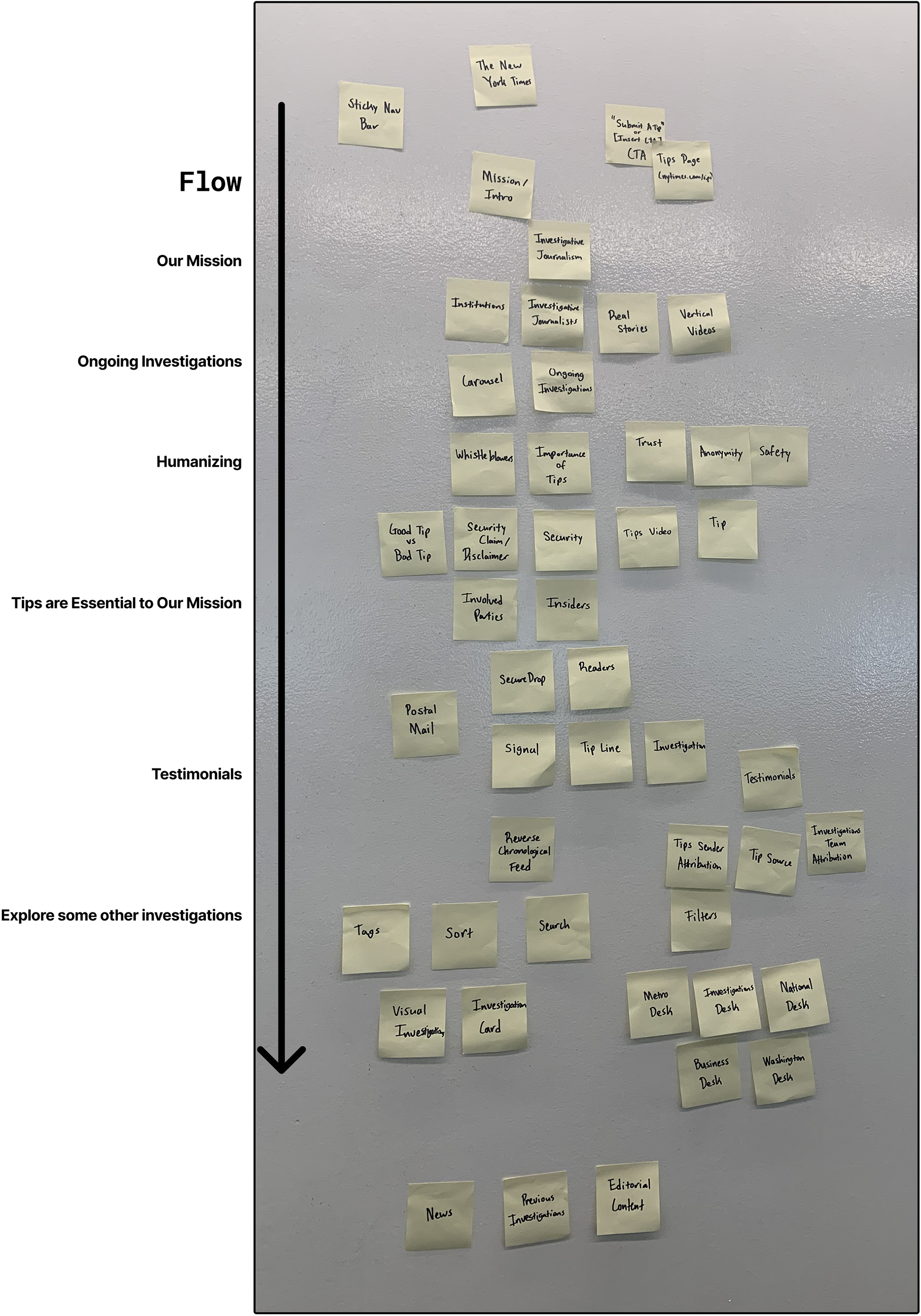
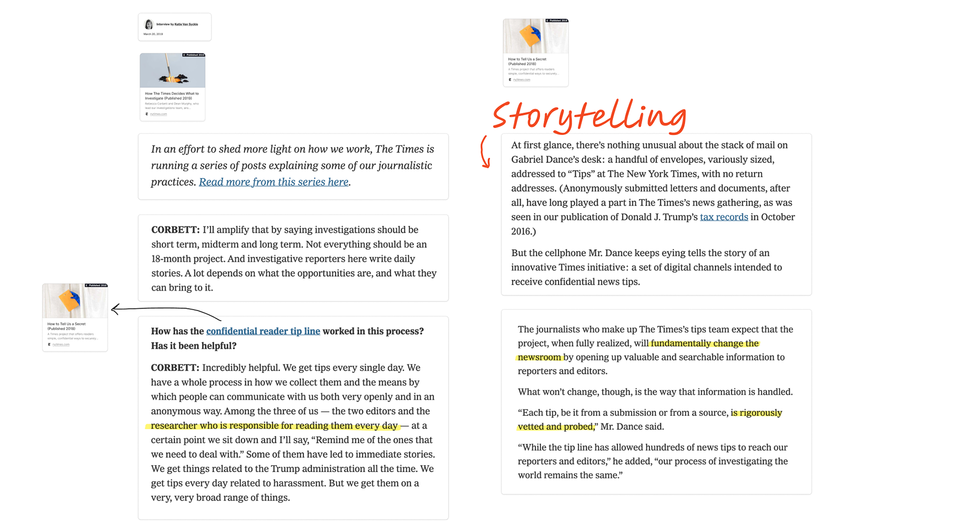
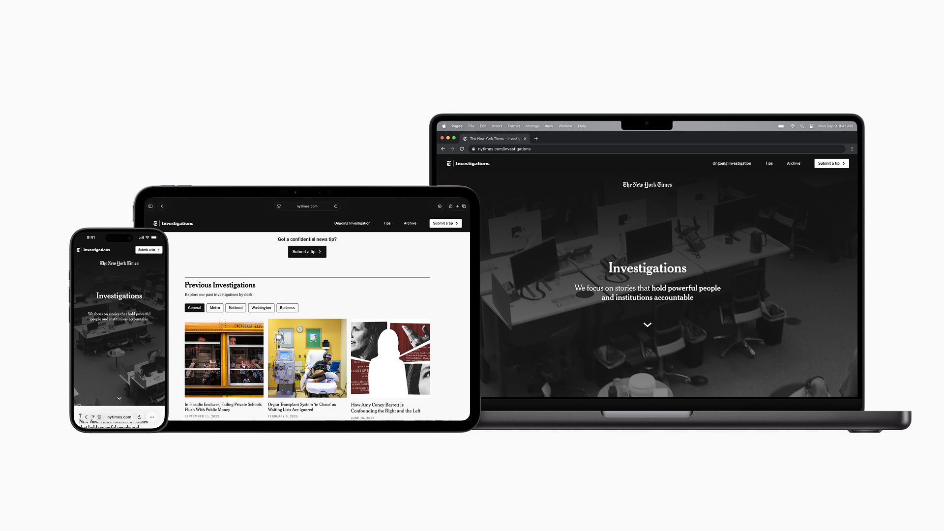
I worked on ad product and experience for various Times products both in R&D and in production, internal tools and platforms for campaign managers, two hackathons (one of which—the annual company-wide NYT Maker Week—my team won!), and a new landing page for NYT Investigations with four other product design interns.
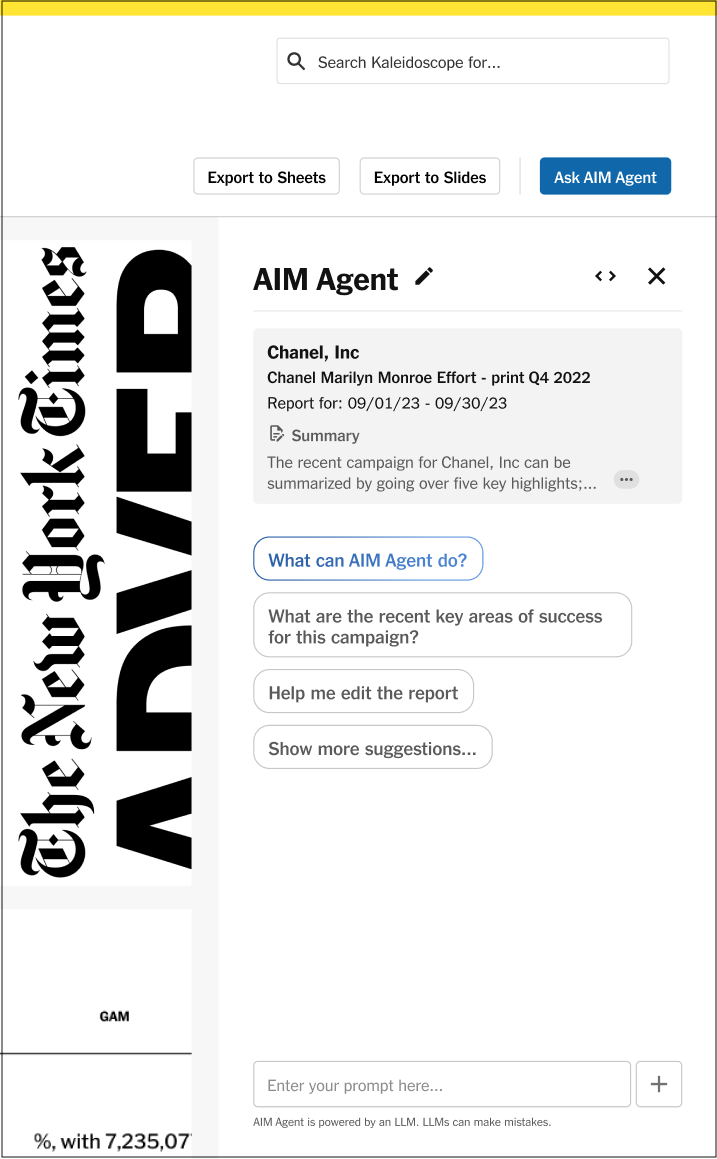
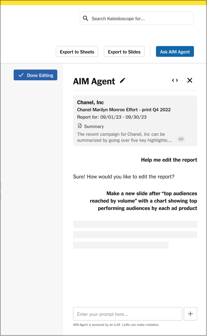
I joined a product cycle for making improvements to the Times' ad campaign data reporting platform, designing features that were more user friendly for campaign managers and testing how generative AI could help their workflow. With the help of user feedback sessions, I prototyped several platform-native agentic assistant flows in which the embedded AI—beyond using the report to answer complex analytical questions about campaign performance—could fetch data from outside the current report, and create new report slides and visualizations using user-requested metrics in pre-existing formats.
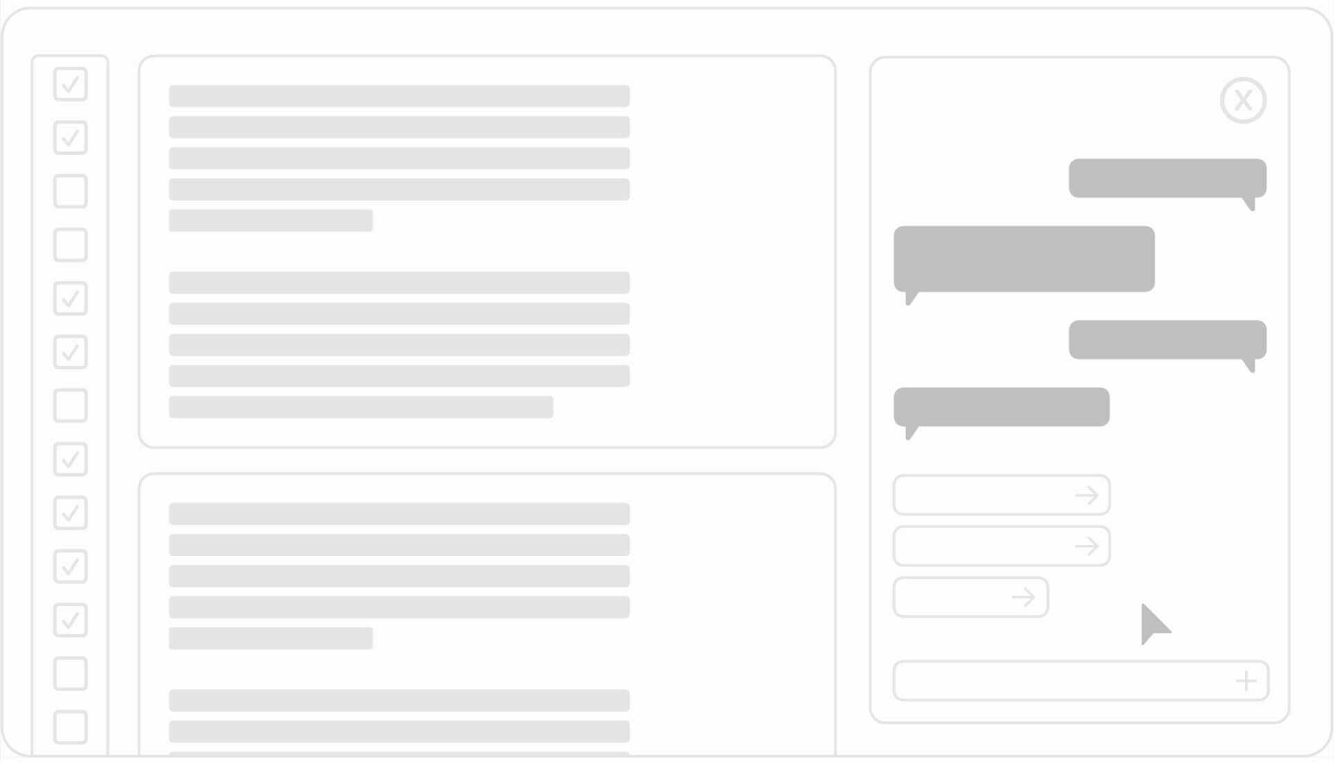
I created this simplified animated gif illustrating the idea of the platform-native agent to protect NDA-sensitive data
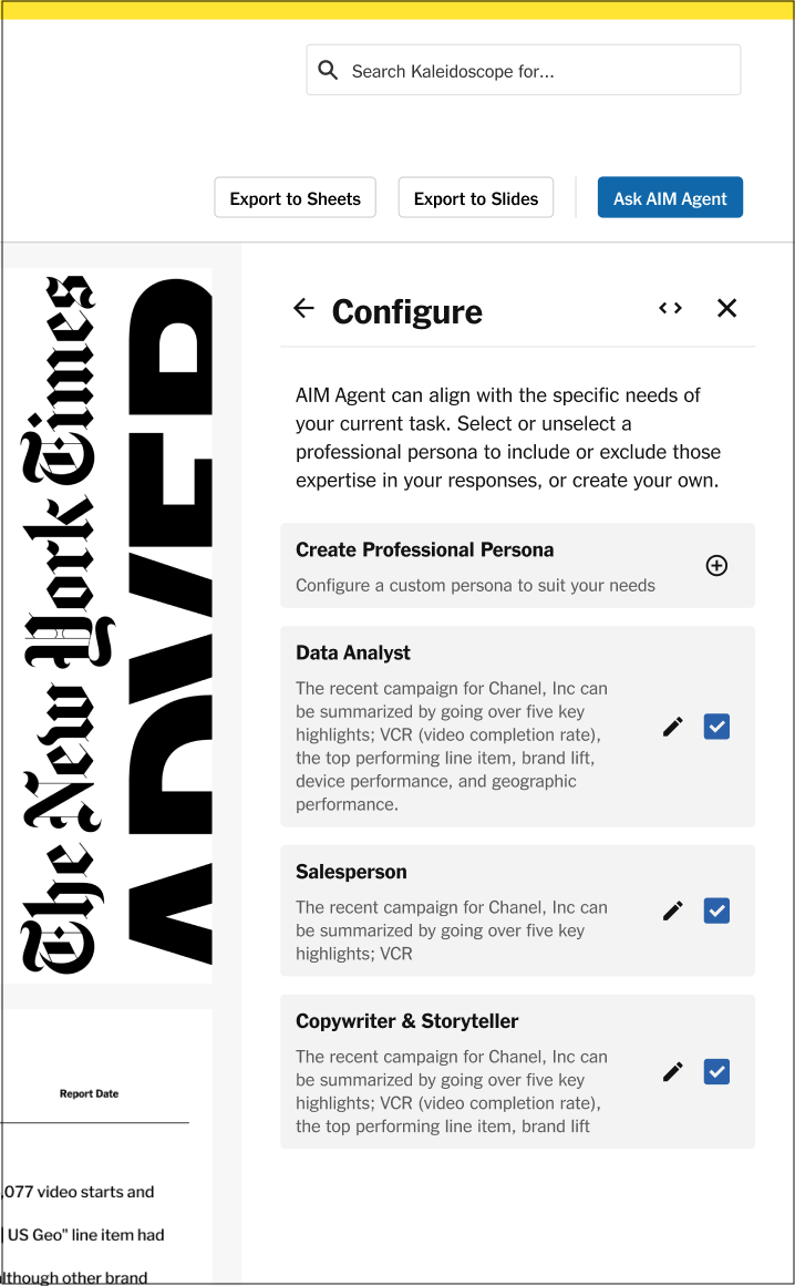
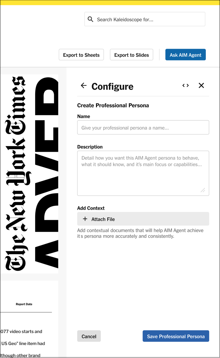
One main pain point for campaign managers using the existing system for AI-assisted campaign reporting was the system's inability to choose between cold-hard-facts, storytelling, exaggerating, and data analysis. With a "Configure" feature, CMs could select which personas or focuses they wanted for the assistant, or add their own to create the assistant most useful to them for any given ad campaign.
CMs could then have an agent that acts as both a chat assistant and a report-editing collaborator, all without leaving the reporting site.
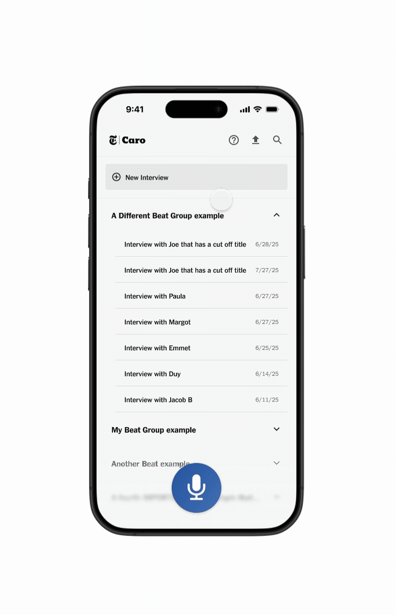
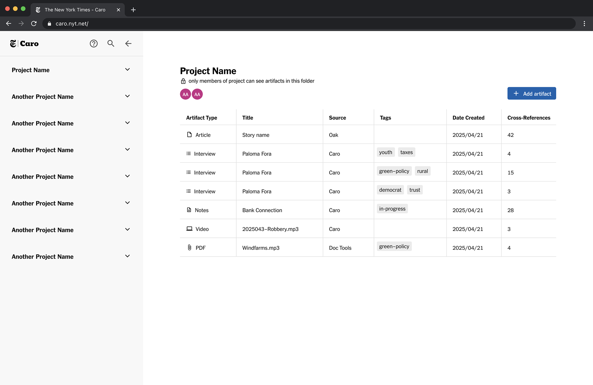
The idea for NYT Caro was born from an interviewing and organizing problem; reporters juggled multiple tools on different platforms to interview sources depending on the environment, the source, and available resources. To inform stories from those interview transcripts, reporters would often have to sort through weeks of messy and disconnected notes and transcripts to find the connections they were looking for.
NYT Caro is a centralized interviewing and notetaking tool that works for reporters at the speed of modern news, putting simplicity, flexibility, and control in their hands. I conducted user research with reporters using the prototype I designed along with Meghna Dholakia. Our journalists reported appreciation for bringing all the disparate workflows they used to interview and organize their sources into one user-friendly internal platform, with one exclaiming that they “would use the product starting Monday.”
Thanks very much to Duy Nguyen for leading the project and my incredible team for all our hard work—we ended up winning the Internal Tools category of the hackathon.
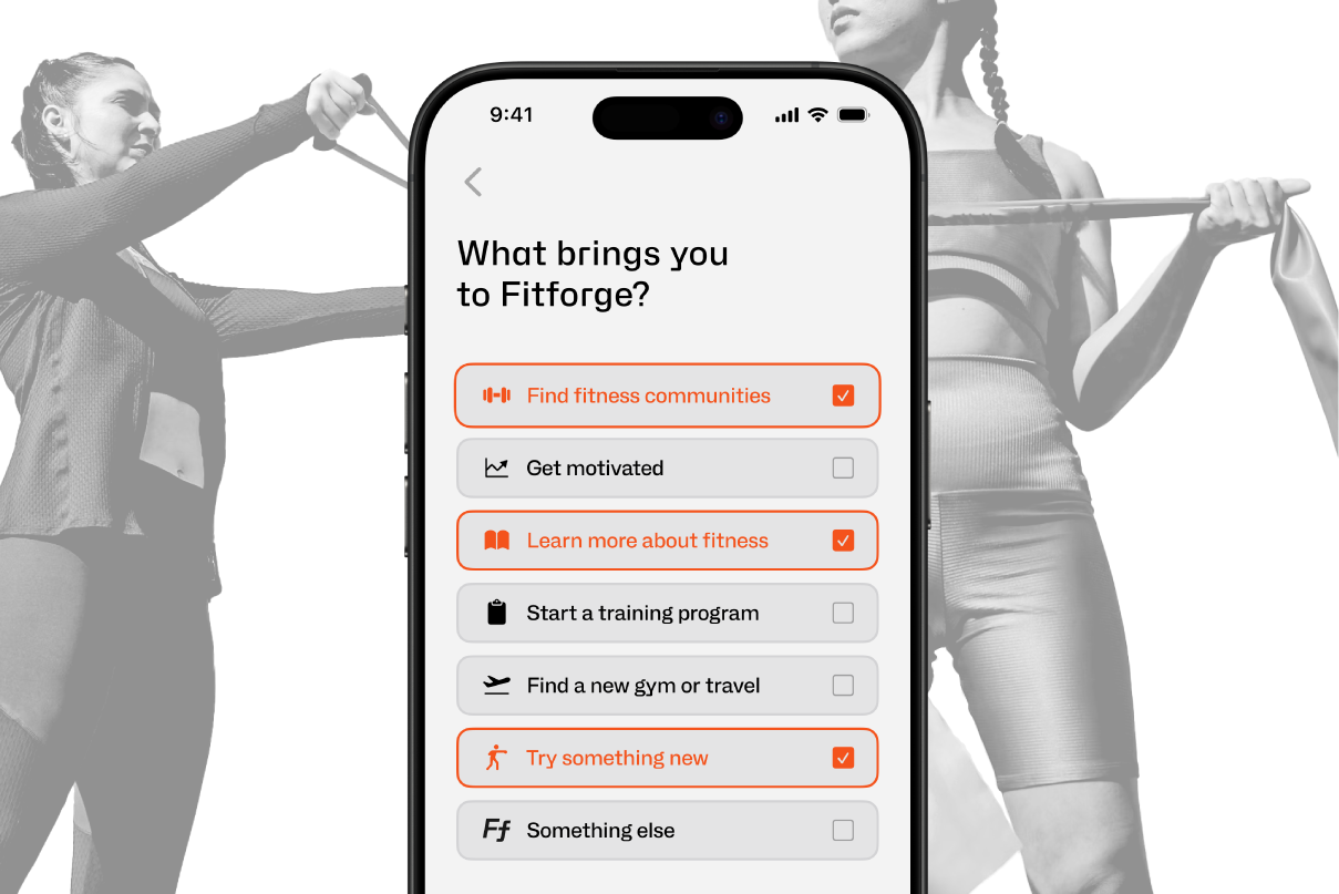
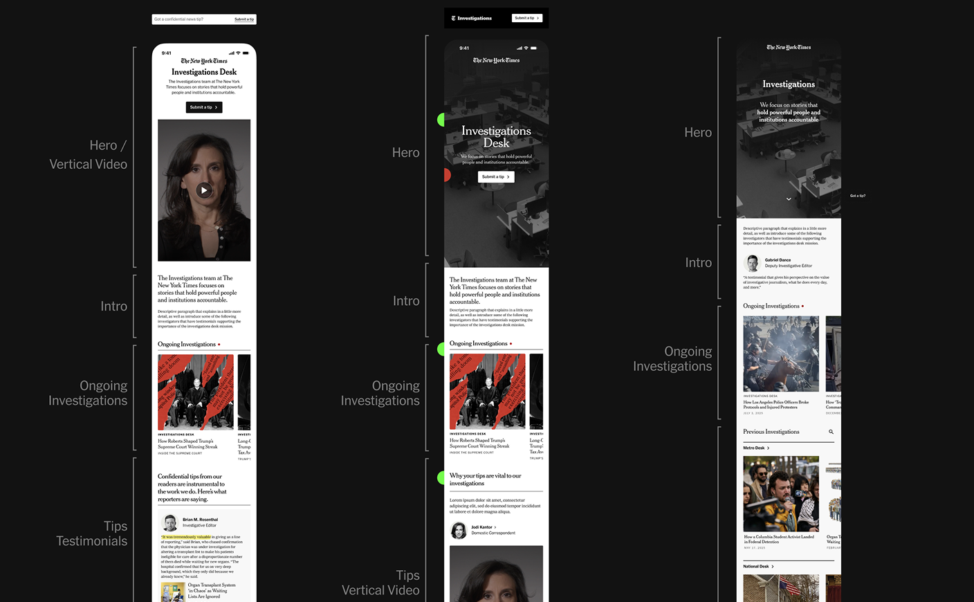
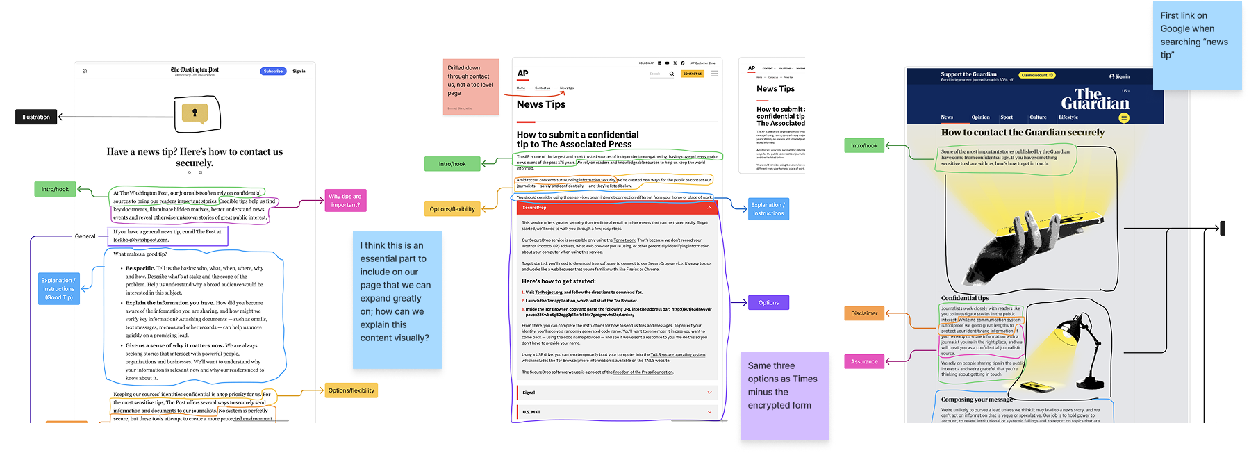
While on the Ad Mission, I also worked with the four other amazing product design interns from the Subscriber Experience, Messaging & Publishing, Games, and Cooking teams on a capstone project facilitated by Dalit Shalom and collaborating with Pulitzer-winning journalists from the Investigations department. With nine weeks of research, stakeholder interviewing and feedback, art direction, and wireframing, we presented a well-received polished prototype to Investigations executives.
Our intern cohort took turns facilitating and leading the project each week. I learned a lot about collaboration with other designers, working with dynamic stakeholders, and how to tell a compelling story within guiding mandates.
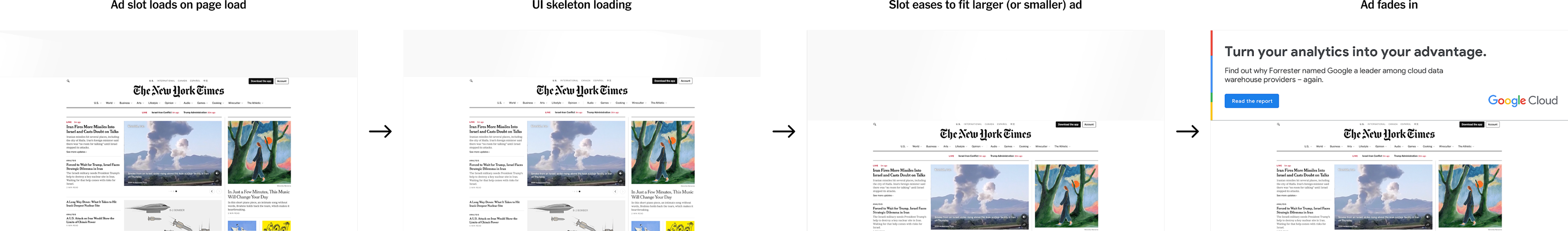
This ad loading prototype uses motion design to strategically minimize cumulative page layout shift, a core vital for SEO, by starting with the most common ad slot size and easing to fit larger or smaller ads. The faint 'skeleton UI' loading communicates that a loading ad is not a mistake or empty space without taking attention away from the content. In the case of an unfilled ad, the 'placeholder UI' is a solution that avoids an awkward blank space without calling too much attention to it and without the hit to SEO from layout shift due to collapsing the ad slot.
For this self-driven project, I consulted engineers familiar with the subject and other product designers to gain context and feedback, and practiced creating my own design brief that aimed to address two scenarios that The Times tries to avoid: page layout snapping from ads that are larger or smaller than the most common ad slot, and unfilled ad slots.
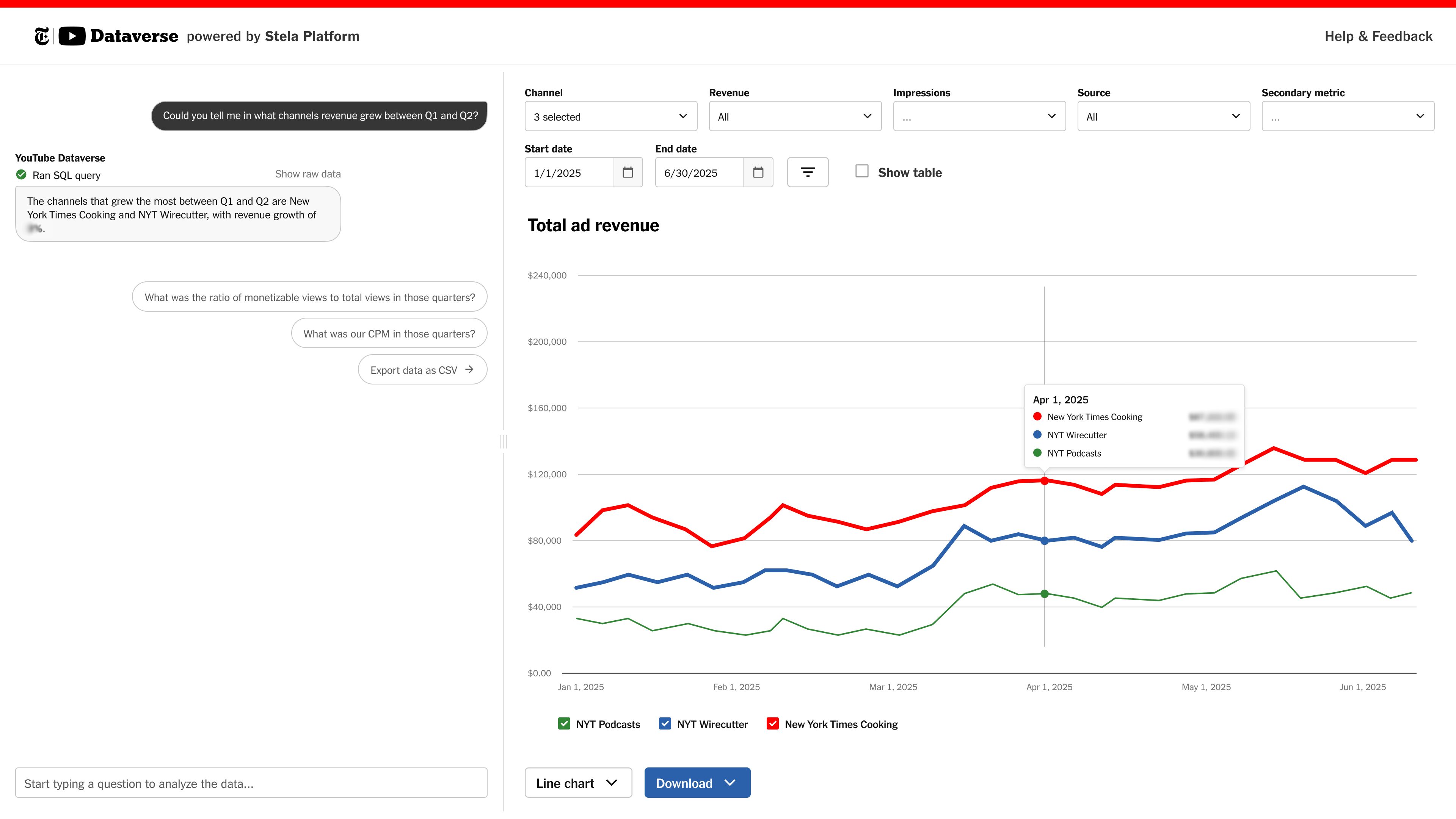
For the Ad Mission- and Advertising-wide Ad Maker Days hackathon, my team and I built a tool for leadership to easily analyze all the many NYT YouTube channels' ad metrics and revenue using our in-house data platform, Stela.
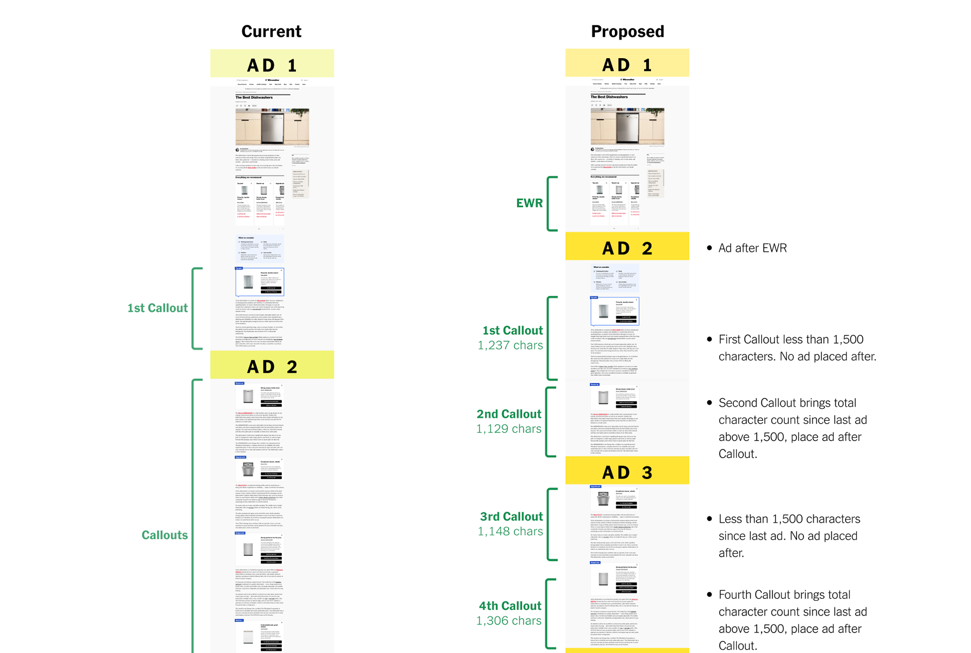
I worked with product managers and leaders from the Wirecutter product team to redesign the ad placement logic for their three main page types, driving significant projected revenue growth from ad impressions. This was a very iterative process that required stress testing to surface edge cases until settling on an adaptive and reliable logic that worked across dynamic Wirecutter editorial content.
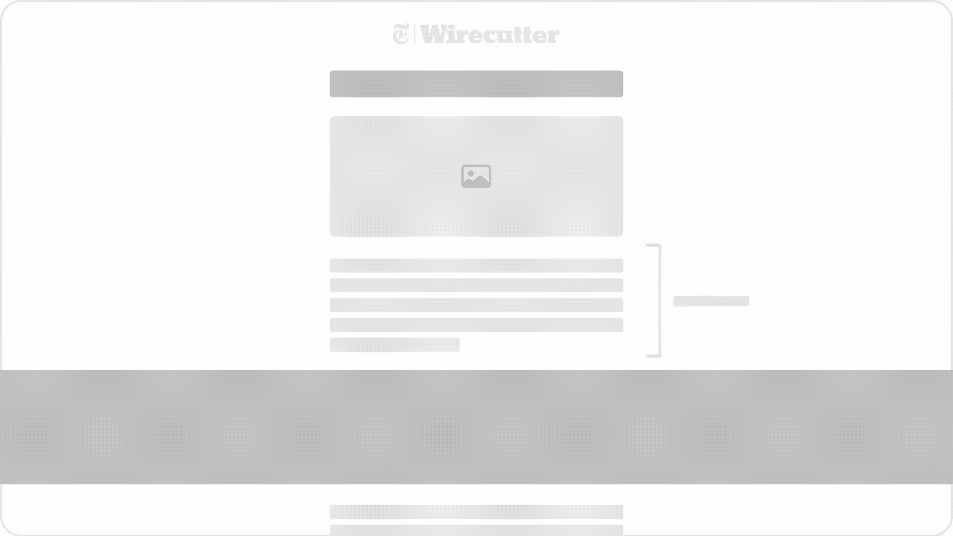
I created this simplified animated gif illustrating the idea of ad placement logic to protect NDA-sensitive data